Plotting options
All options below are keyword arguments of rf.plot (and of
rf.plot_histograms, which draws existing
hist.Hist objects with the same options).
Overlays, stacks and data
- Overlay (default): every sample is drawn as an outline (
histtype="step"). Usehisttype="fill"for translucent filled areas,"errorbar"for points,"band"for uncertainty bands; aSample(histtype=...)overrides per sample. - Stack:
stack=Truestacks all non-data samples as filled histograms in the given order (first sample at the bottom) and draws a hatched band for the statistical uncertainty of the total. - Data: samples with
is_data=True(or passed asobserved=...) are points with error bars, drawn on top and never stacked, in the style's text colour (black by default) unless the sample setscolor. errorbars=Trueadds statistical error bars to non-data histograms.
Systematic uncertainties
Samples carry their sources of systematic uncertainty, {name: variation};
systematics= on plot() and histograms() adds sources to every simulated
sample (a sample's own source of the same name wins):
bkg = rf.Sample(
    "mc.root",
    tree="events",
    label="Background",
    weight="weight",
    systematics={
        "pileup": ("weight_pu_up", "weight_pu_down"),  # weights replacing Sample.weight
        "trigger": "weight_trig_up",  # one-sided: down mirrors up
        "xsec": 0.05,  # ±5 % normalisation
        "shower": (1.10, 0.97),  # (up, down) normalisation factors
        "jes": {"Jet_pt": ("Jet_pt_jesUp", "Jet_pt_jesDown")},  # branches
        "generator": rf.Systematic.samples("mc_herwig.root"),
    },
)
p = rf.plot(
    [bkg, sig], "Jet_pt", observed=data, stack=True, ratio=True, systematics={"lumi": 0.017}
)
| Form | Variation |
|---|---|
"w_up", ("w_up", "w_down") |
weight expression(s) replacing Sample.weight; the plot weight=, scale and luminosity scaling still multiply |
0.05, (1.10, 0.97) |
the nominal histogram scaled by 1 ± 0.05 (a magnitude, at least 0 and below 1), or by the two positive factors, which may point either way |
{"Jet_pt": ("Jet_pt_up", "Jet_pt_down")} |
branch names replaced by other branches in the variable, the selection and the weight, so a cut on Jet_pt moves with it; replacements are branch names, not expressions |
Systematic.samples(up, down) |
other files or arrays with the sample's selection, weight, cross section, tree name and entry range; files look up a string ngen themselves, arrays take the nominal sample's; a Sample is used as given |
Rules:
- Every tuple is
(up, down). Without a down variation, the up shift is mirrored:down = 2 × nominal − up. - The binning comes from the nominal values; variations fill the same axis. Weight and branch variations are evaluated on the branches read once for the nominal histogram.
- Per bin, each source shifts the contents by
up − nominalanddown − nominal. The larger positive shift enters the upper uncertainty, the larger negative one the lower (so two variations moving the same way widen one side only). Different sources are independent and added in quadrature; the total is statistical ⊕ systematic, per side. - Sources with the same name are fully correlated across samples: the stack total adds their variations linearly (a sample without the source contributes its nominal contents), and a ratio varies numerator and denominator together, so a shared luminosity uncertainty cancels in an MC/MC ratio.
normalize=True,"unity","density"or a numeric target normalises every variation by its own total, so the plot shows shape uncertainties; a pure normalisation uncertainty drops out.normalize="width"only divides by bin width and retains normalisation uncertainties. If the nominal cannot be normalised, its variations also stay raw. If only a variation has a zero or non-finite total, normalization raisesSystematicError.flow="sum"/"show"treat variations like the nominal histogram.- Non-finite values are reported for each affected variation, with the source
name and direction in the warning.
nonfinite="error"rejects them. - Data samples cannot carry systematics (
SystematicError), and neither can pre-filledHistogram(is_data=True); plot-level sources skip them. plot2d,correlation,summarize,cutflow,efficiency,profileandhistogram()(a plainhist.Hist) ignore systematics. Significance panels also use only statistical uncertainties.
Drawing follows mplhep's conventions: a stack's hatched band shows the
statistical and systematic uncertainty of the total (legend Stat. + syst.
unc.), overlaid samples with variations get a light band in their own colour,
and the ratio panel includes the systematics in its band around one
(split_ratio, data/MC) or in the error bars of the points (propagate:
statistical uncertainties uncorrelated, systematic ones propagated source by
source through the varied ratio; a variation that empties a denominator bin
leaves that bin's systematic uncertainty undefined, with a warning). The
automatic ratio range covers the bulk of the band and of the systematic error
bars (robust percentiles, like the points, so a single bin with a huge
uncertainty runs off the panel instead of squashing it; pass ratio_ylim to
show it in full). It stays at or above zero unless a central ratio is negative
(signed weights).
The numbers are part of the result:
u = p.uncertainty()  # all simulated histograms summed (the stack total); or one by label
u.stat, u.syst_down, u.syst_up  # per bin, visible bins
u.total_down, u.total_up  # statistical ⊕ systematic
u.components["jes"]  # signed (up − nominal, down − nominal) shifts
p.histograms[0].variations  # {"jes": (hist_up, hist_down), ...}
p.ratios[0].syst_band  # relative (down, up) band of the reference
Pre-filled histograms take variations directly and are drawn the same way:
rf.Histogram(h, label="MC", variations={"jes": (h_up, h_down)}) passed to
plot_histograms; uncertainty and
sum_histograms work on them too.
Use (h_up, None) for a mirrored variation. Sample.systematics and
Histogram.variations are read-only; sample.replace(systematics=...) and
histogram.replace(variations=...) return copies with other ones.
Luminosity
lumi= scales simulated samples that carry a cross section
(Sample(xsec=..., ngen=...)) to expected yields, xsec × lumi / ngen, and
writes the luminosity into the label. Numbers are in fb⁻¹; strings carry a
unit: lumi="10.8 ab^-1". Data samples and samples without a cross section
are left alone. The same keyword exists on histogram(s), plot2d,
summarize, correlation, cutflow, efficiency and profile. A
luminosity already set on the Style wins in the label: Style(lumi=...)
describes the figure, lumi= the scaling, and they need not agree (a partial
dataset scaled to the full one, for instance).
Normalisation
normalize=
| Value | Meaning | y label |
|---|---|---|
False/None |
raw sums of weights | Events or Entries / 5 GeV |
True, "unity" |
visible bins sum to one | Normalised to unity |
"density" |
integral over the visible range is one | Density |
"width" |
divide by bin width, no rescaling | Entries / GeV |
| a number | visible bins sum to that number | Normalised to 100 |
Variances are scaled consistently. Flow bins scale with the same factor; for
"width" and "density" they are divided by the width of the neighbouring
visible bin. Plain hist.Hist objects with a count storage passed to
plot_histograms are converted to Weight storage first. If such a histogram
was filled with weights (or rescaled) its sum of squared weights is lost, and
rootfig refuses it with a ValueError rather than invent uncertainties; pass
assume_poisson=True to use the absolute bin contents as variances (with a
warning), or fill with hist.storage.Weight() in the first place.
The rescaling modes divide by the signed sum of the visible bins: a histogram
dominated by negative weights still sums to the target, its shape flips sign,
and a warning says so. An empty histogram, or one whose positive and negative
weights cancel exactly, is left unchanged with a warning and keeps the plain
Events label (Histogram.normalization stays None).
Ratio panel
ratio=True adds a lower panel sharing the x axis:
- with a stack: data / total MC, error bars from the data, grey band for the
MC statistical uncertainty (
ratio_uncertainty="numerator"); a stacked ratio needs anobserved=sample; - with data and overlaid samples: data / the first non-data sample (only the data appears in the panel);
- otherwise: every further sample / the first sample, uncertainties of both
propagated in quadrature (
ratio_uncertainty="propagate").
ratio="Background" picks the reference by label; all other histograms, data
included, are divided by it. The uncertainty treatment is chosen per histogram:
data over simulation keeps the reference uncertainty as a band, simulation over
simulation propagates both sides, so systematic sources they share cancel.
ratio_uncertainty= applies one treatment to all.
ratio="significance" (or "s/sqrt(b)", "s/sqrt(s+b)") draws a
significance panel instead: per bin, the signal over the square root of
the background (or of signal plus background), with propagated
uncertainties. The signal is the last non-data sample (the top of a stack)
and the background the sum of the others; ratio=("s/sqrt(b)", "ZH") names
the signal. The values are returned as a Ratio in Plot.ratios.
ratio_ylim and
ratio_label override the automatic range (at least 0.5 to 1.5, widened to
cover the bulk of the points) and label (Ratio to X or Data / MC). A
rotated y label is bounded by the height of the short ratio panel, so a long
one is shrunk and, if that is not enough, wrapped onto two lines; pass a
shorter ratio_label such as "Ratio" to keep it at full size. The
computed values are returned in Plot.ratios as
Ratio objects (values, errors, band, edges, and
syst_errors/syst_band with systematic uncertainties).
Binning and range
bins takes an int, a (n, low, high) triple, a sequence of edges or a
hist axis, and is shared by every sample of one plot (and by the numerator
and denominator of an efficiency).
With an integer bins the range comes from range:
range |
Meaning |
|---|---|
(low, high) |
explicit |
"robust" |
default: the min/max of the data, ignoring values far from the bulk |
"auto" |
the full finite minimum and maximum over all samples |
rf.plot("events.root", "d0_significance", bins=50)  # robust
rf.plot("events.root", "d0_significance", bins=50, range="auto")  # full extent
rf.plot("events.root", "d0_significance", bins=50, range=(-5, 5))  # explicit
Rejected values are not discarded
A value outside the range is not removed from the data: it goes to the
under/overflow, shown by the flow arrows (flow="show" turns them into
visible bins, flow="sum" folds them into the edge bins). Statistics boxes
and rf.summarize are computed before binning, so means and entry counts
cover the full sample whichever range is used.
This happens in two steps. Outliers are rejected by their modified z-score
(0.6745 * |x - median| / MAD), with a threshold of 30, which removes sentinels
and anything else far from the bulk. That is done within each sample, and the
ranges they keep are unioned, so a sample is judged against its own median and
spread: a signal offset from a background is not an outlier merely because the
background outnumbers it, and a sample keeps the same values whether it is
plotted alone or in an overlay. The threshold is then tightened for as
long as each step costs no more than an additional 1 percent of any one
sample, by entries and by weight. Additional is meant literally: the budget is
measured against what the first step already moved out of the view, which may
be a good deal more than 1 percent. This second step cuts a tail that reaches
far but thins out smoothly, the kind a distance threshold keeps and that leaves
the interesting part of the distribution in a corner of the axis.
The budget is charged per sample rather than over the pooled entries, so a small
signal sitting far from a large background keeps its own place on the axis
instead of being cut as a rounding error, and it is charged against the weight a
cut would remove as well as the entries, so a handful of high-weight entries is
not treated as negligible. A sample with fewer than 20 distinct values is
categorical — counts, flags, multiplicities — has no tail to cut and gets no
budget at all, so the second step takes no value off its axis; this is decided
per sample too, and holds when it is overlaid with a continuous one. If MAD is zero, the mean absolute deviation from
the median is used instead. Every candidate is padded by 5 percent and clamped
to the "auto" range (whose upper edge is nudged above the maximum to include
it), so the range never reaches past the data. Degenerate ranges are widened
symmetrically. The threshold cannot distinguish sentinels from valid data.
Cases where you may want range="auto":
- a distribution with a long tail (log-normal, Student-t, or an invariant mass
with a continuum) has valid tail entries pushed into the flow bins — this is
what the second step is for, so
"auto"is the way to see the whole tail; - a sparse discrete distribution can lose rare valid values from the visible range, for example the ones in a binary sample with 999 zeros and one one;
- a lone value far from a bulk of near-identical ones looks exactly like a sentinel and is rejected with them, however real it is;
xbreak=(a, b)is validated against the inferred axis, so a break meant to span a far tail needsrange="auto"or an explicit range.
Inferring a robust range requires additional median and deviation calculations over the combined samples, with additional time and memory costs. An explicit range avoids range inference.
The plot is mostly empty space
The inferred range cuts a thin tail, but only as far as its coverage budget allows. A distribution whose tail carries more than that — a heavy Student-t, a steeply falling spectrum over several decades — still spreads the axis over bins holding a fraction of a percent of the peak. Three ways out, in order of how often they are what you want:
range=(a, b)around the core. Nothing is lost: entries outside go to the flow bins, whereflow="hint"(the default) marks them with arrows andflow="sum"folds them into the edge bins.logy=True, which makes the tail visible instead of hiding it.xbreak=(a, b)to cut the empty middle out and keep both ends, withrange="auto"or an explicit range so the break lies inside the axis.
Axes
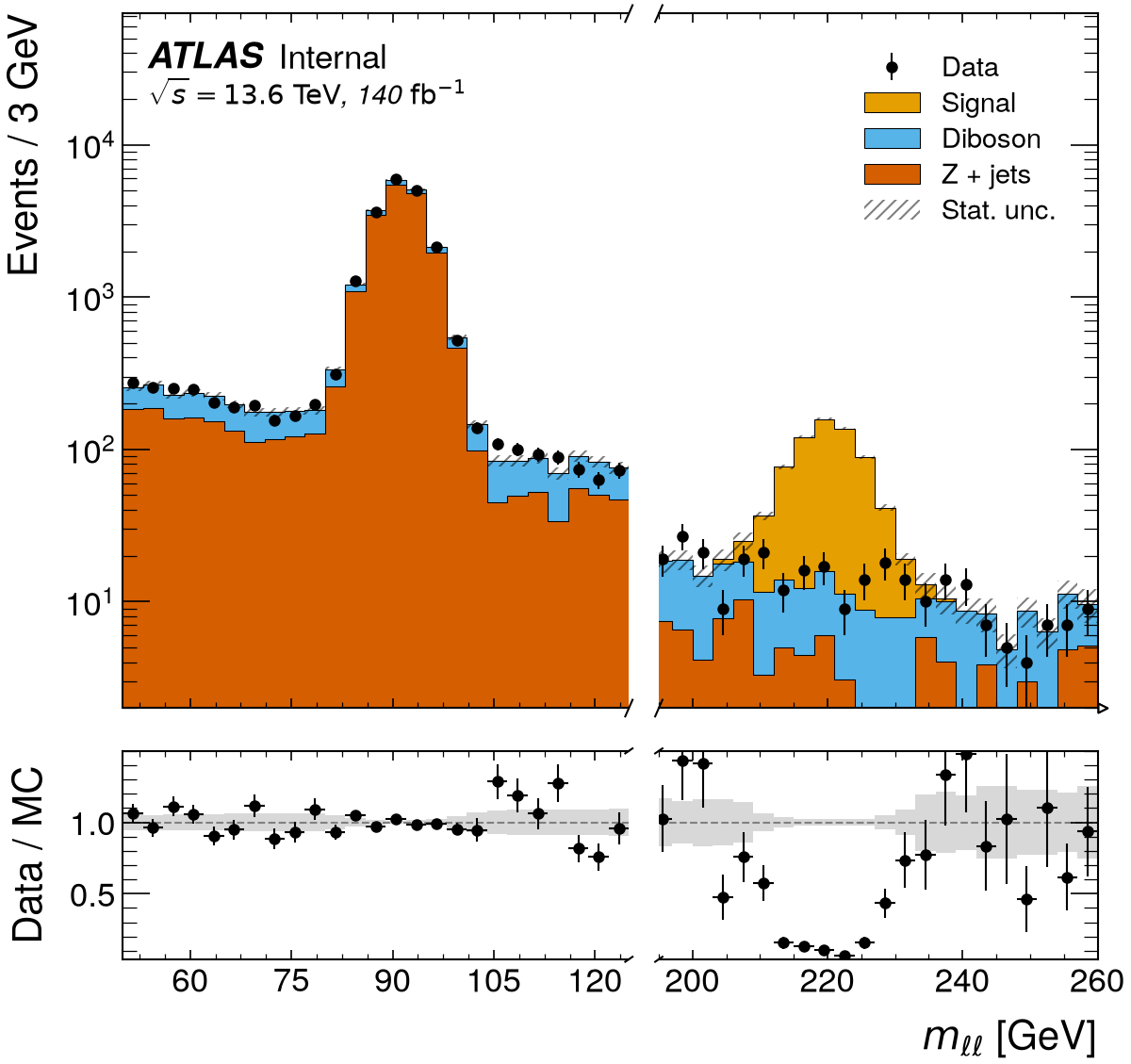
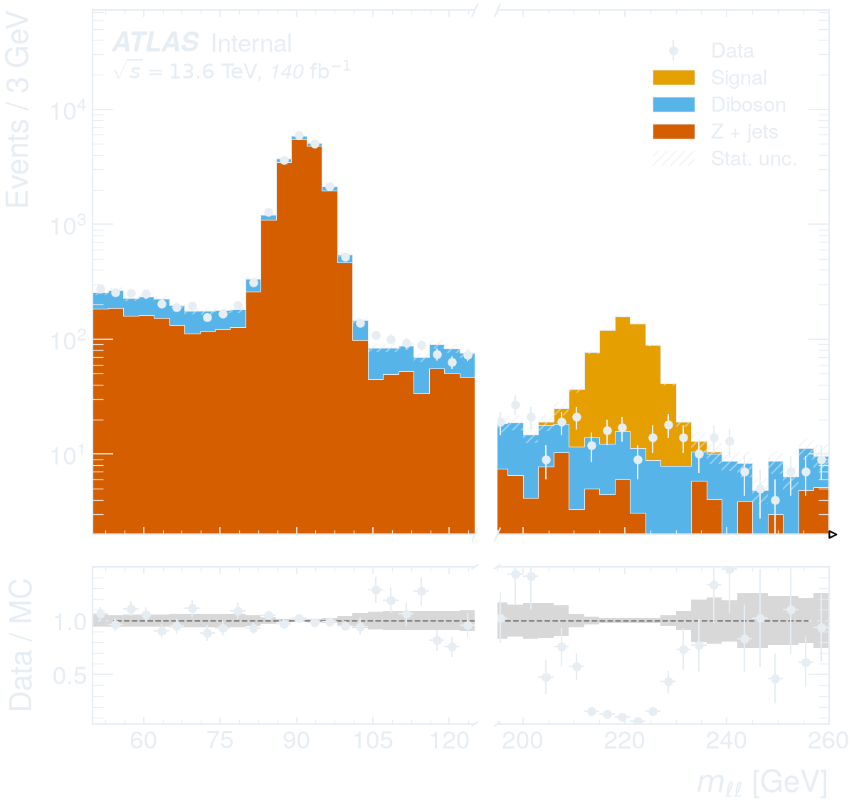
logx,logy: logarithmic scales. Log-spaced bins:bins=rf.log_bins(n, low, high).xlim,ylim: limits;ylim=(None, 1e4)keeps the automatic lower value. Automatic y limits add a small margin above the tallest bin (a factor 1.2 in linear scale, 12 in log scale) and then raise it further as the drawn legend, label, statistics box and text lines need.xbreak=(a, b): cut the range betweenaandbout of the x axis and draw the two remaining segments side by side with break marks, sharing the y axis (and the ratio panel, if any). Useful for a peak plus a far tail or a sentinel region. The right segment isPlot.ax_right(Plot.ratio_ax_right). Not available together withax=orflow="show".
 -
- flow: how under/overflow is shown (this is where entries outside an
inferred range end up), "hint" (small arrows, default),
"show" (extra bins labelled <low / >high, added on a side as soon as any
sample has content there, identical for all samples and the ratio panel),
"sum" (added to the edge bins before anything is computed, so ratios,
significances, stack bands and y limits use the folded bins), "none".
- logx, logy: logarithmic axes. logx=None (default) follows the
Variable's log flag (plot2d, efficiency and profile do the same for
their variables); True/False override it.
- xlabel, ylabel, unit, title. The title sits above the axes, where
the CMS-style label is also drawn; with such a style prefer text=.
- Automatic y limits leave room for the legend, the experiment label, the
statistics box and text lines: a small fixed margin is added above the
tallest bin, and the upper limit is then raised until none of them covers a
histogram (the legend picks a free upper corner). Room is only made for
what is actually drawn, so a plot without annotations keeps the margin.
A ylim with an explicit upper value switches this off.
Legend, labels, text and statistics
legend=Falseor a location string such as"upper left".style=an experiment name or aStyle; see Samples, variables, cuts and styles.with rf.dark_theme():draws the figures made inside the block for a dark page — light ink on a transparent background, applied on top of any style (including experiment styles that fix a white background). Colours set inStyle.rc, background and text included, are applied after it and win for the figures and axes rootfig creates, so such a style is not rendered dark. Data points and outlines follow the style'stext.color. Plain matplotlib inside the block matches too: axes made withplt.subplots()forax=, text added toPlot.ax, andfig.savefig()keeps the transparent background. Axes passed withax=keep the properties they were created with (their background, frame and ticks), so aStyle.rcpassed to that plot colours only what rootfig draws into them.text=extra line(s) drawn inside the frame: in the upper left corner forlabel_loc=0(the CMS and DUNE default), below the secondary text for the split layoutlabel_loc=3, and below the label for locations 1, 2, and 4.- A label line above the frame (experiment name, status, luminosity) that does not fit the width of the axes, next to a colour bar or over a broken x axis, is shrunk to fit, down to 60% of its original font size. If that is still too wide, the luminosity gets a separate line above the label. The luminosity of a broken x axis sits above the right end of the right segment. An explicit title is placed above these labels, preserving its font, alignment and padding.
stats=Trueadds entries, mean and standard deviation per sample below the legend (a location string moves it).
Figure handling
figsize=(w, h);ax=some_axesdraws into your own axes (pass a pair(main, ratio)for ratio plots), so several rootfig plots can share a figure.save="file.pdf"saves immediately;Plot.save(path)accepts a directory (file named after the variable) andformats=["pdf", "png"].- Figures use matplotlib's constrained layout, so labels, legends and colour
bars fit inside the canvas and a saved file has exactly the
figsizedimensions: 1D, 2D and ratio plots of one size share one shape. Figures drawn into your ownaxare saved with a tight bounding box instead. - Fonts are fixed on the figure when it is made, so saving or displaying it later renders exactly the layout that was computed, in the style's fonts.
Plot.fig,Plot.ax,Plot.ratio_axare plain matplotlib objects;Plot.histogramswrap thehist.Histobjects with labels and statistics.- In a notebook the figure is displayed automatically — it is a pyplot figure,
flushed by the inline backend at the end of the cell, so
%matplotlib inlineis not needed. End the call with;to hide thePlotrepr, and usePlot.close()in loops that make many figures.
2D histograms and correlations
rf.plot2d(sample, x, y, bins=((40, 0, 200), (30, -3, 3)), logz=True, normalize="density")
rf.correlation(sample, ["MET", "nJet", "HT"], selection="nJet >= 2", percent=True)
rf.plot2d options: logz, logx, logy, cmap (any matplotlib colour
map, default viridis), colorbar=False, zlabel (default Events or the
normalisation), normalize, title, text, style, figsize, ax, save.
The figure has the same size as a 1D plot; the colour bar takes its space from
the axes. For 2D histograms and correlation matrices, label_loc defaults to
0, with the experiment and secondary text above the frame. Location 3 splits
them: experiment above, secondary text inside. Only label_loc=1, 2, or 4
moves both inside. Luminosity remains above for locations 0–3 and inside for 4.
rf.correlation options: labels (tick labels, default the variable labels),
percent=True (integer percentages instead of two-decimal coefficients),
annotate=False (colours only), cmap (default RdBu_r), title, style,
figsize, ax, save. The matrix is returned as Plot.matrix. Without a
figsize the figure grows with the number of variables, in proportion to the
style's figure width, so the larger fonts of experiment styles keep their
cells readable. It is titled
"<sample>: correlation"; with an experiment style the experiment label replaces
that automatic title, using the placement described above. An explicit title
is shown either way.
Both variables of a 2D histogram (and all variables of a correlation matrix) must share their structure: all per-event, or all per-object from the same collection.
Efficiencies
rf.efficiency([reco], "TrueMuon_pt", passed="TrueMuon_matched", bins=(20, 0, 100), unit="GeV")
For every sample the entries satisfying selection form the denominator and
those also satisfying passed the numerator, with the same binning. The
efficiency is drawn as points with Wilson score intervals (z=1 standard
deviations by default; weighted samples use effective entries). Options are
the usual axis, legend, label and style ones (xlabel, ylabel, unit,
title, logx, xlim, ylim, legend, text, style, figsize, ax,
save); the Efficiency objects (values, lower,
upper, edges) are in Plot.efficiencies.
Profiles and resolutions
rf.profile(sample, "true_E", "(reco_E - true_E) / true_E", statistic="std", bins=(20, 0, 100))
statistic="mean" (default) draws the weighted mean of y per bin of x
with its standard error (ROOT's TProfile); "std" draws the standard
deviation with its error, the usual resolution-versus-variable plot. x and
y must have the same structure; xlabel and unit describe the x axis. The
Profile objects (values, errors, counts, edges)
are in Plot.profiles.
Negative weights (NLO samples) can make a weighted variance negative or an
efficiency leave [0, 1]. rootfig then reports nan for the standard
deviation, the profile error or the confidence interval (with a warning for
efficiencies) rather than a made-up uncertainty; means, yields and histogram
contents are unaffected. Bins whose total weight is negative keep their mean
or efficiency (the plain ratio) but get no uncertainty; bins whose weights
cancel to exactly zero count as empty (nan).
Cut flows
table = rf.cutflow(
    [zh, ww, zz],
    ["nMuon >= 2", rf.Cut("abs(m_ll - 91.2) < 10", label="Z window"), "recoil_mass > 120"],
    lumi="10.8 ab^-1",
)
print(table)  # yields ± error (raw events) and step efficiencies
table.get("ZH").efficiencies  # relative to the previous step
table.get("ZH").absolute_efficiencies
Step efficiencies are plain ratios of weighted yields (nan after a zero
yield). With signed (NLO) weights a yield can be negative and a ratio can lie
outside [0, 1]; it is reported as is.
Cuts apply cumulatively; a sample's own selection is the first row. Per-object
cuts pass an event when any object passes. weight, lumi and nonfinite
work as in plot(): events with a missing or non-finite weight are excluded
from every row (with a warning, or an error for nonfinite="error").
Statistics tables
table = rf.summarize([sig, bkg], ["MET", "Muon_pt"], selection="nMuon > 0", weight="mc_weight")
print(table)  # aligned text table
table.get("MET", "Signal").mean  # a Summary: entries, mean, std, sem, skewness, min, max