Gallery
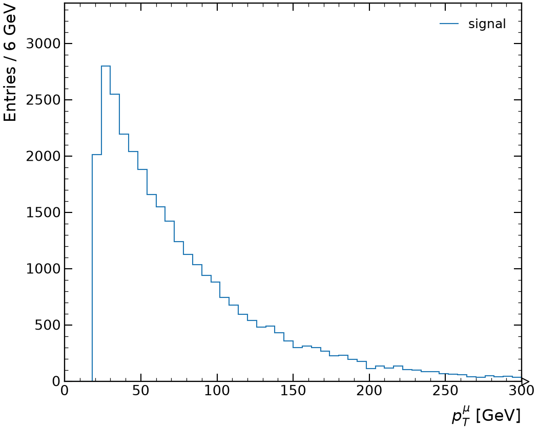
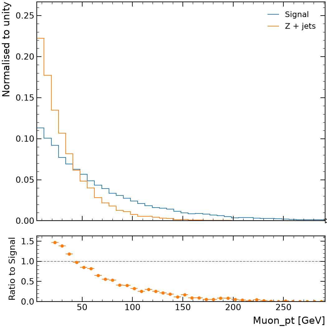
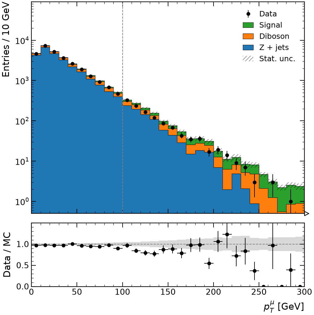
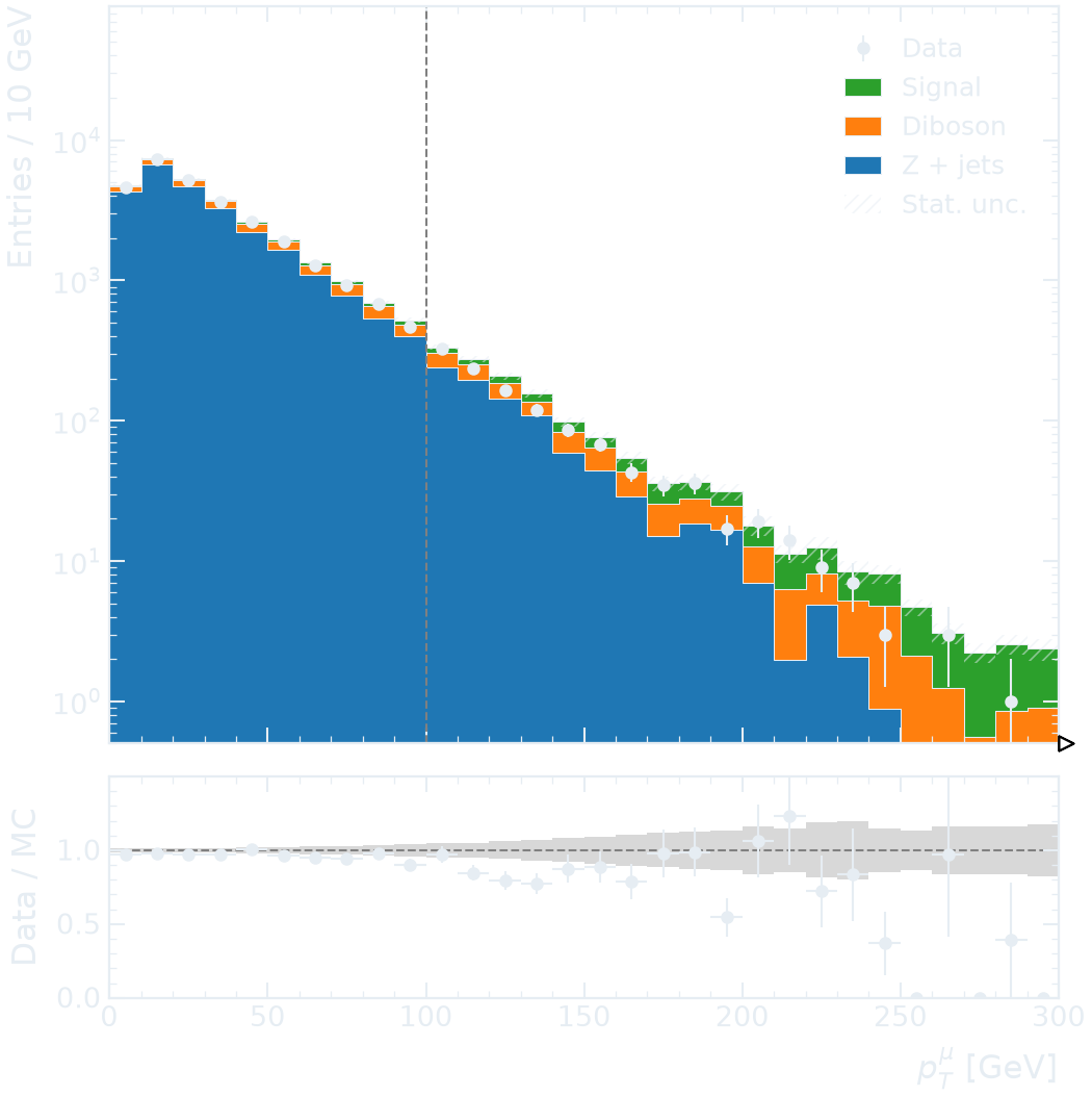
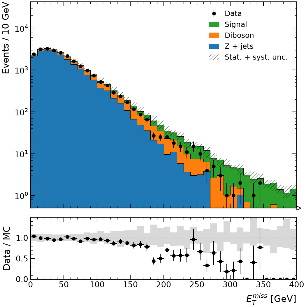
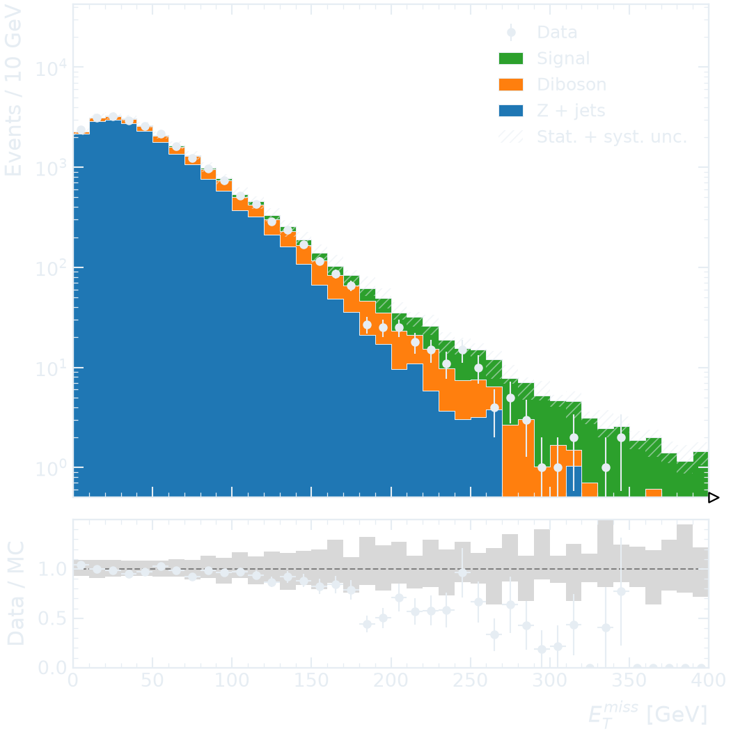
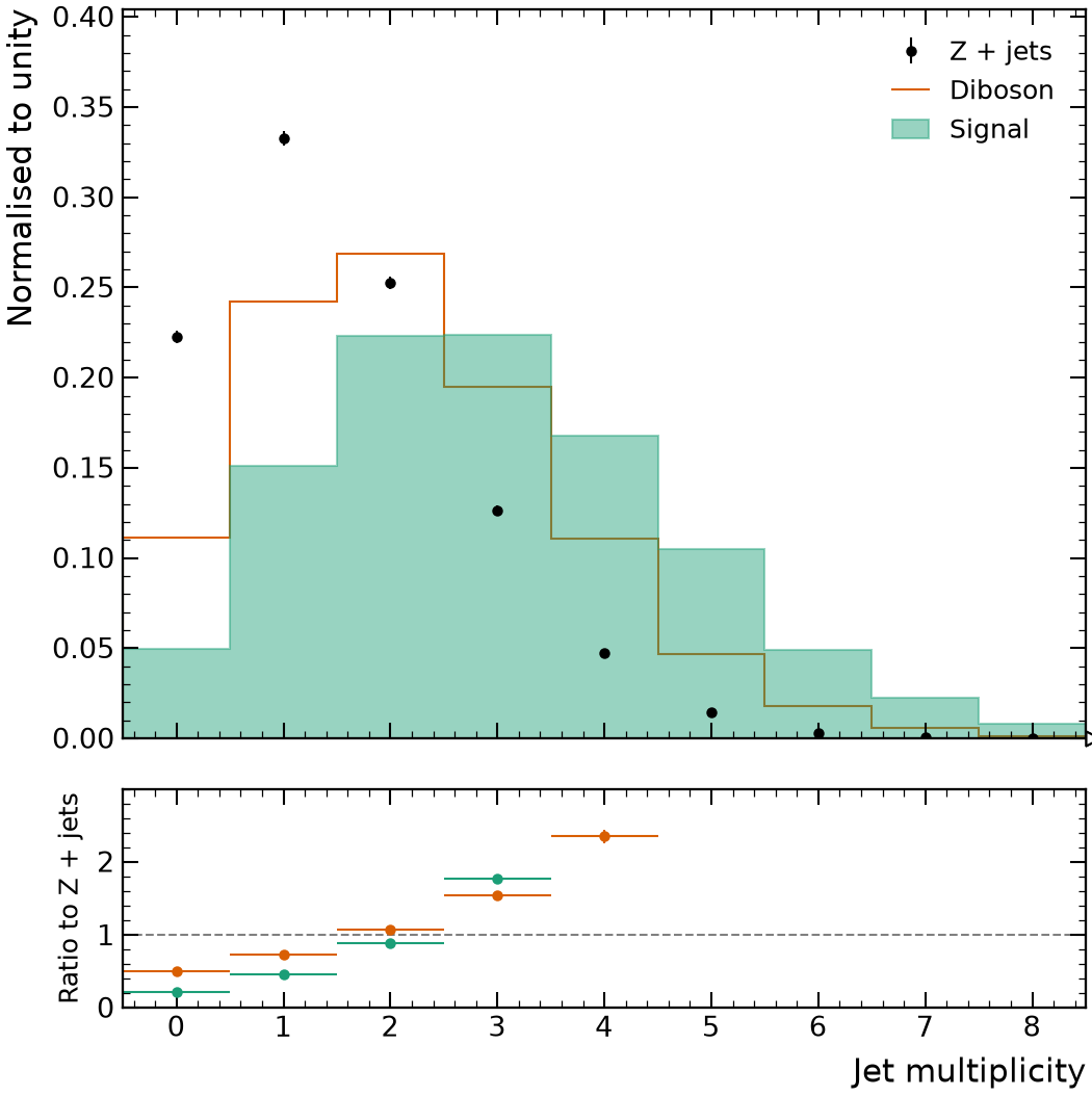
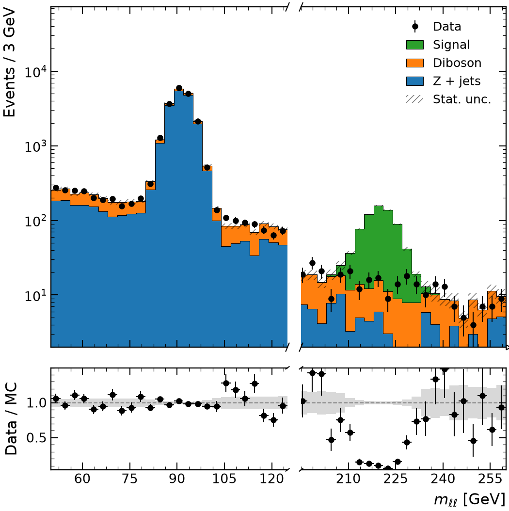
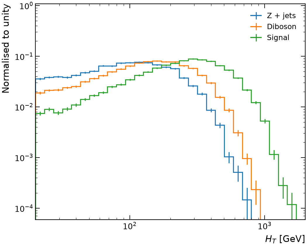
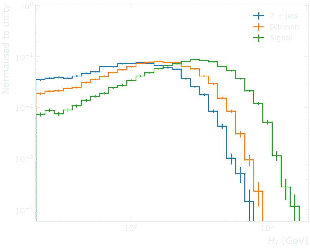
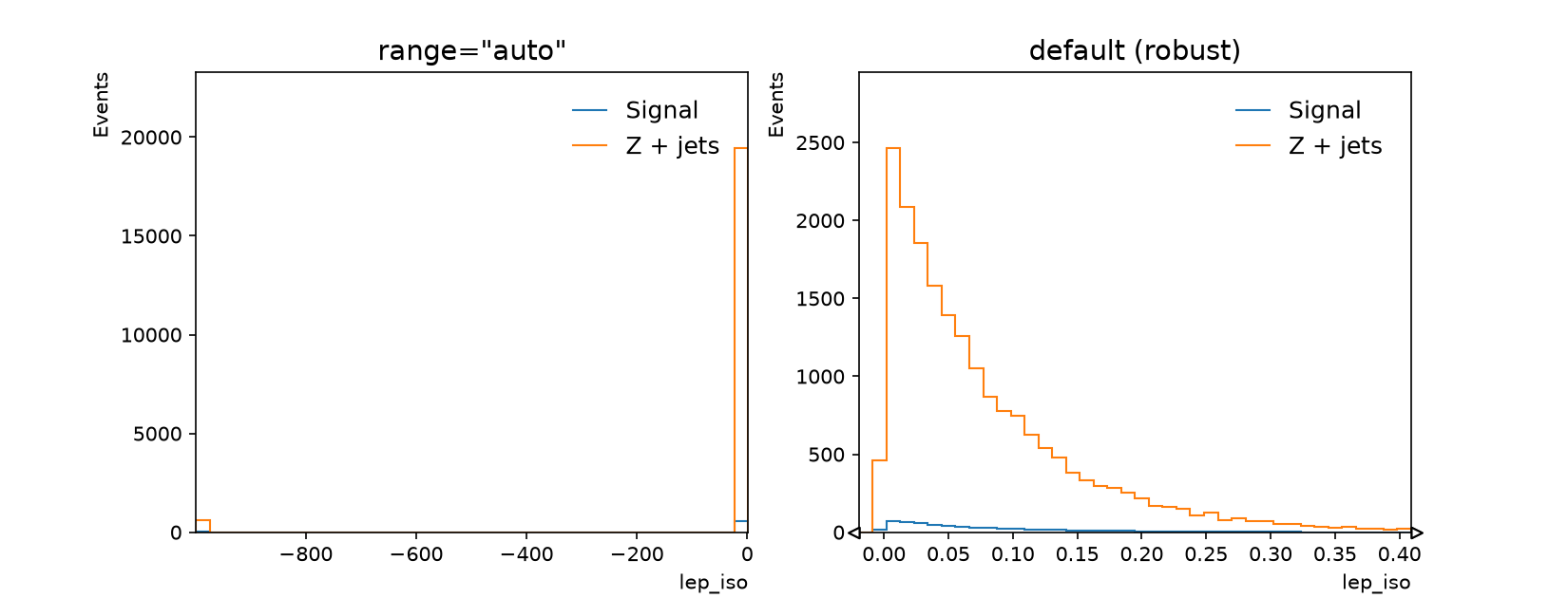
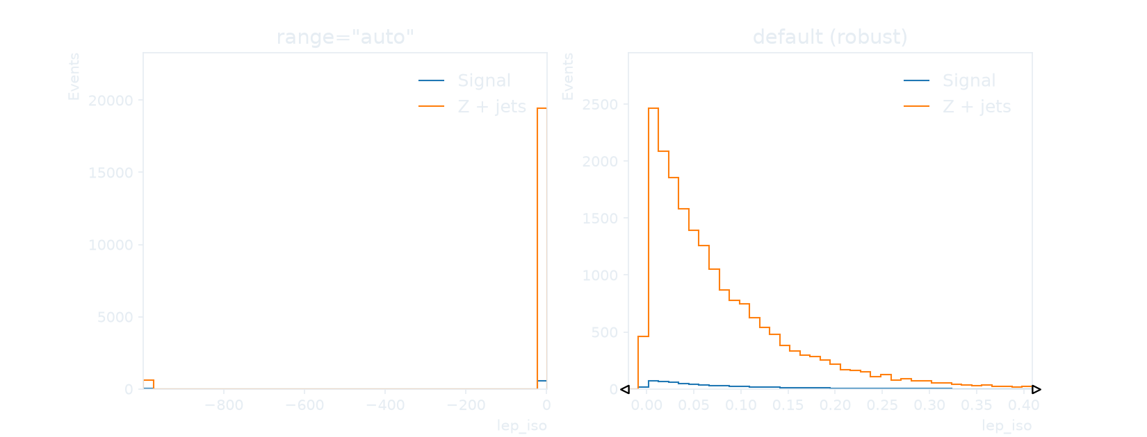
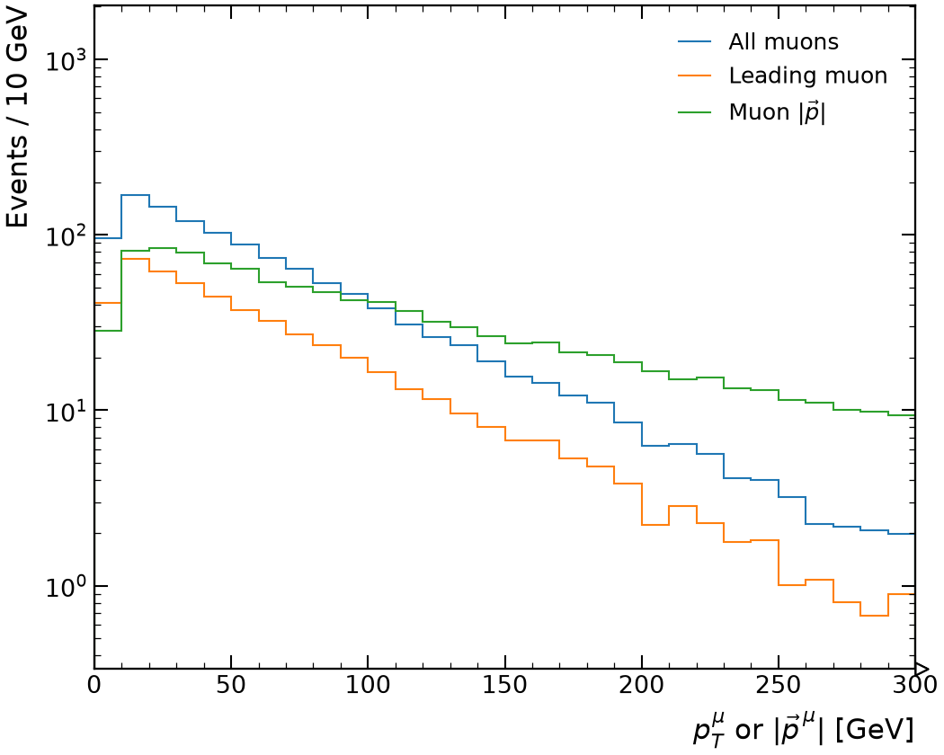
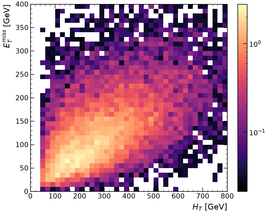
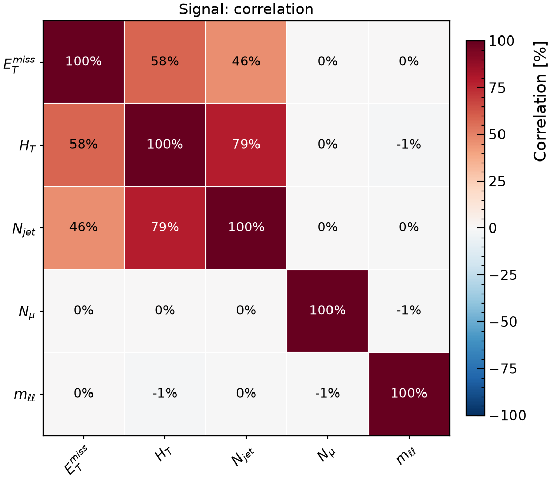
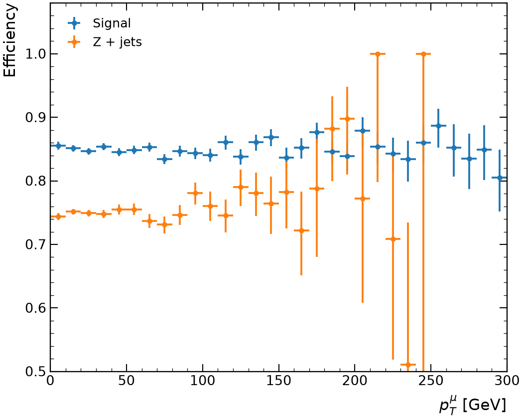
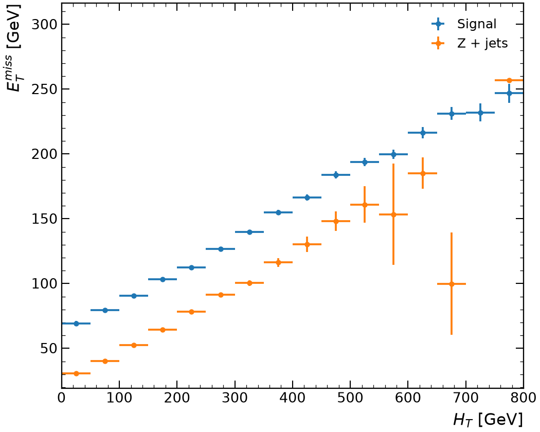
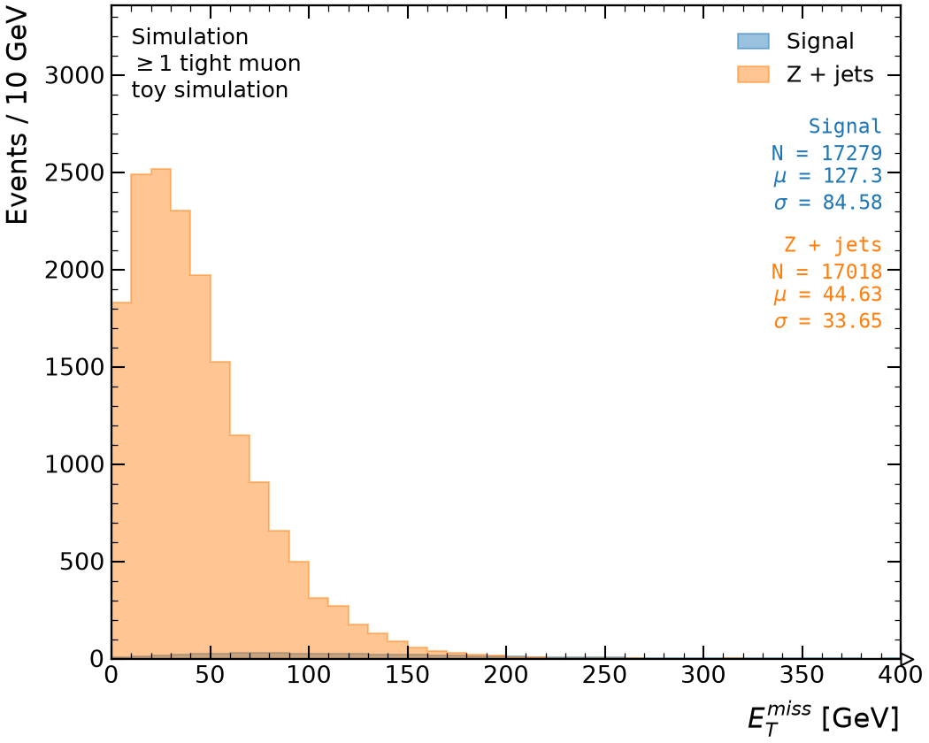
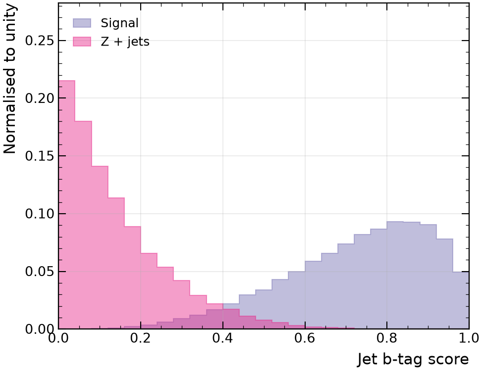
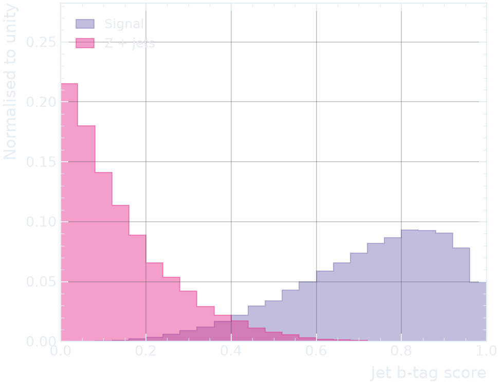
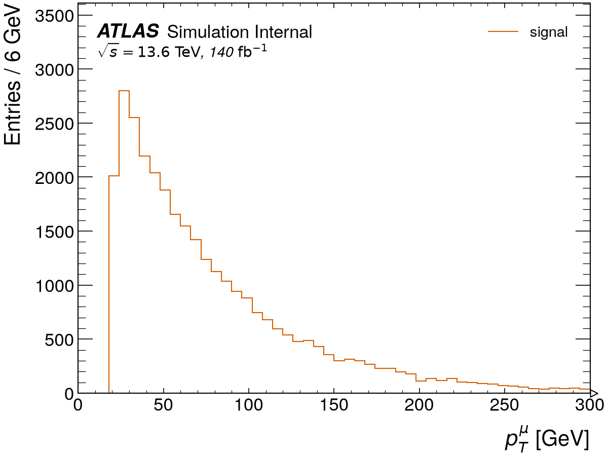
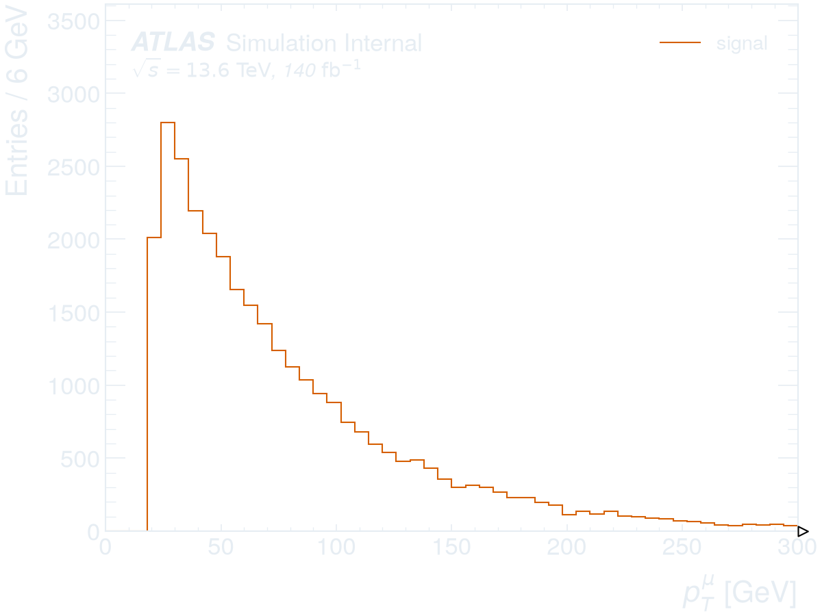
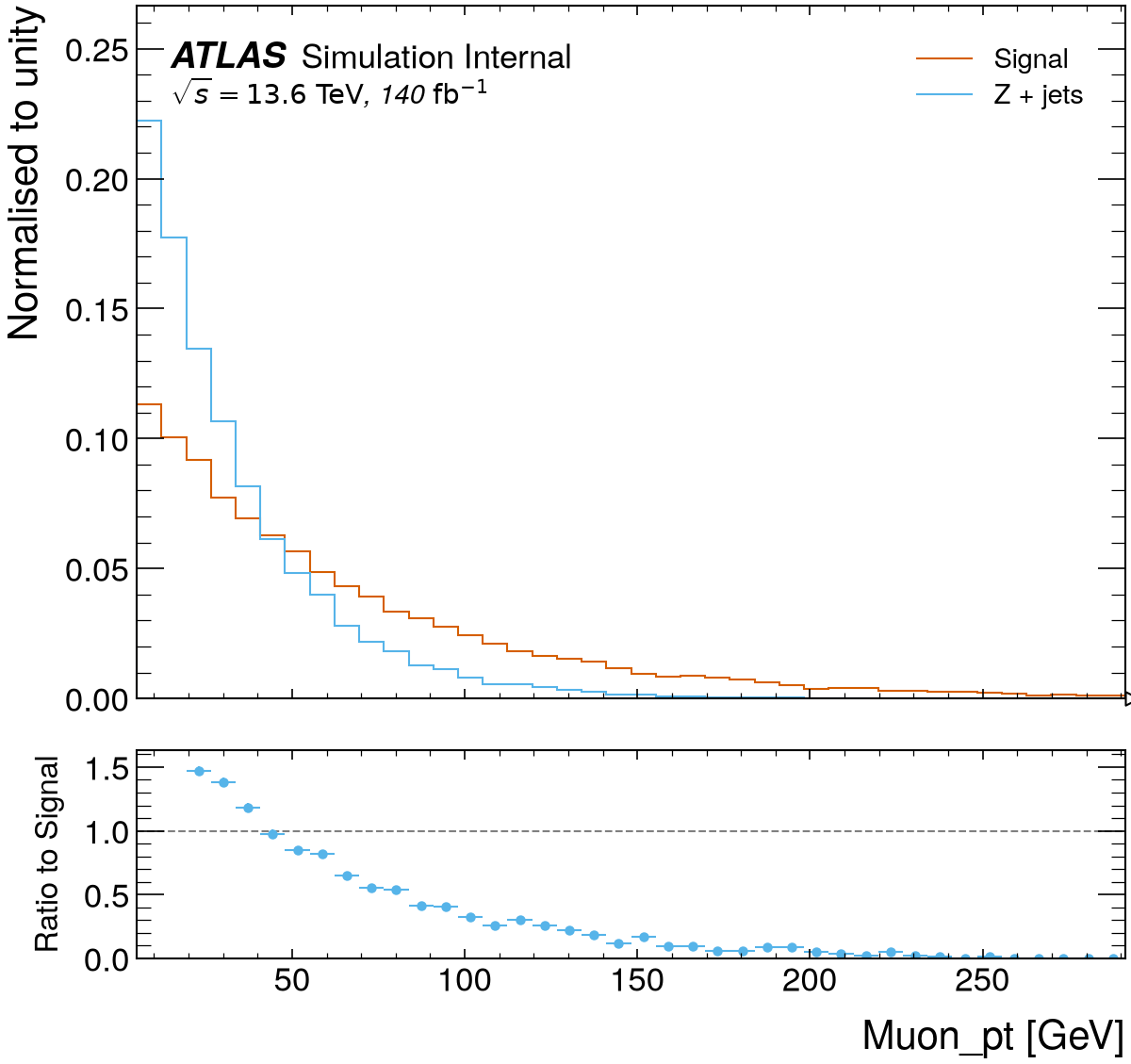
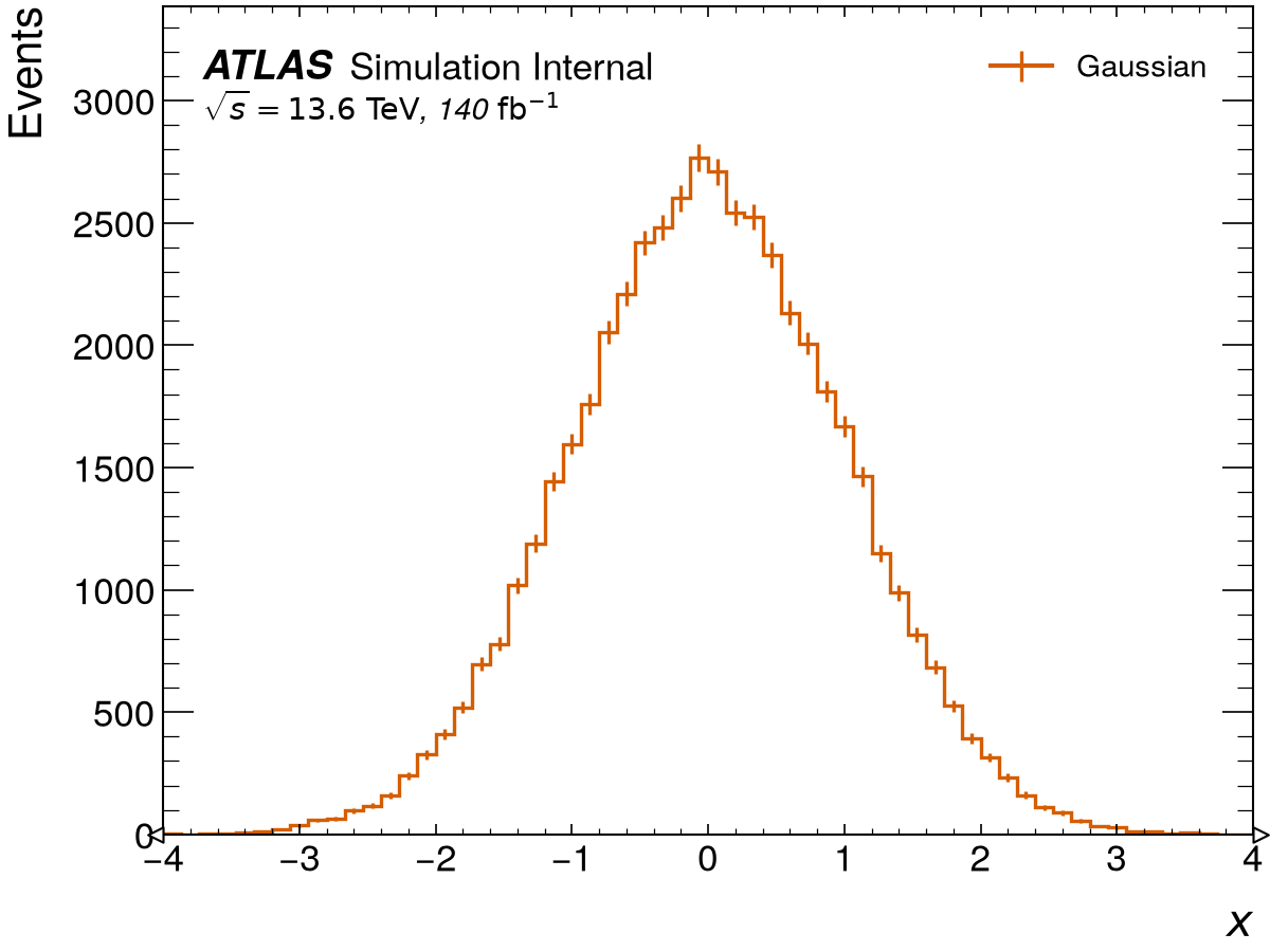
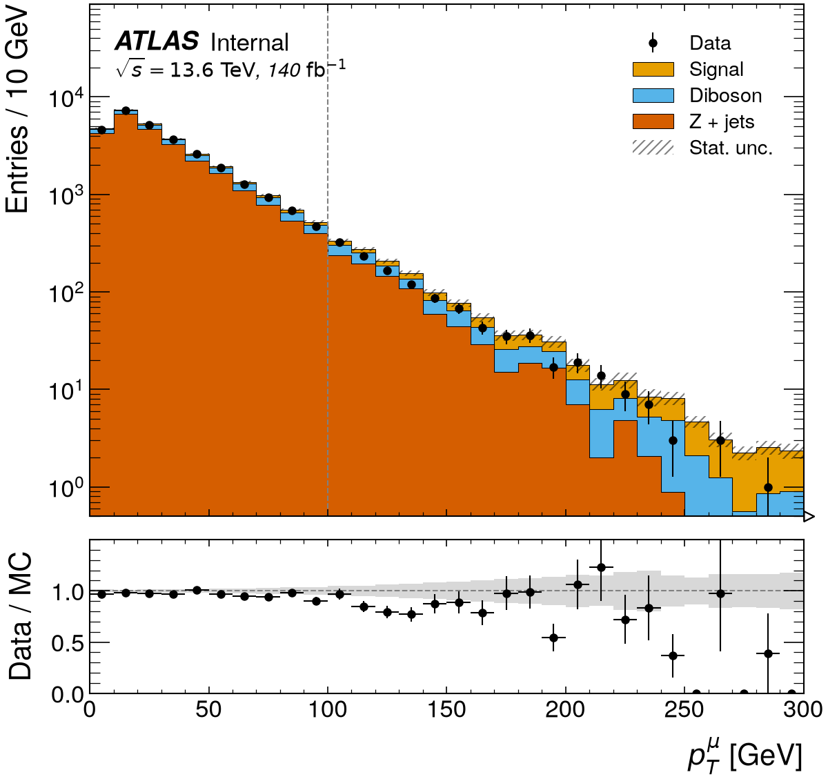
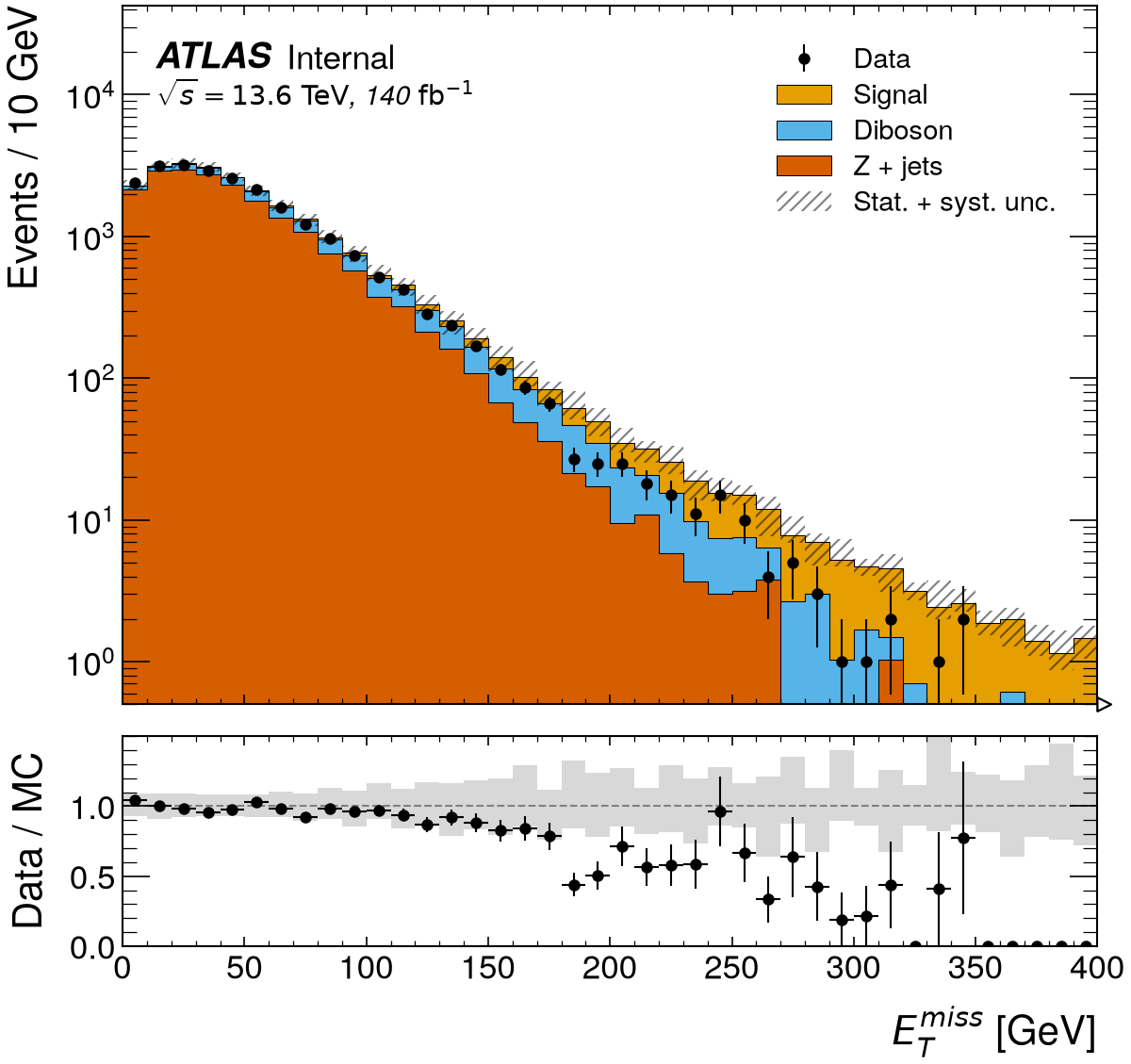
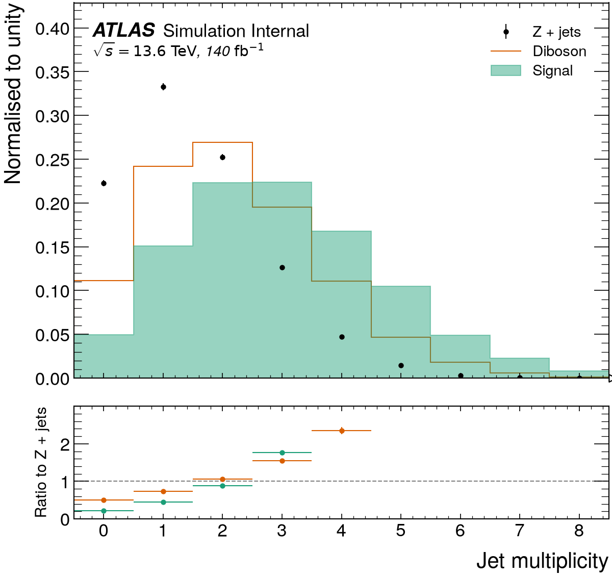
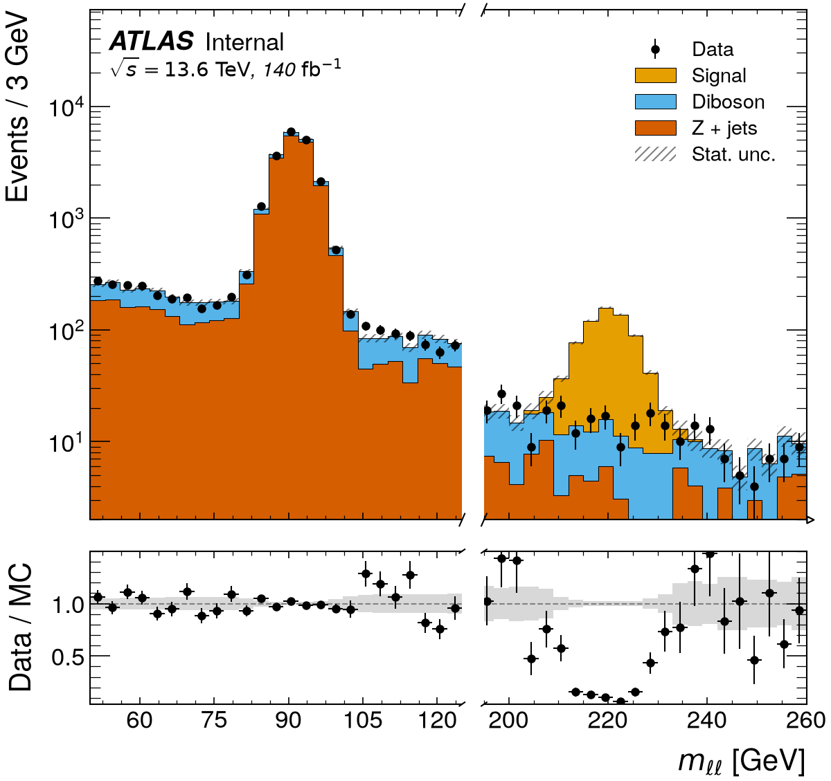
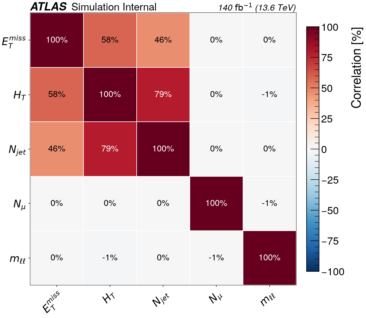
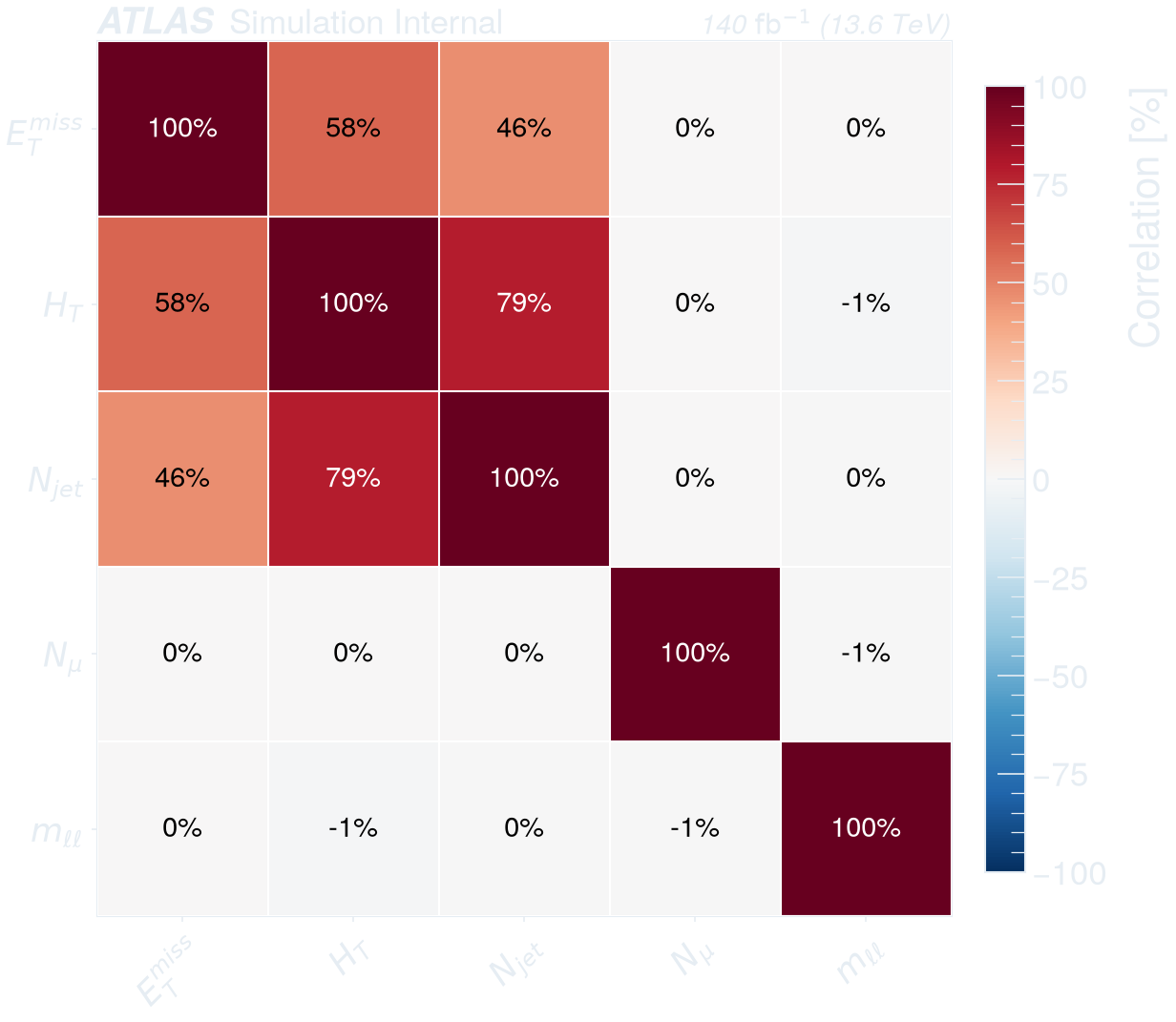
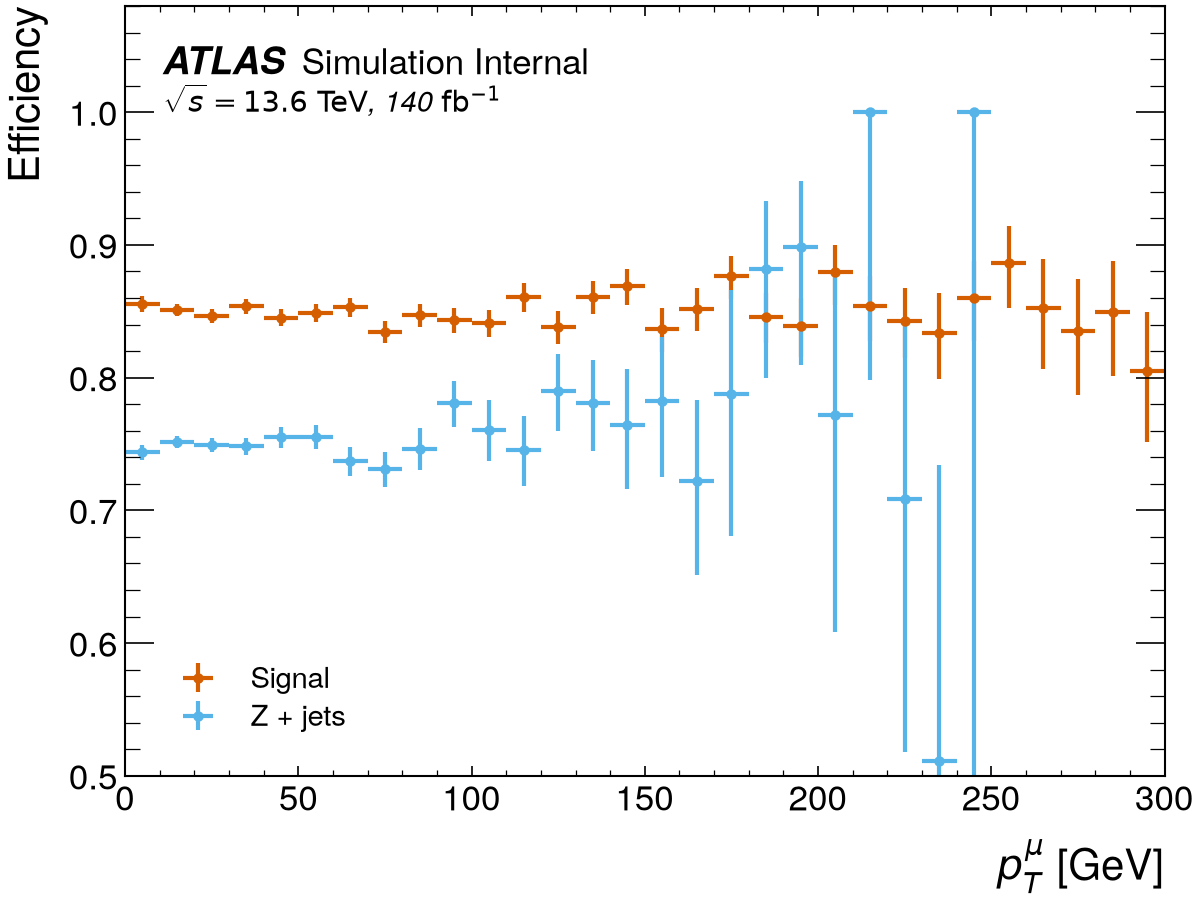
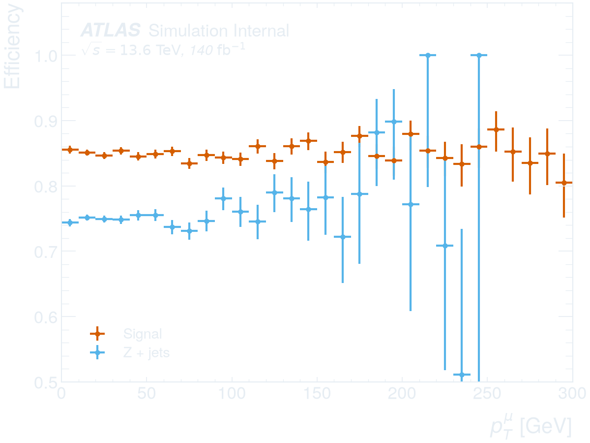
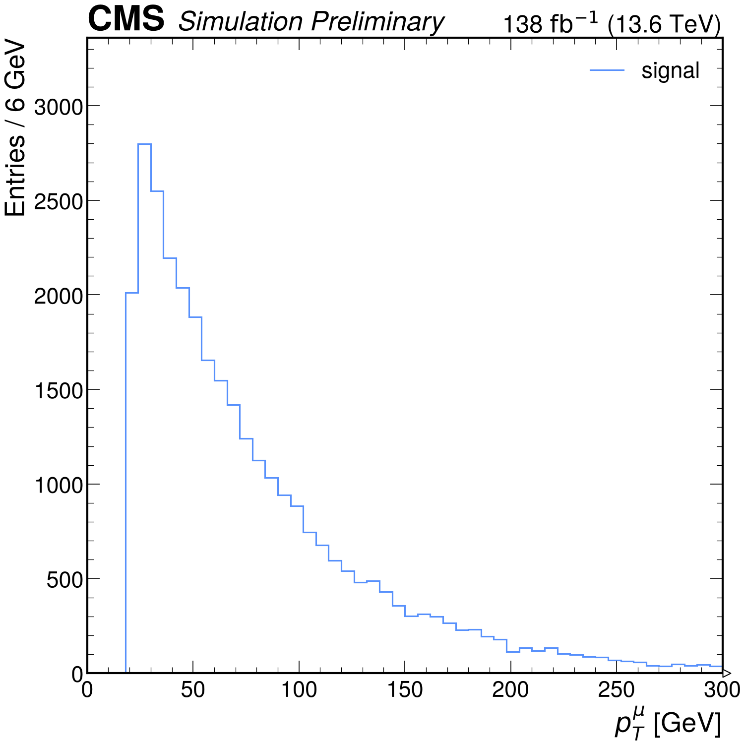
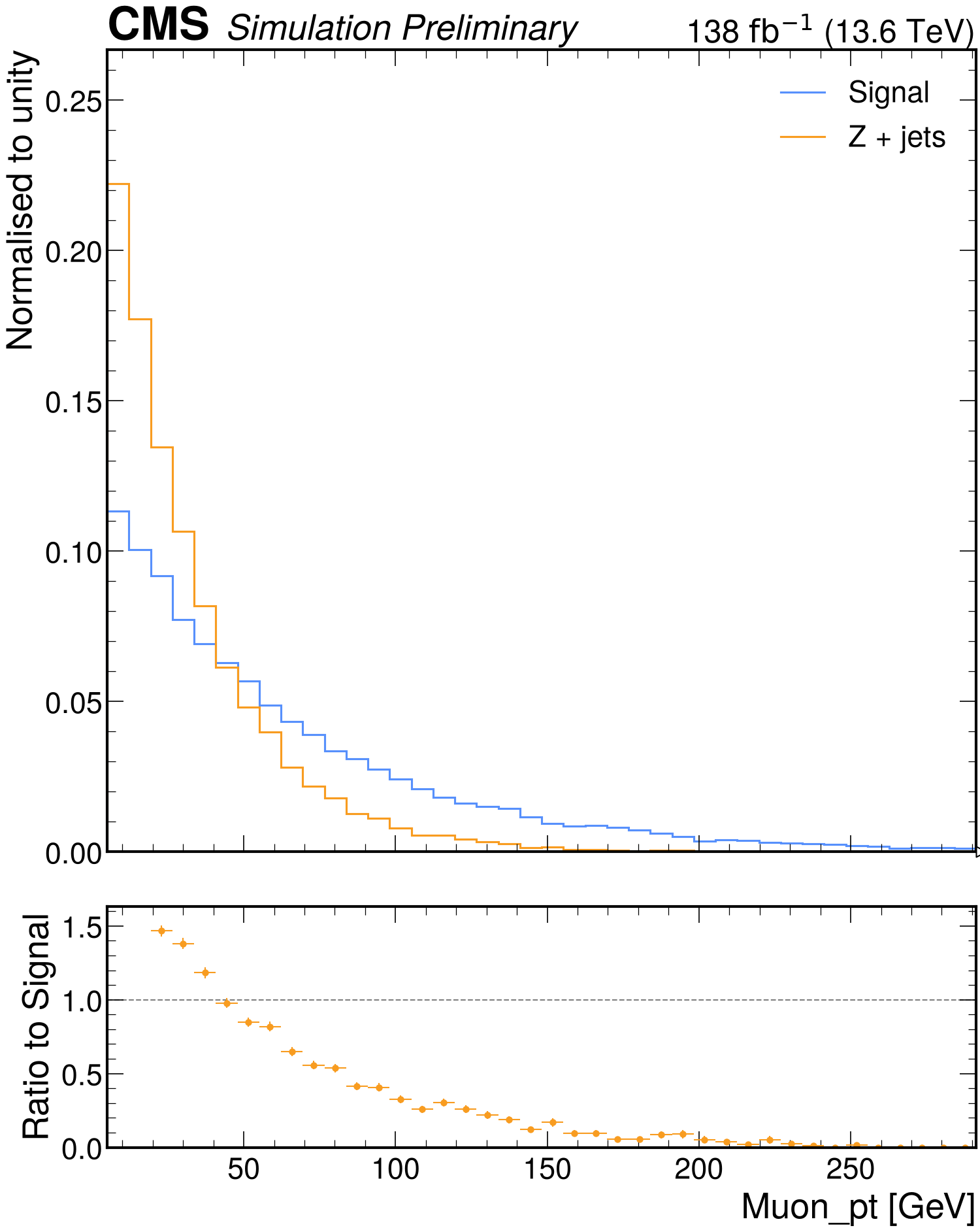
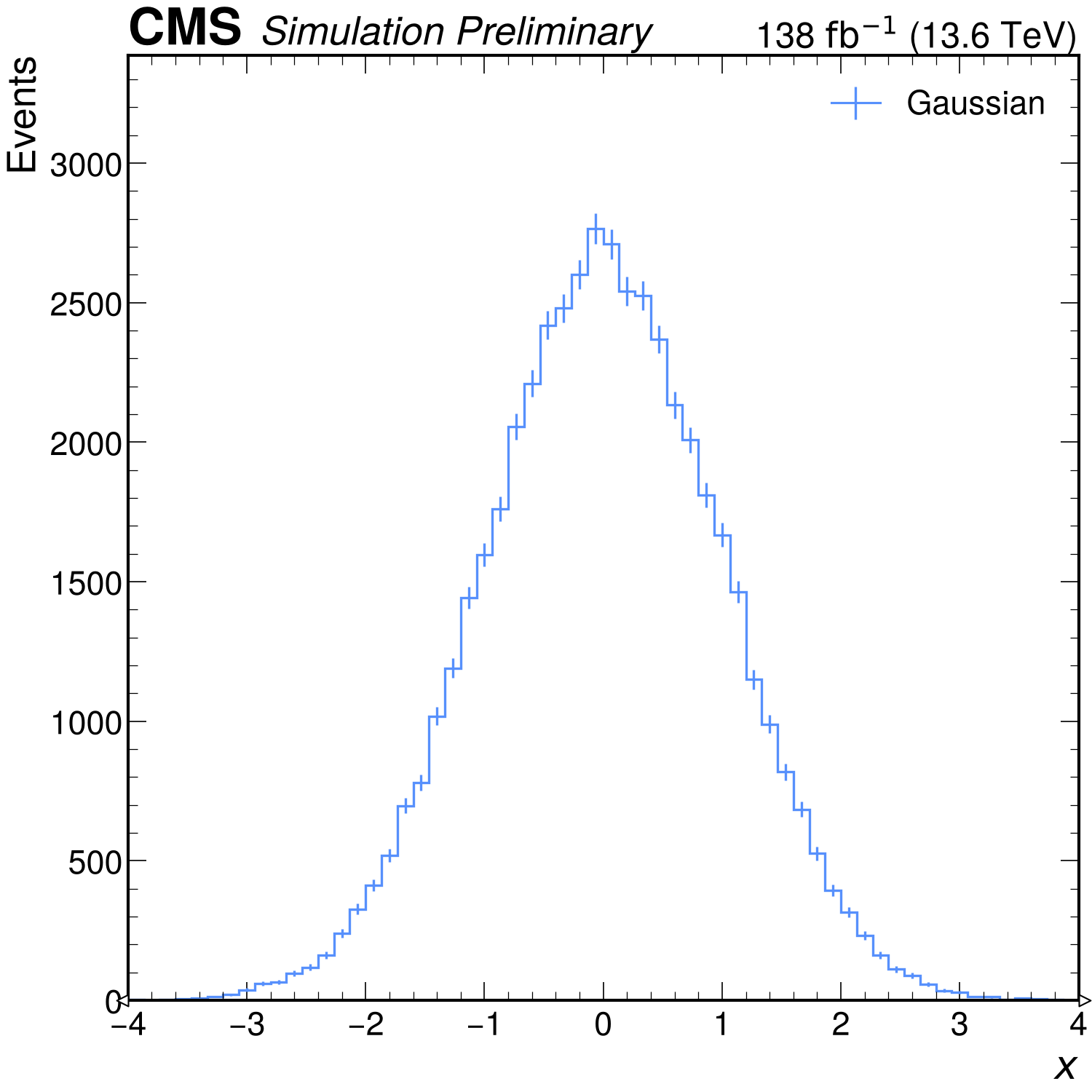
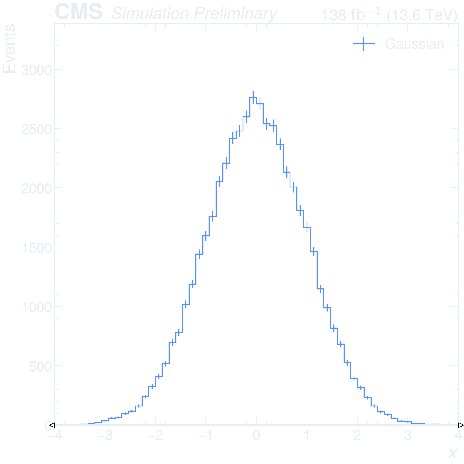
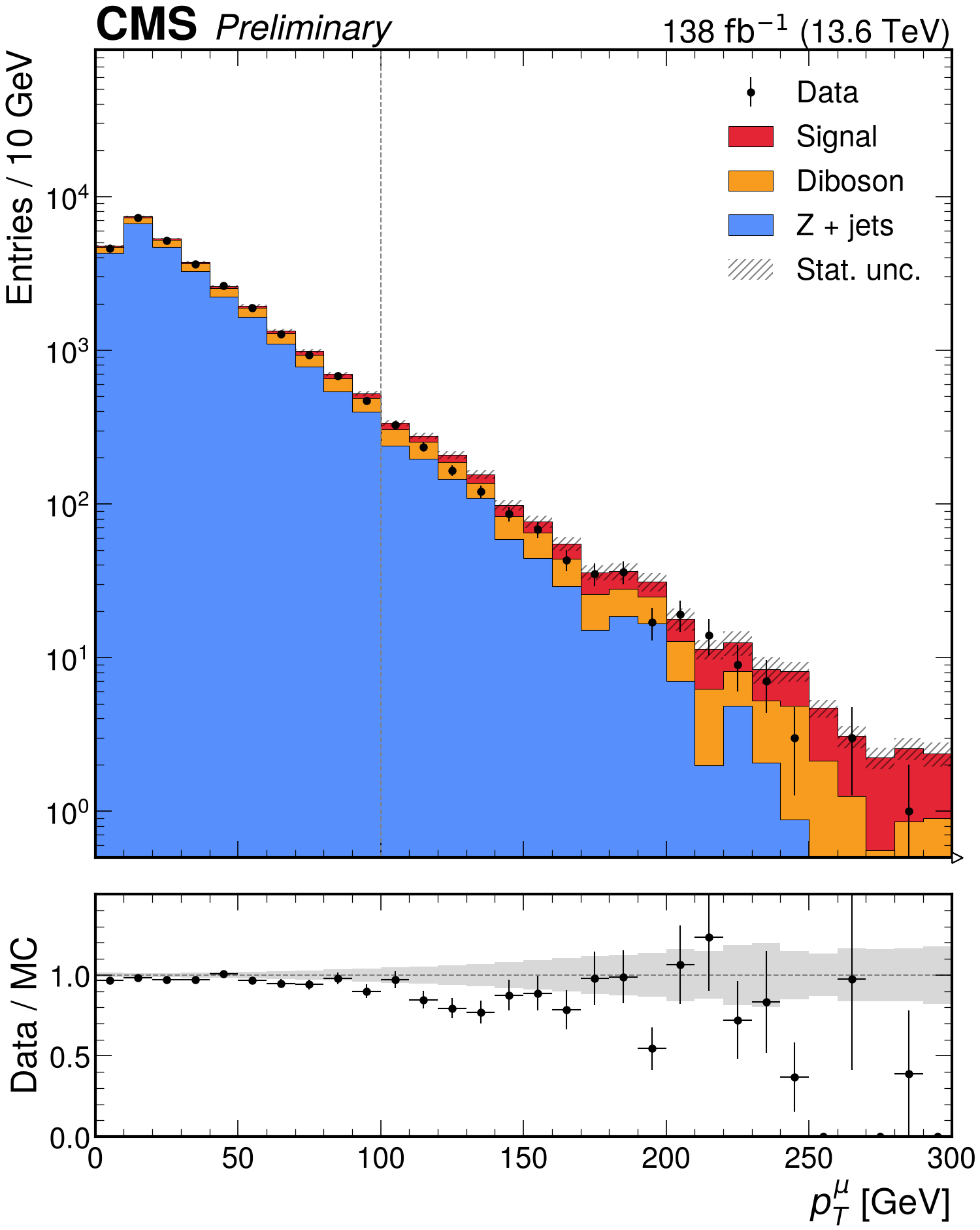
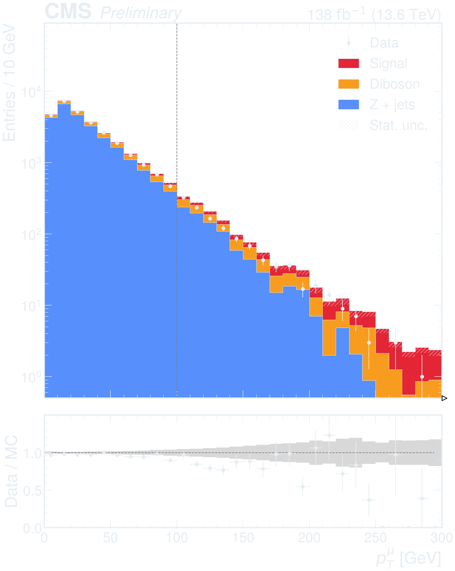
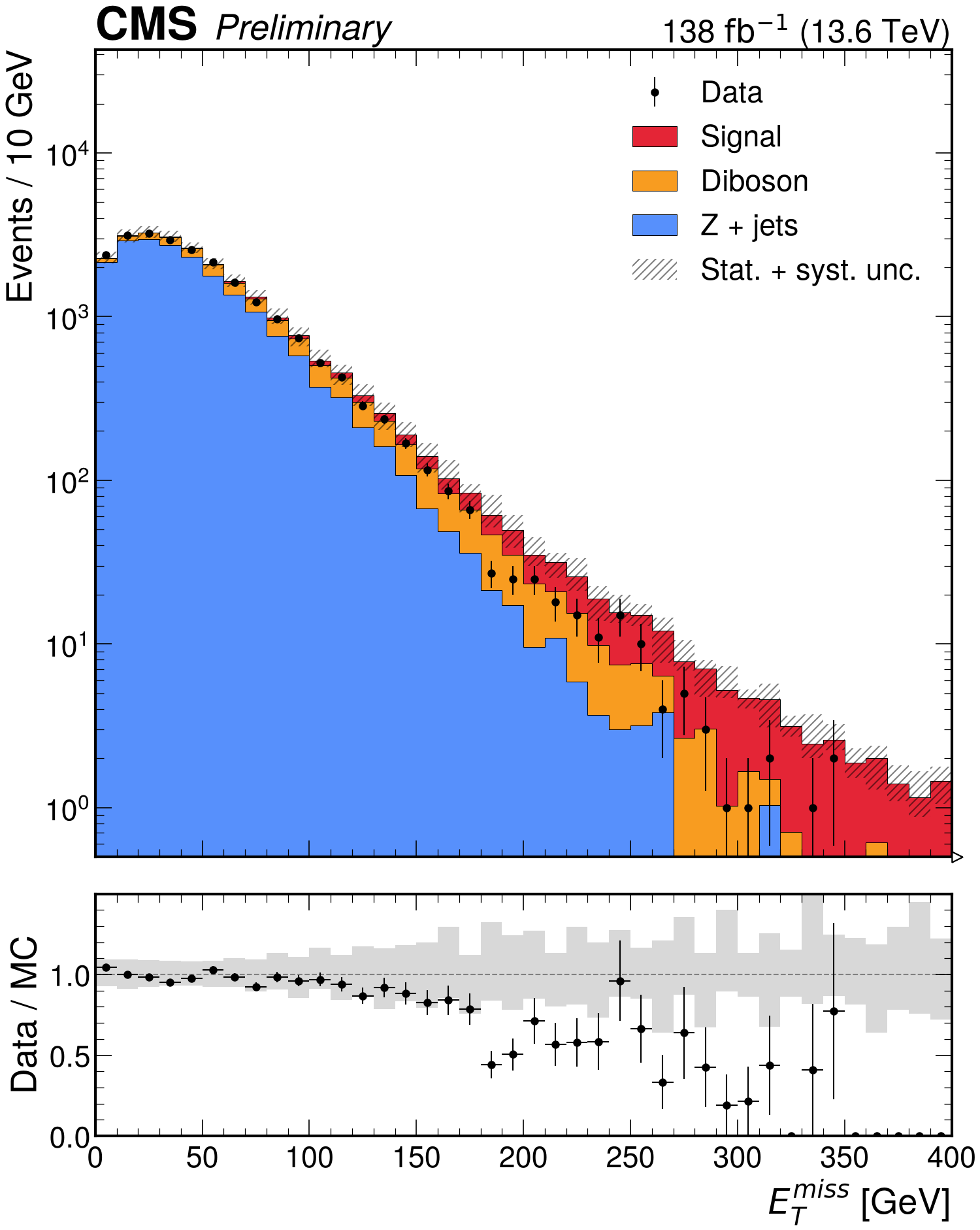
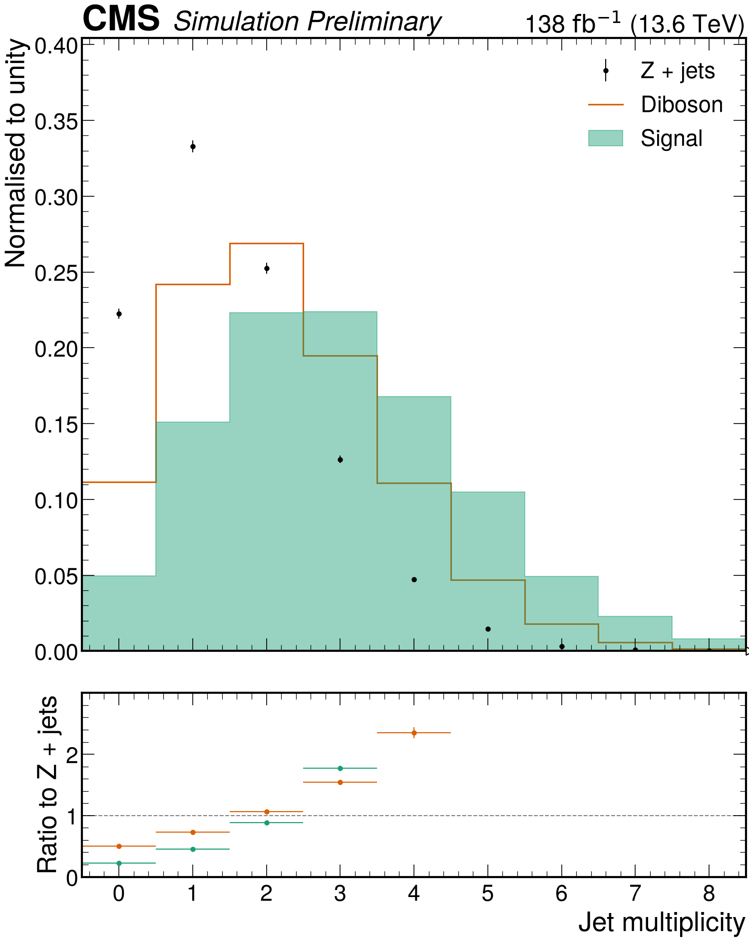
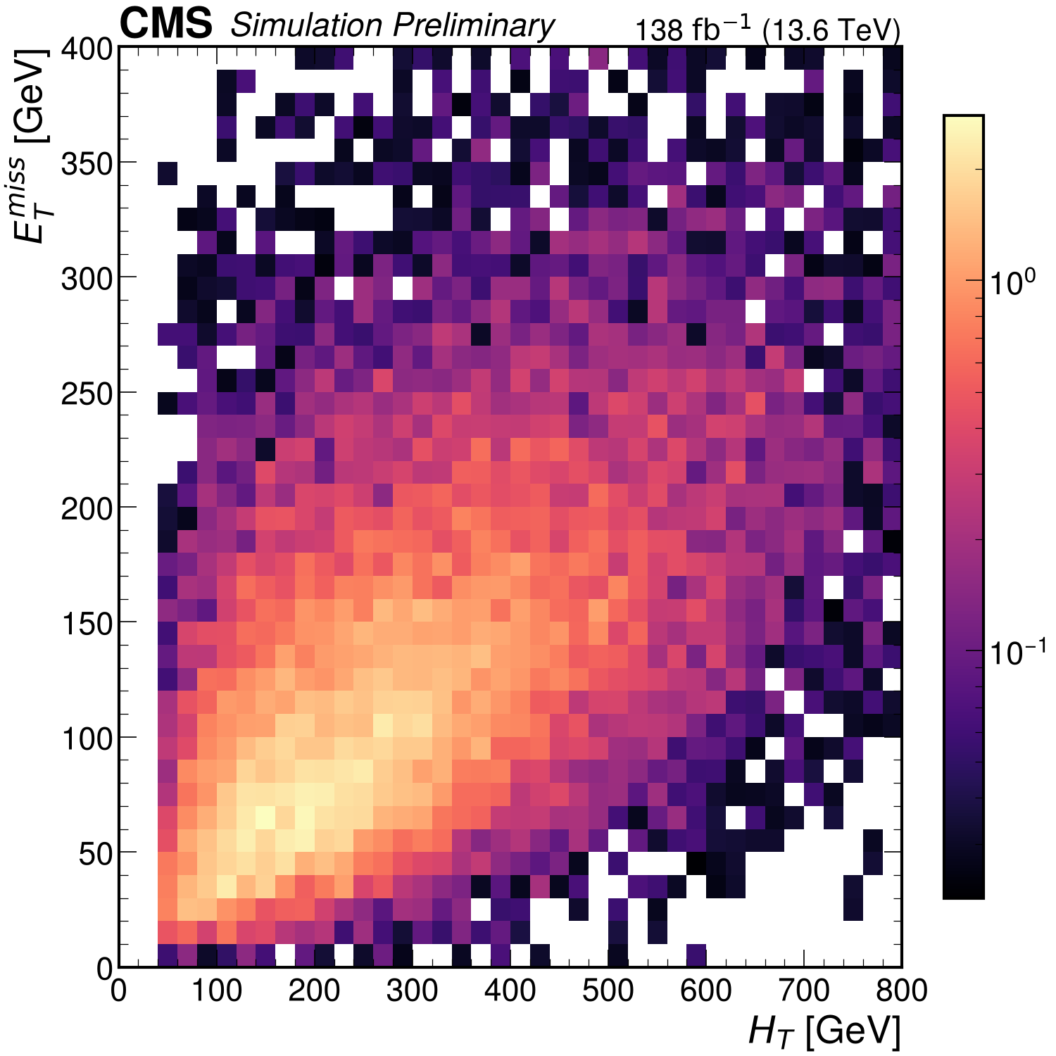
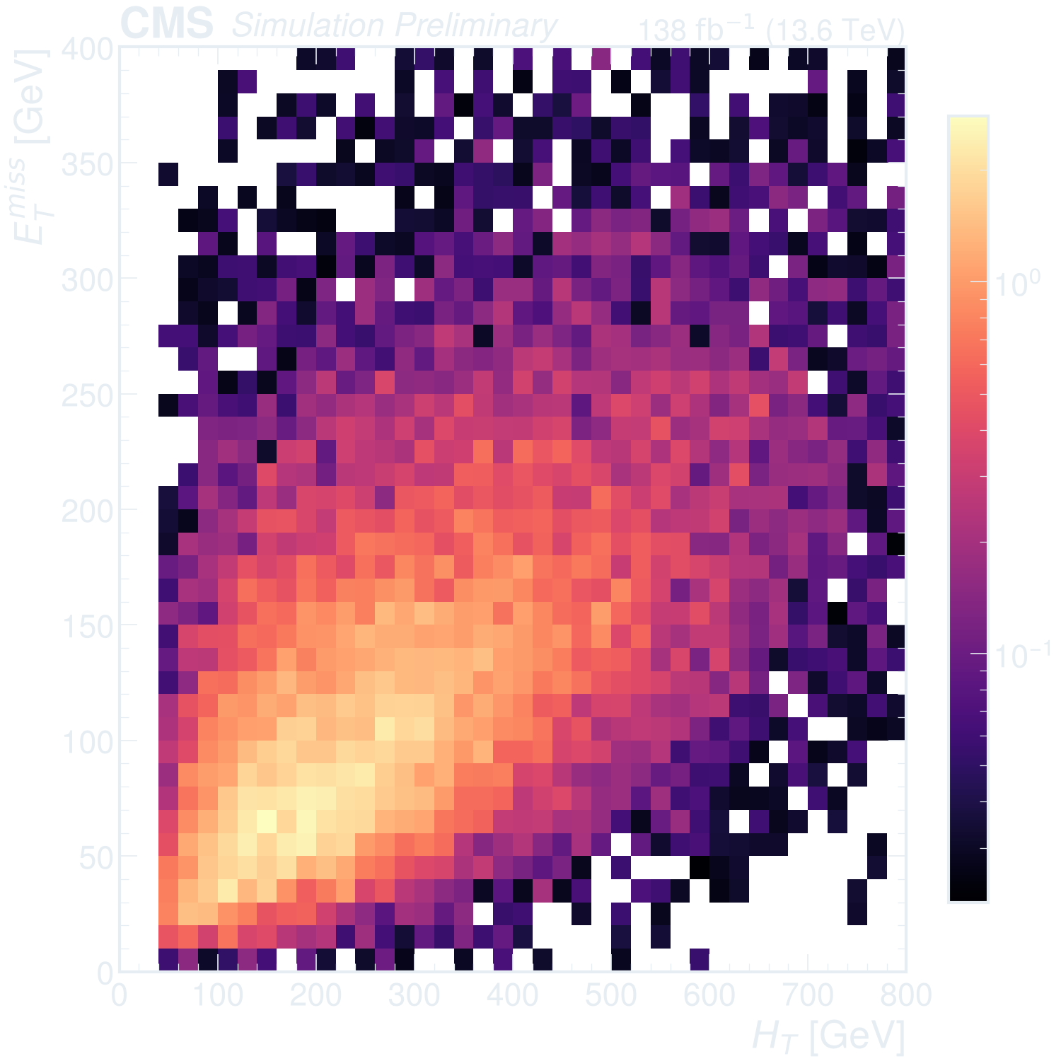
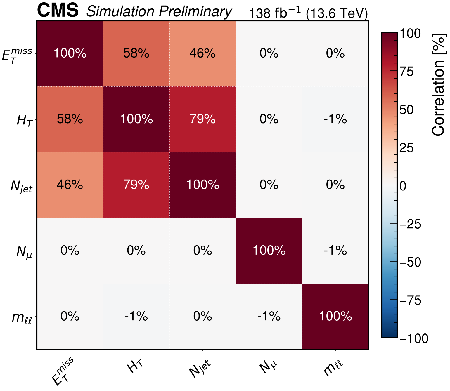
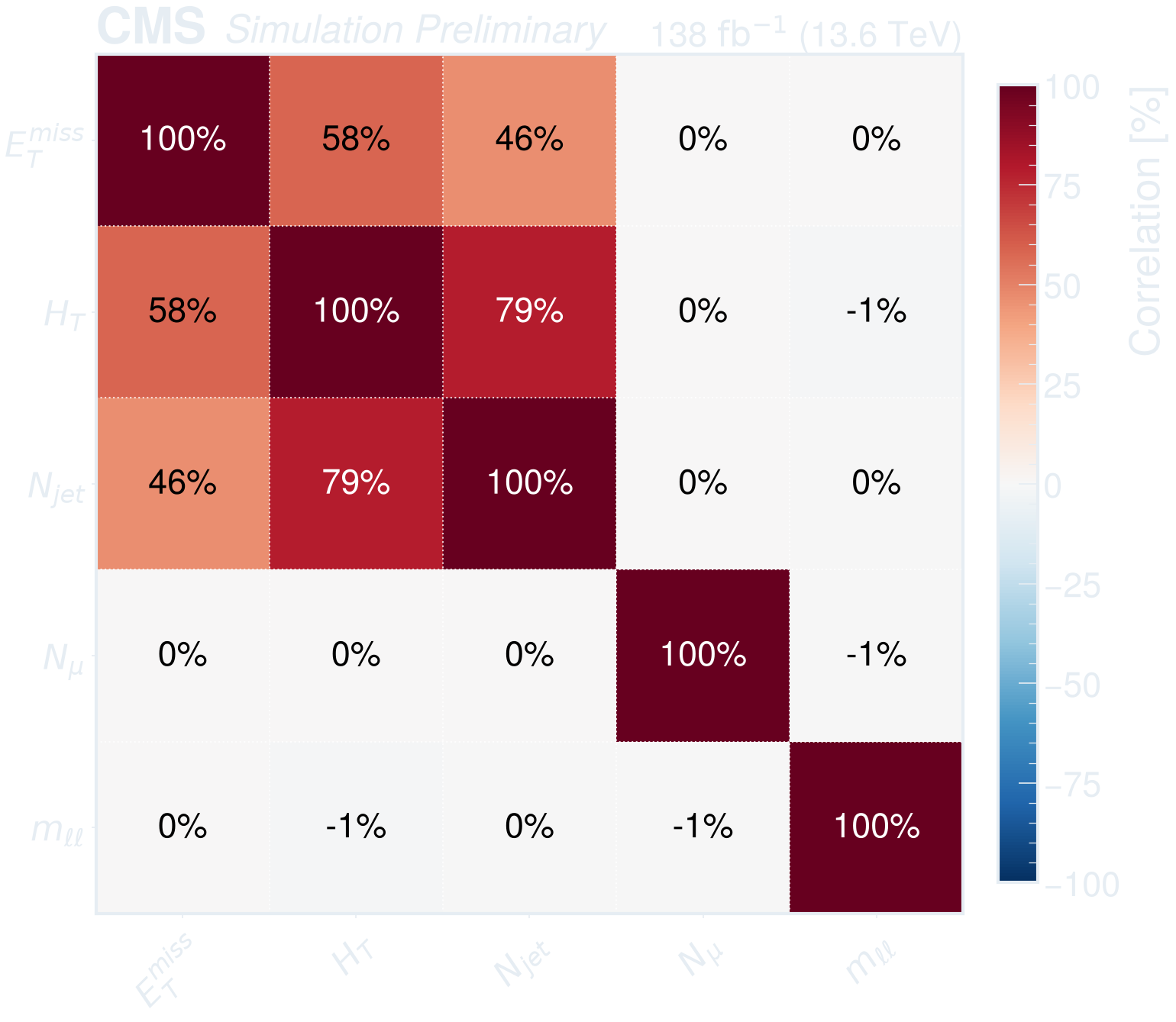
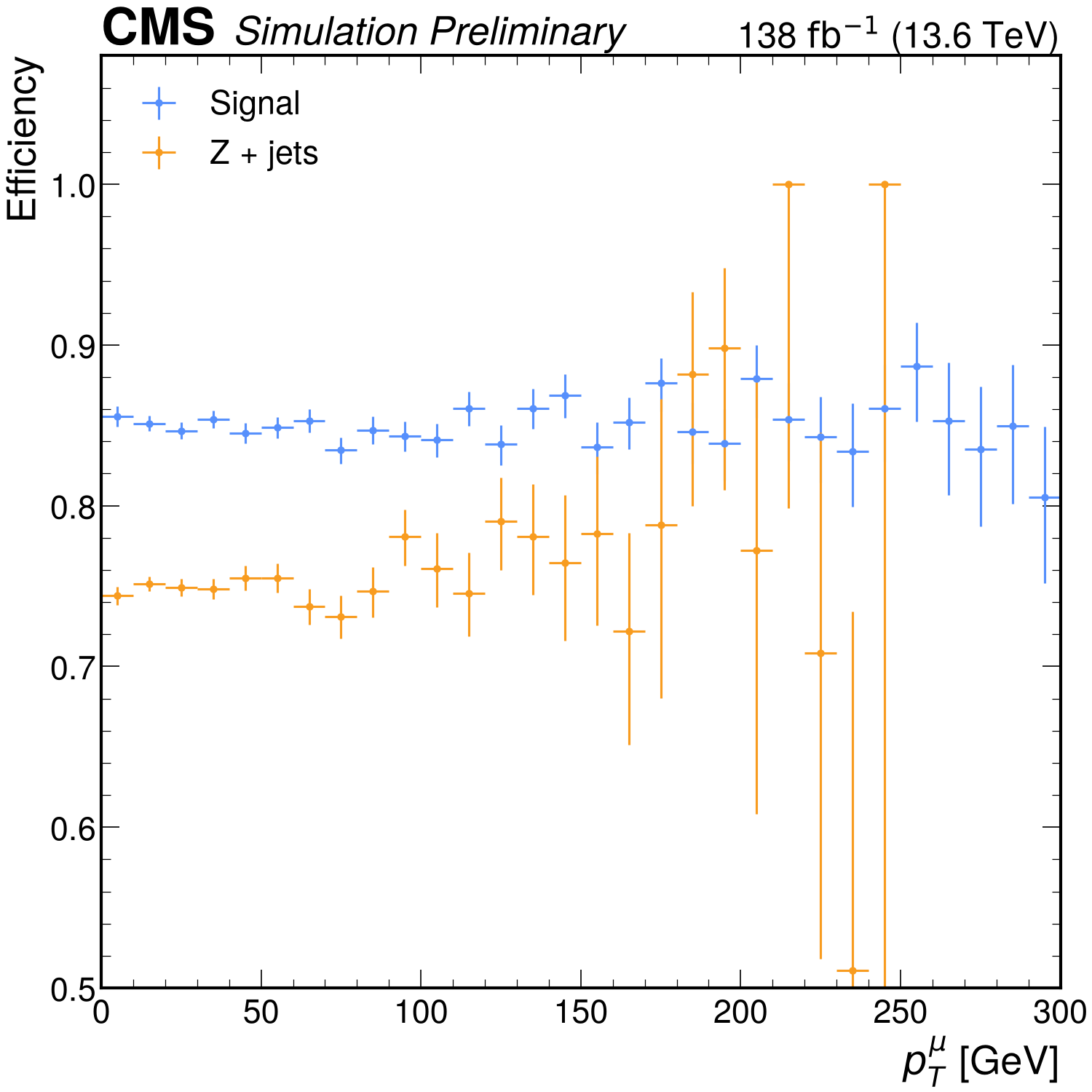
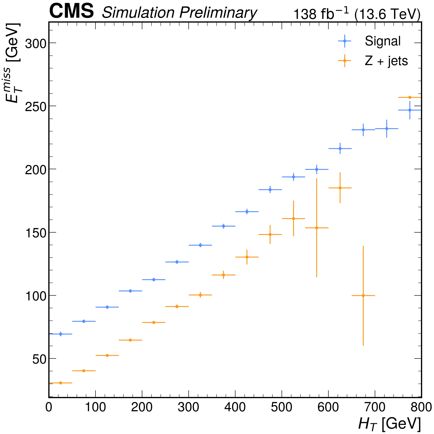
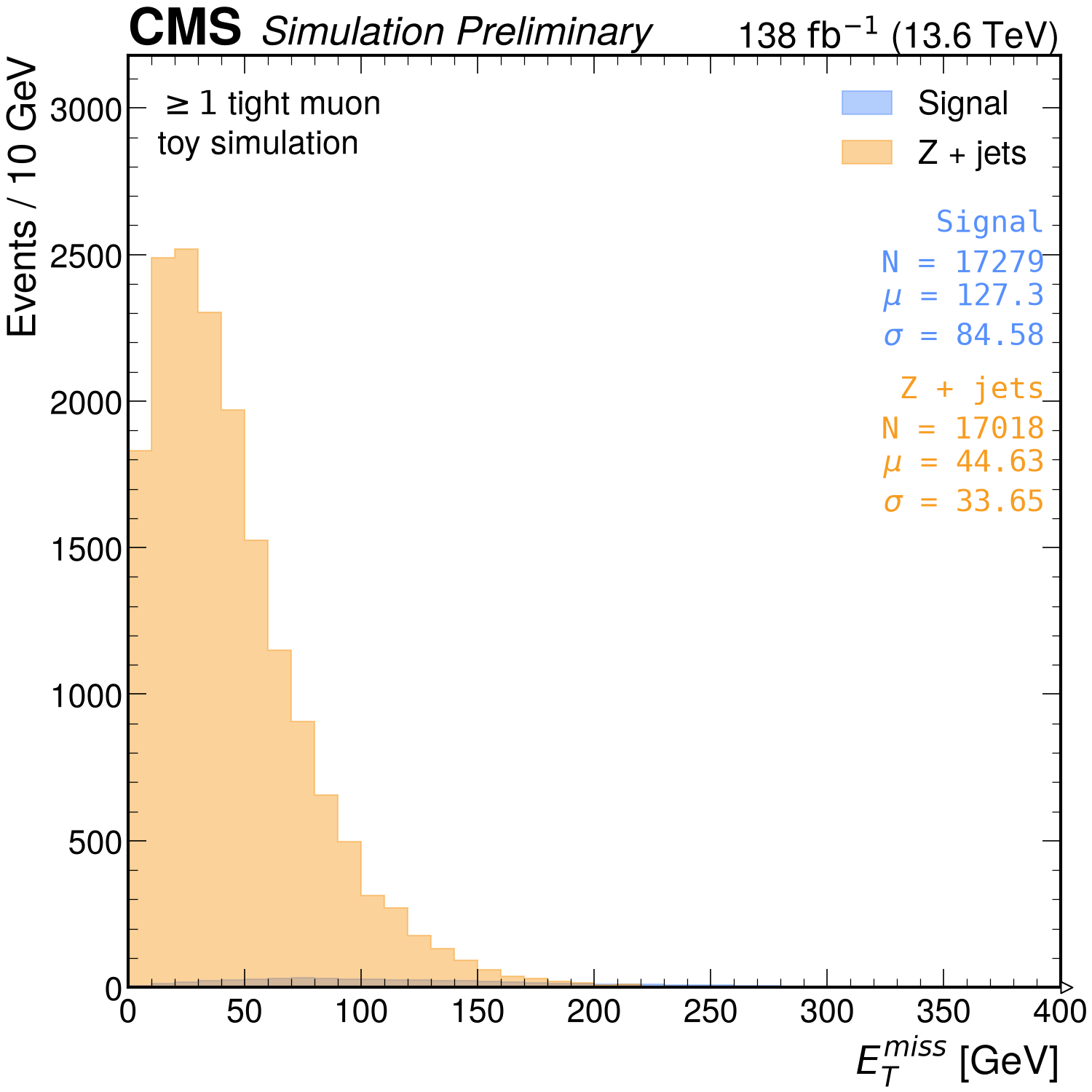
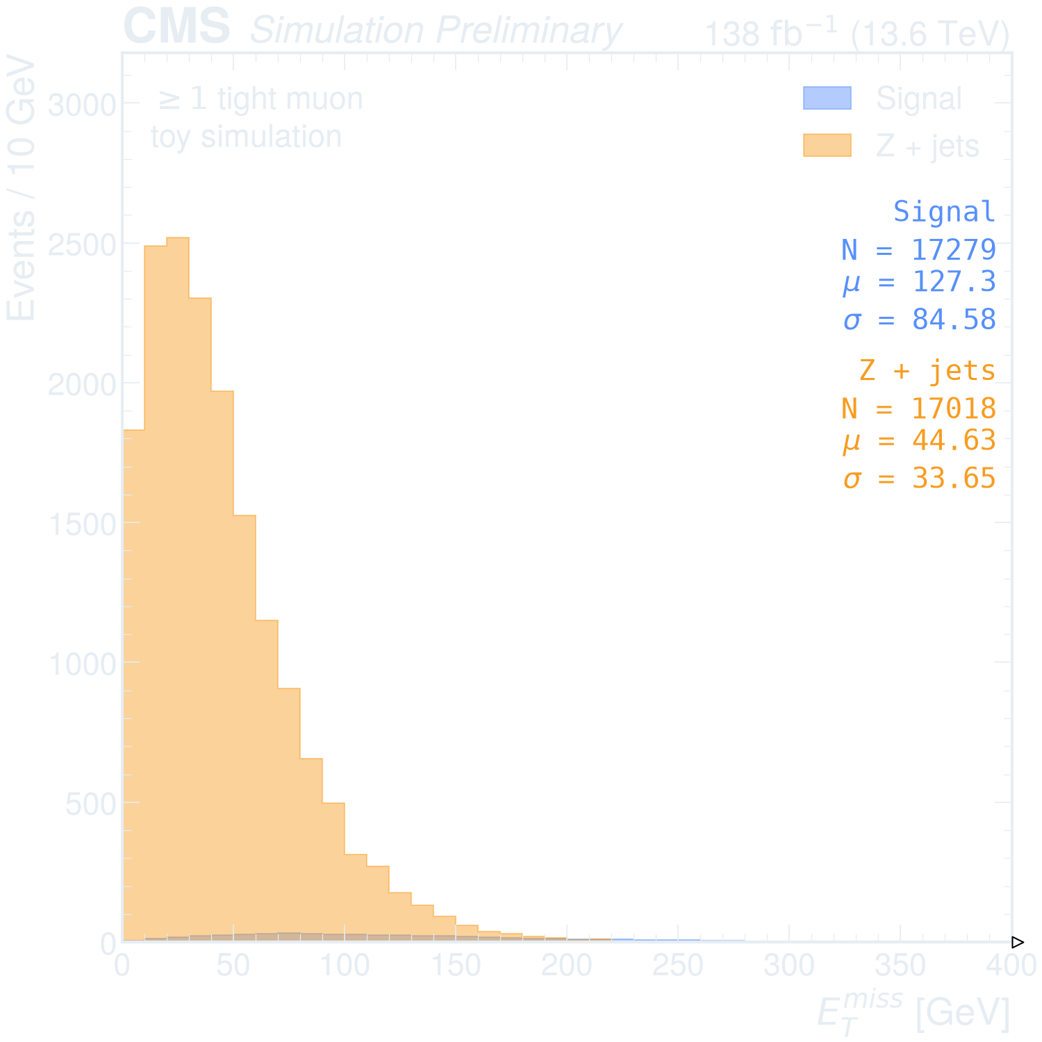
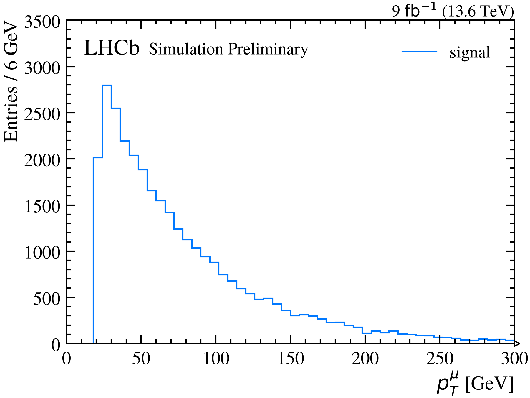
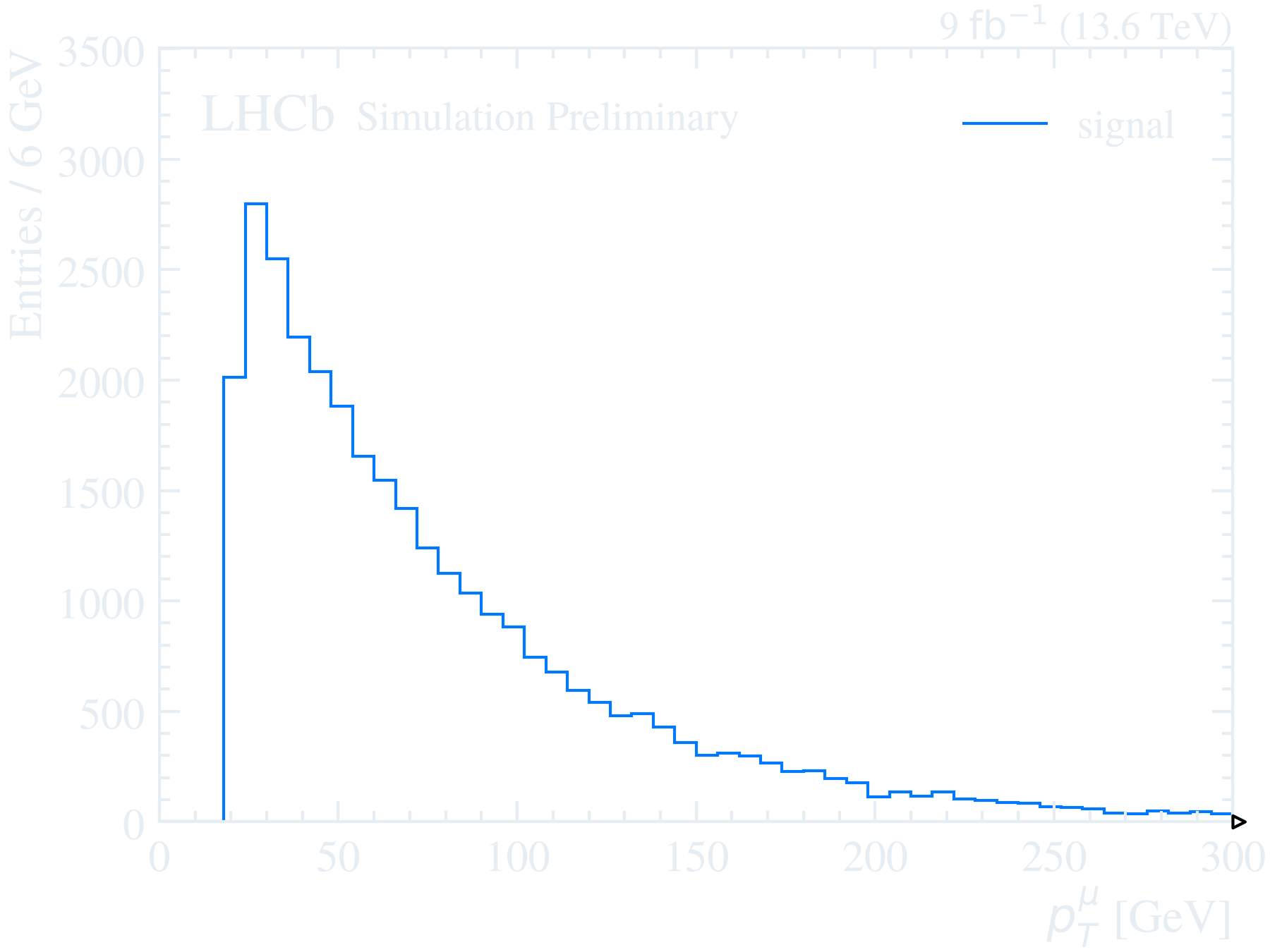
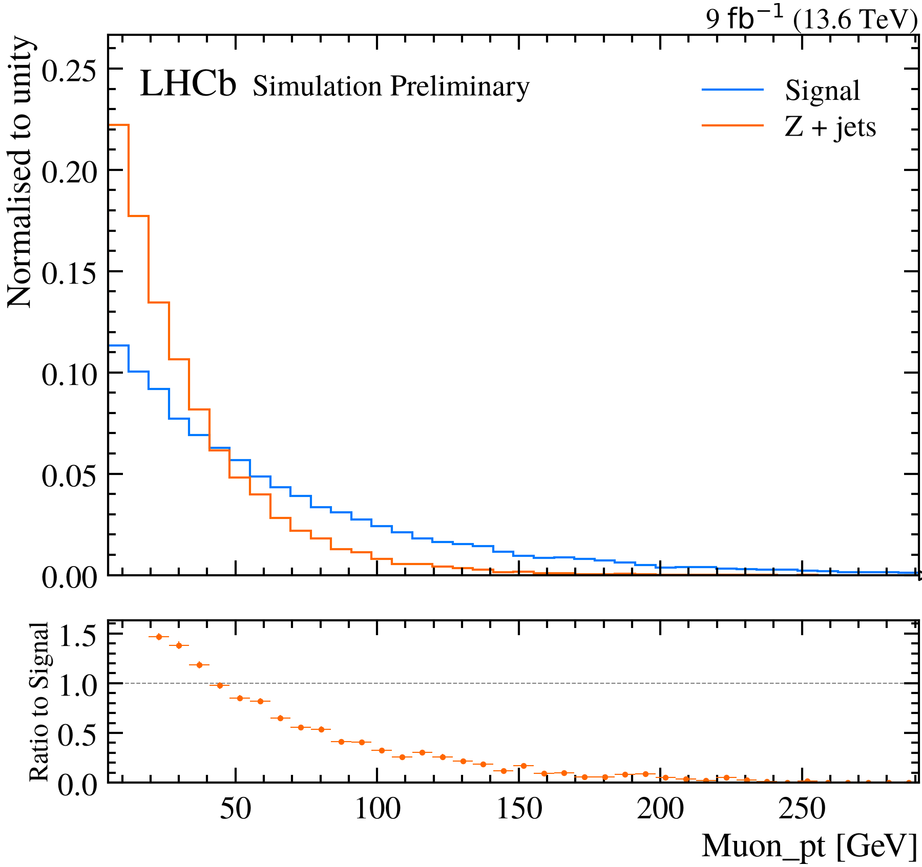
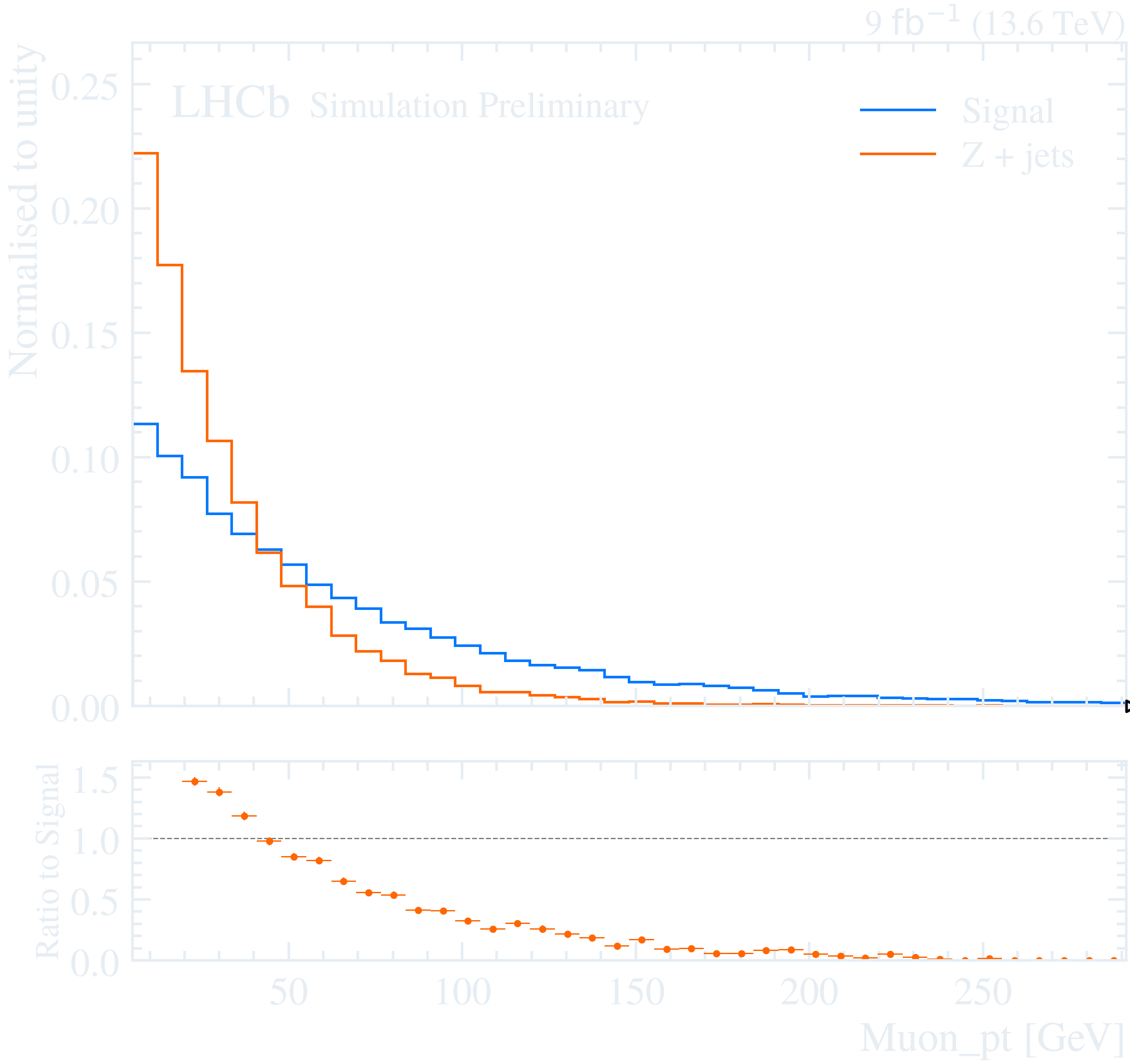
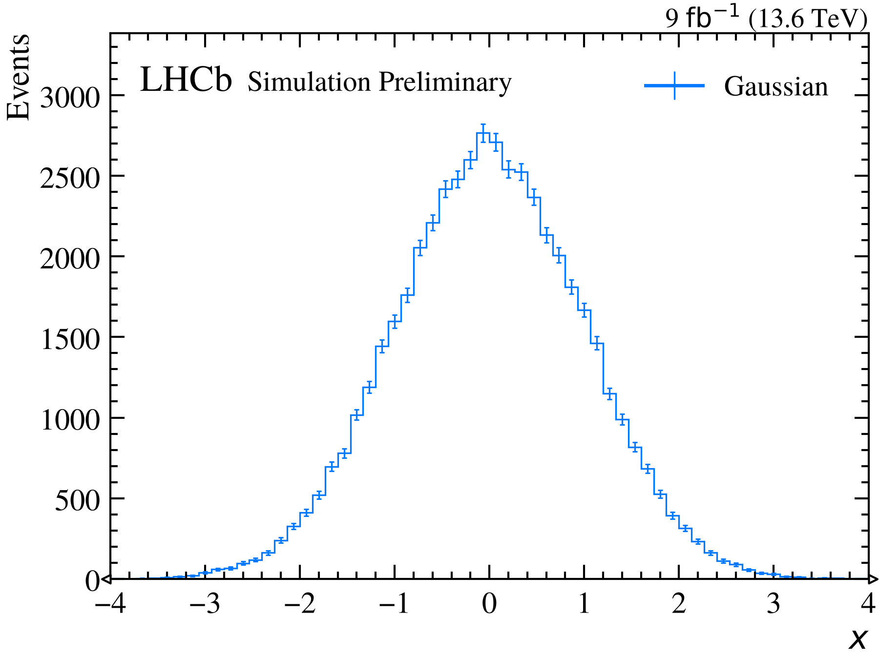
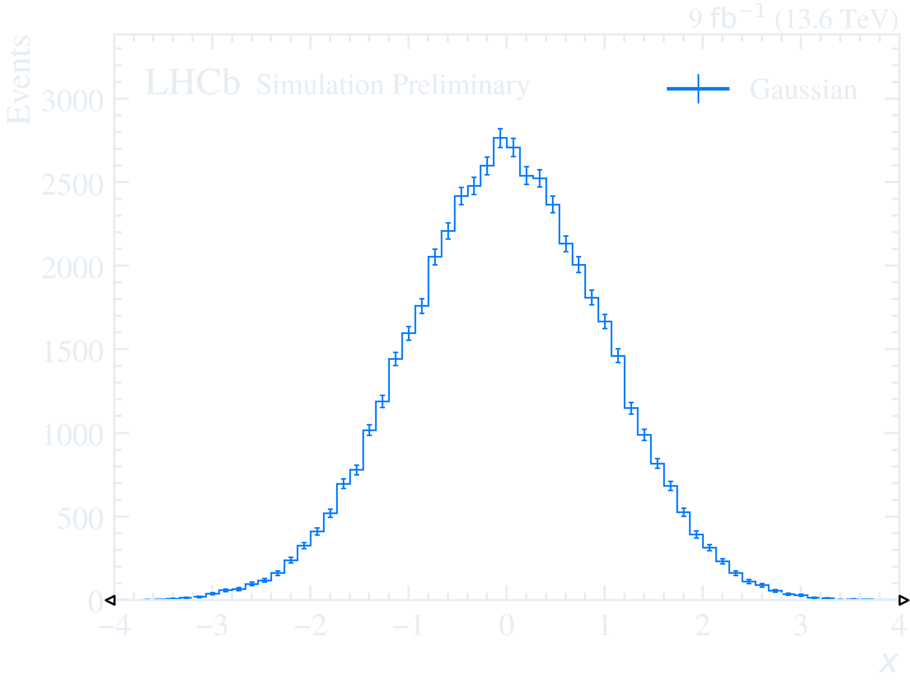
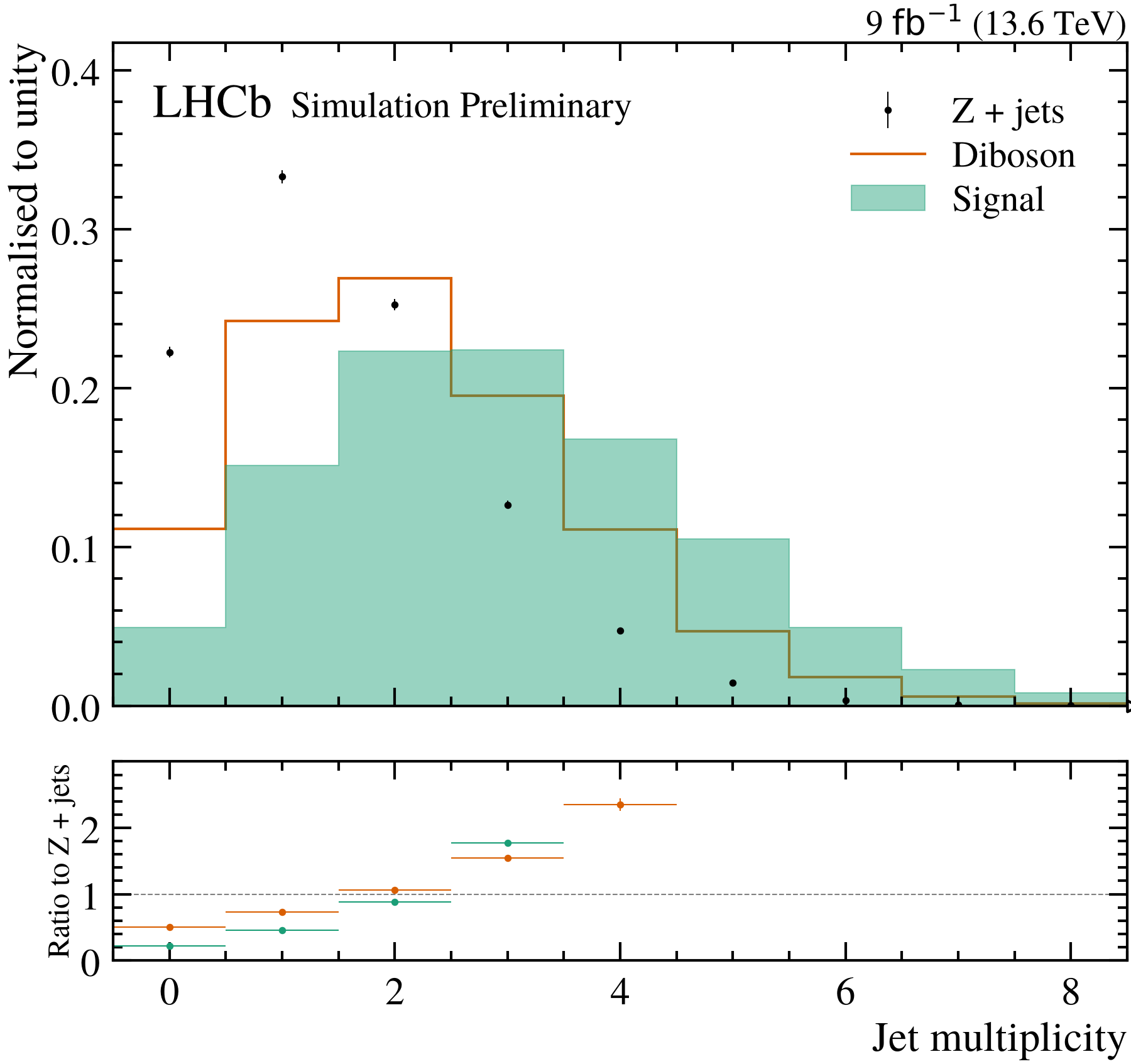
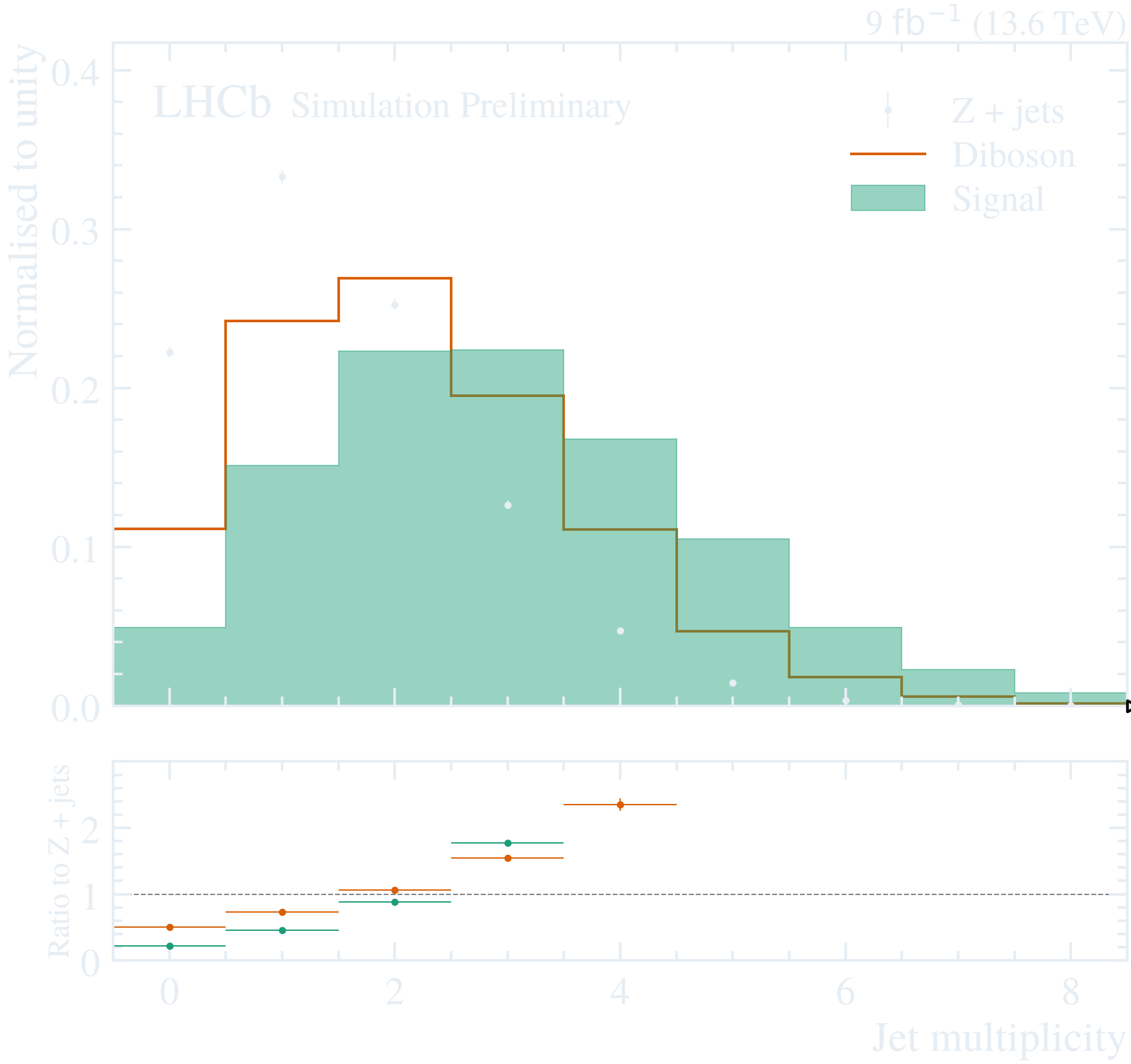
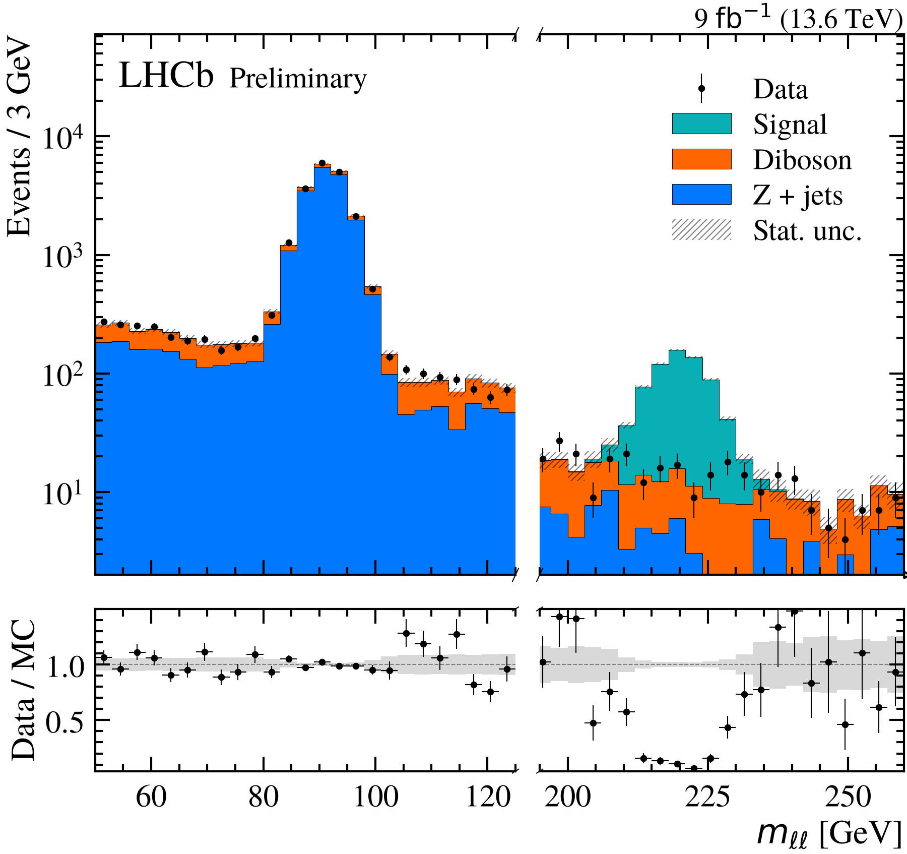
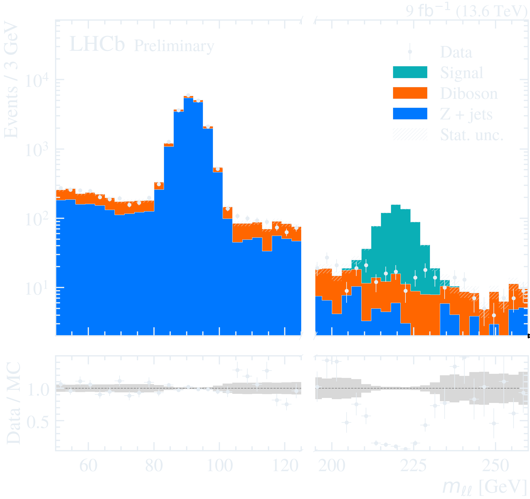
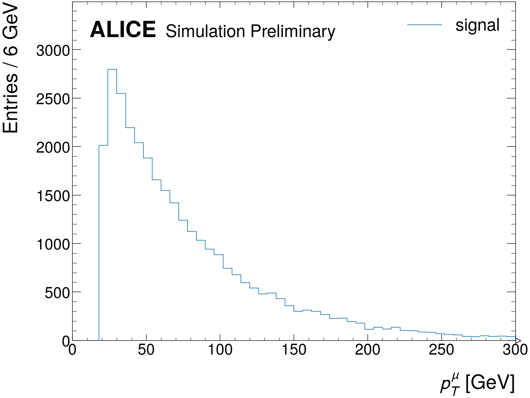
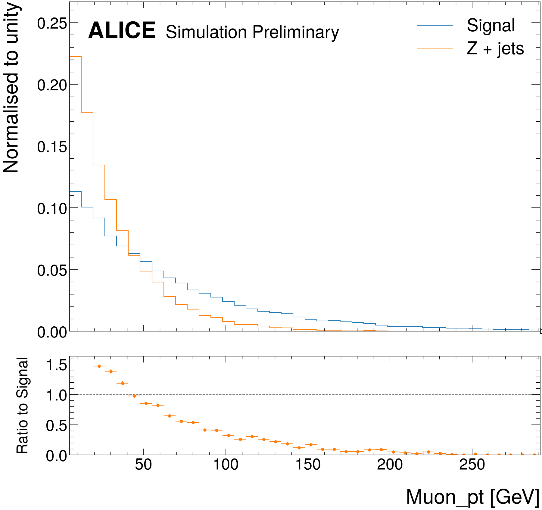
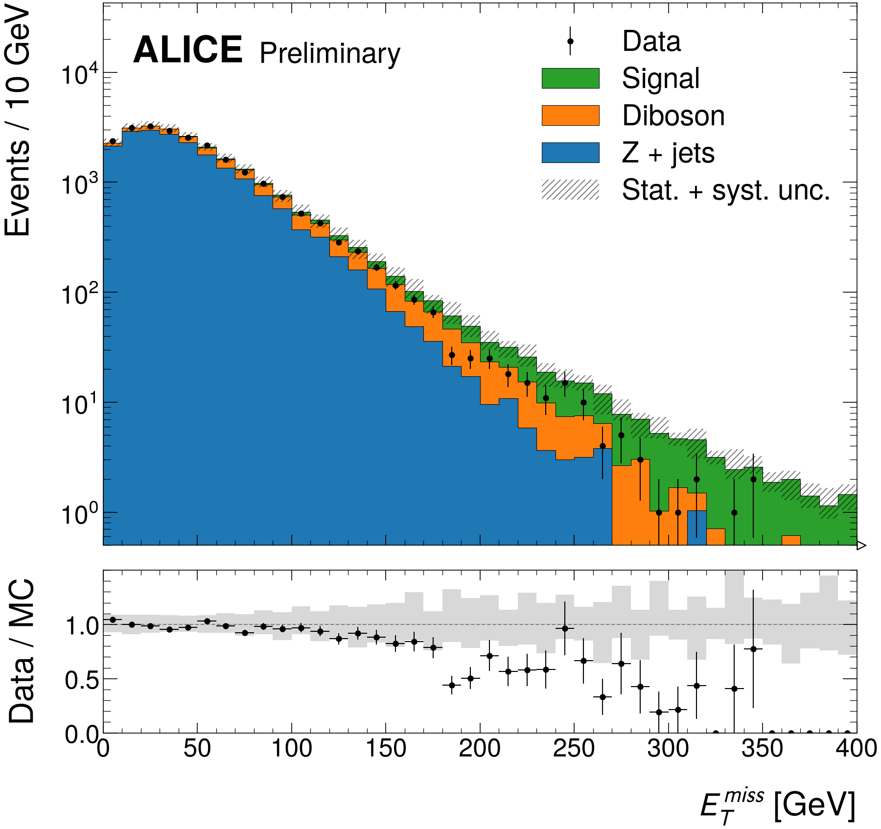
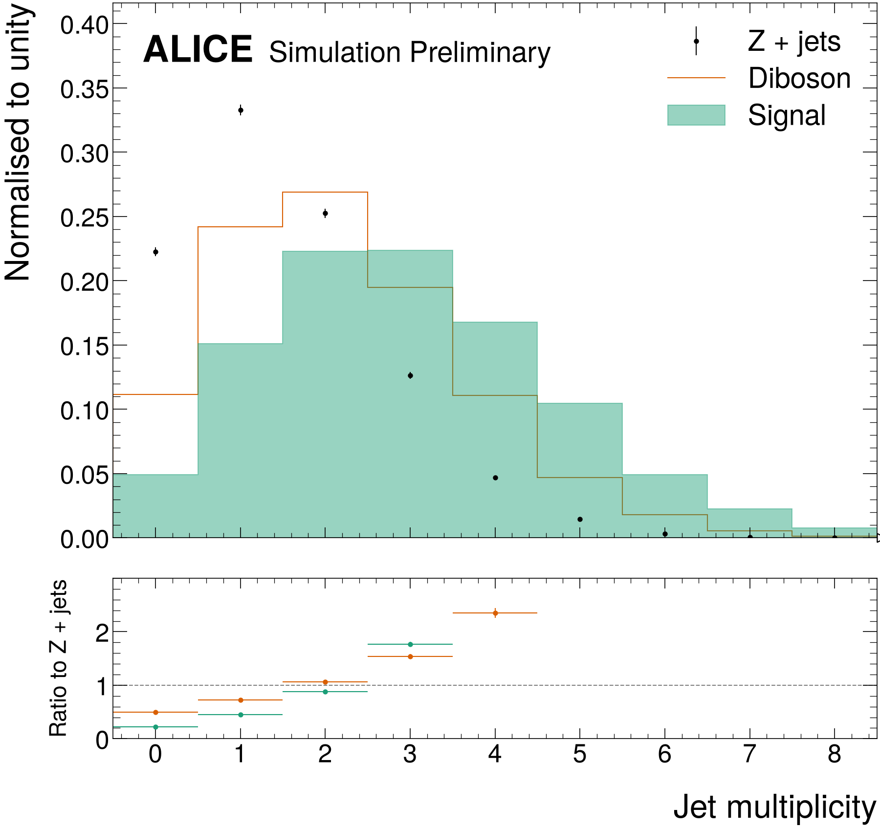
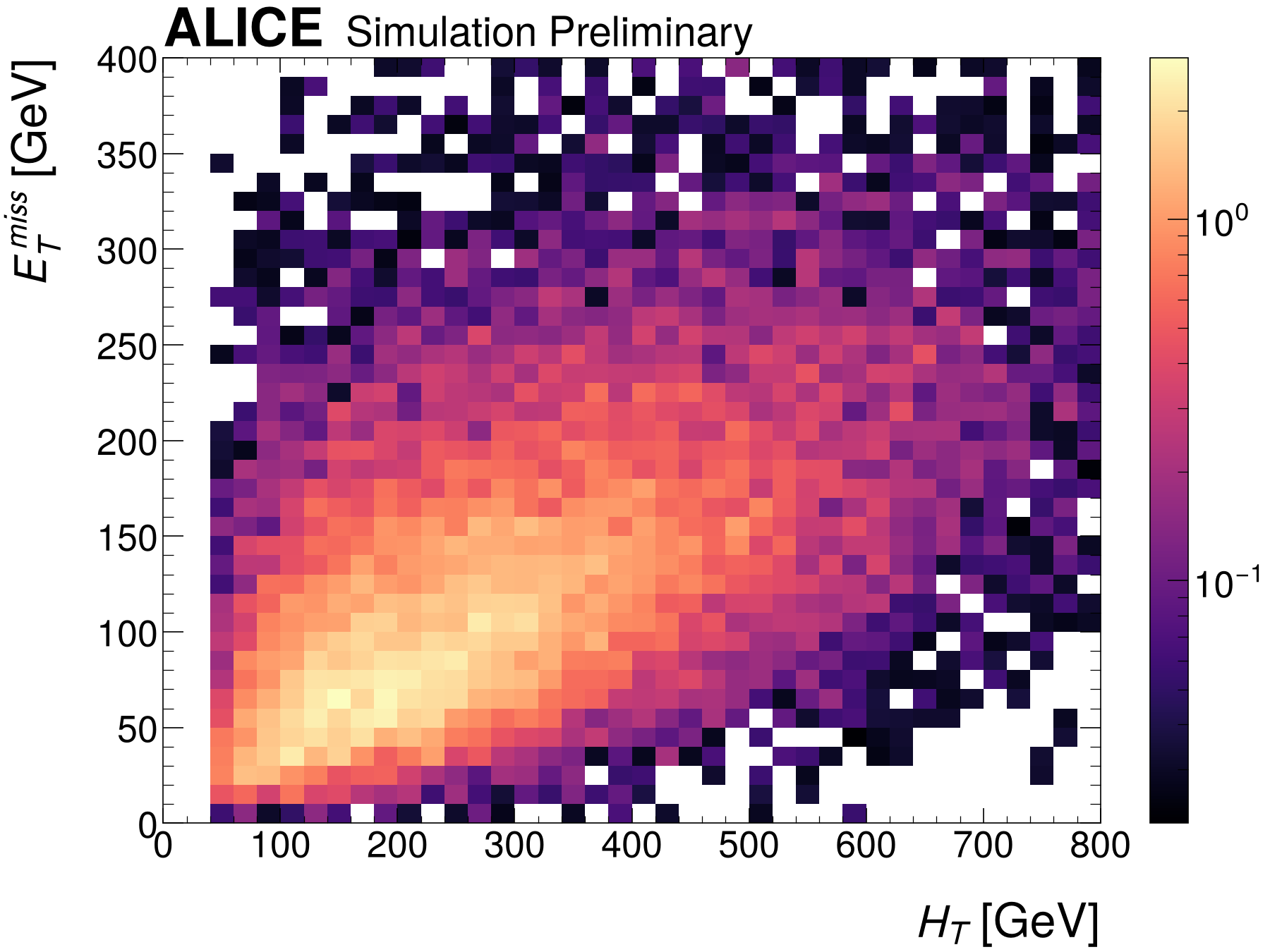
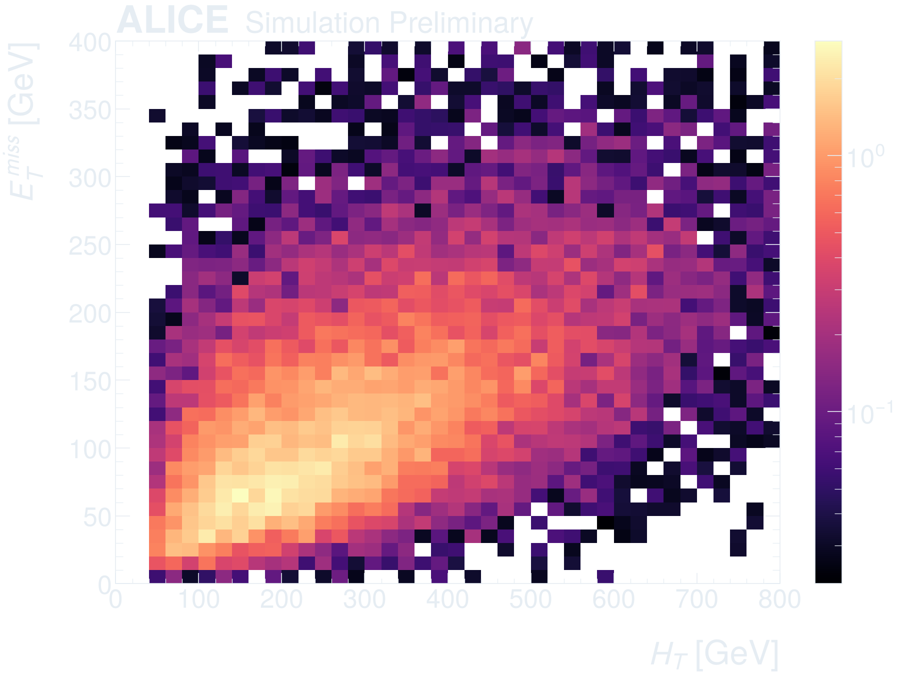
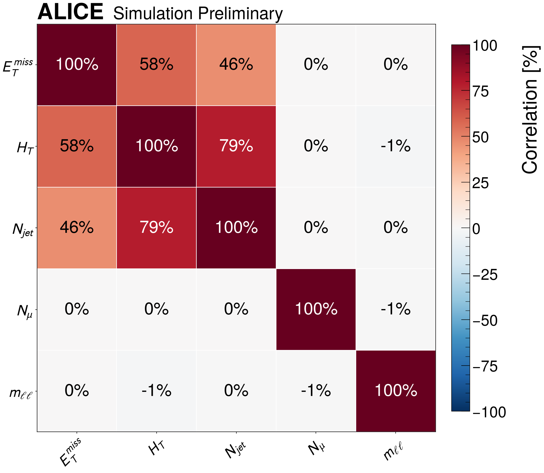
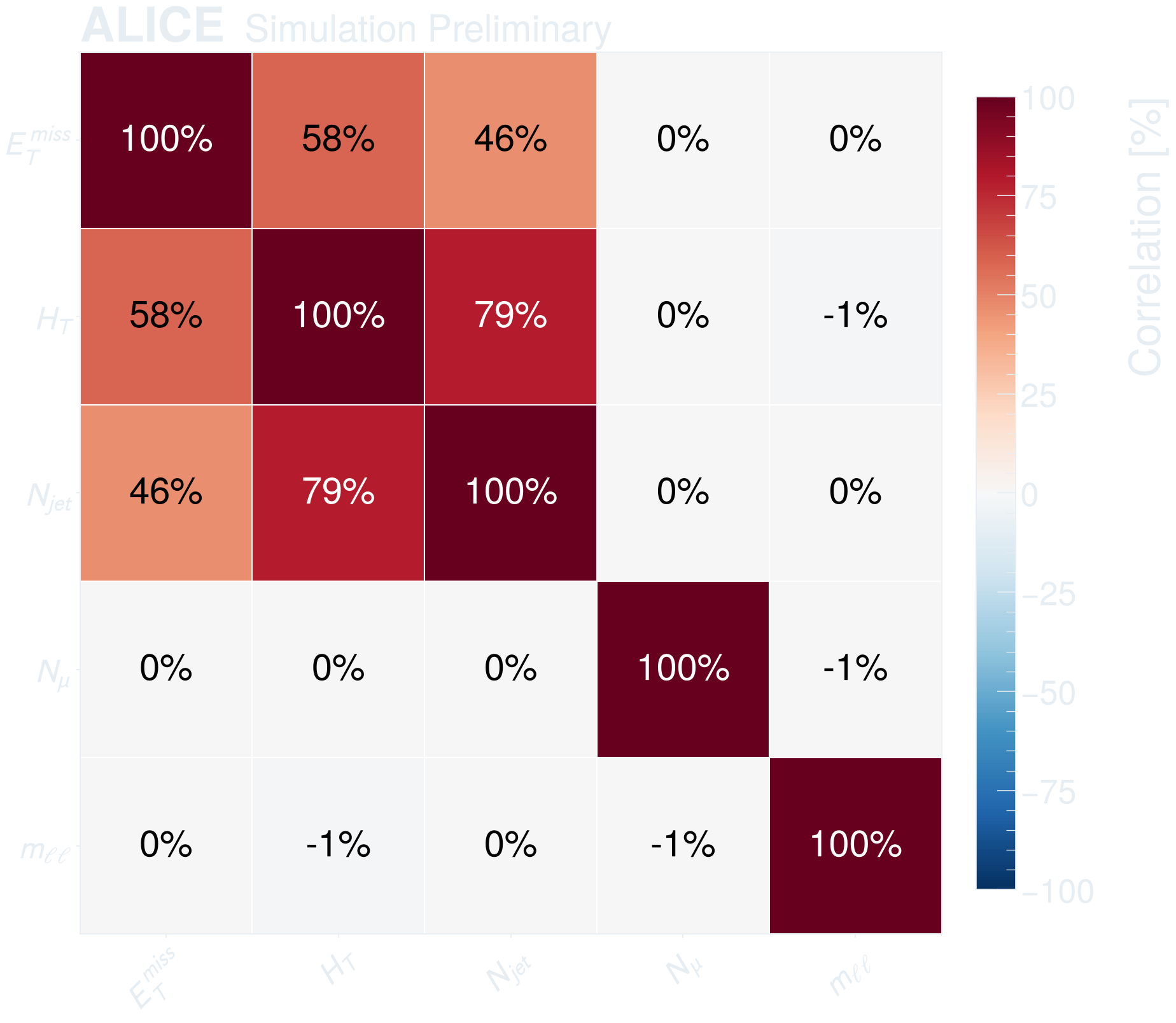
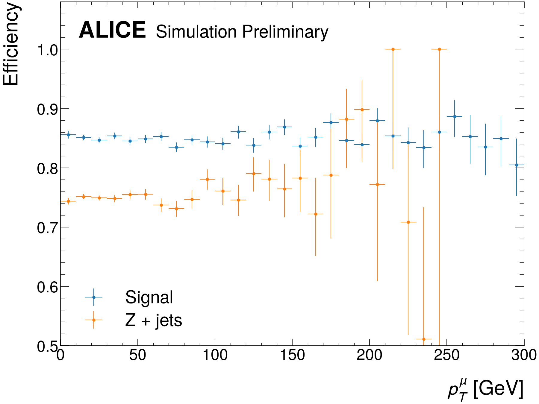
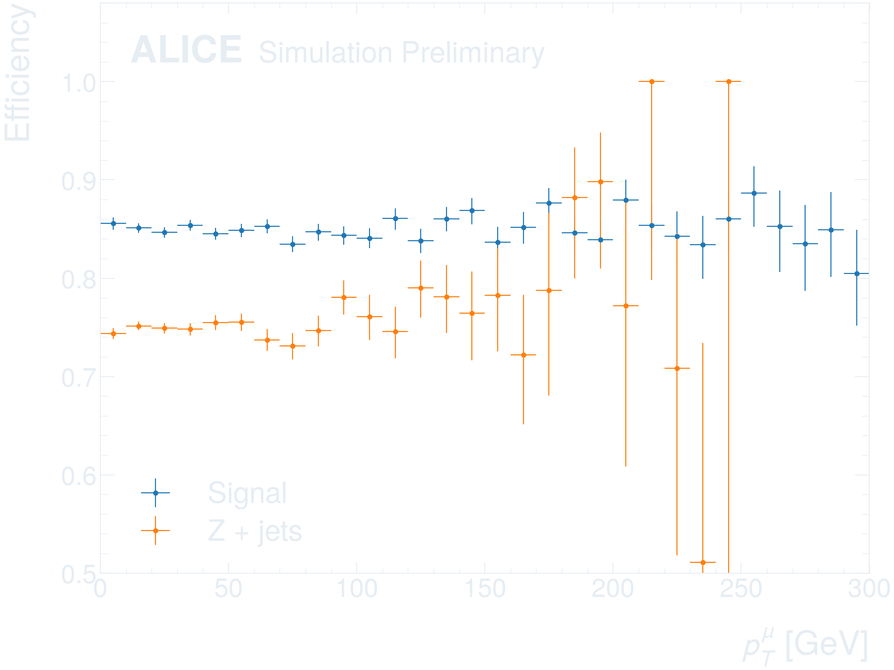
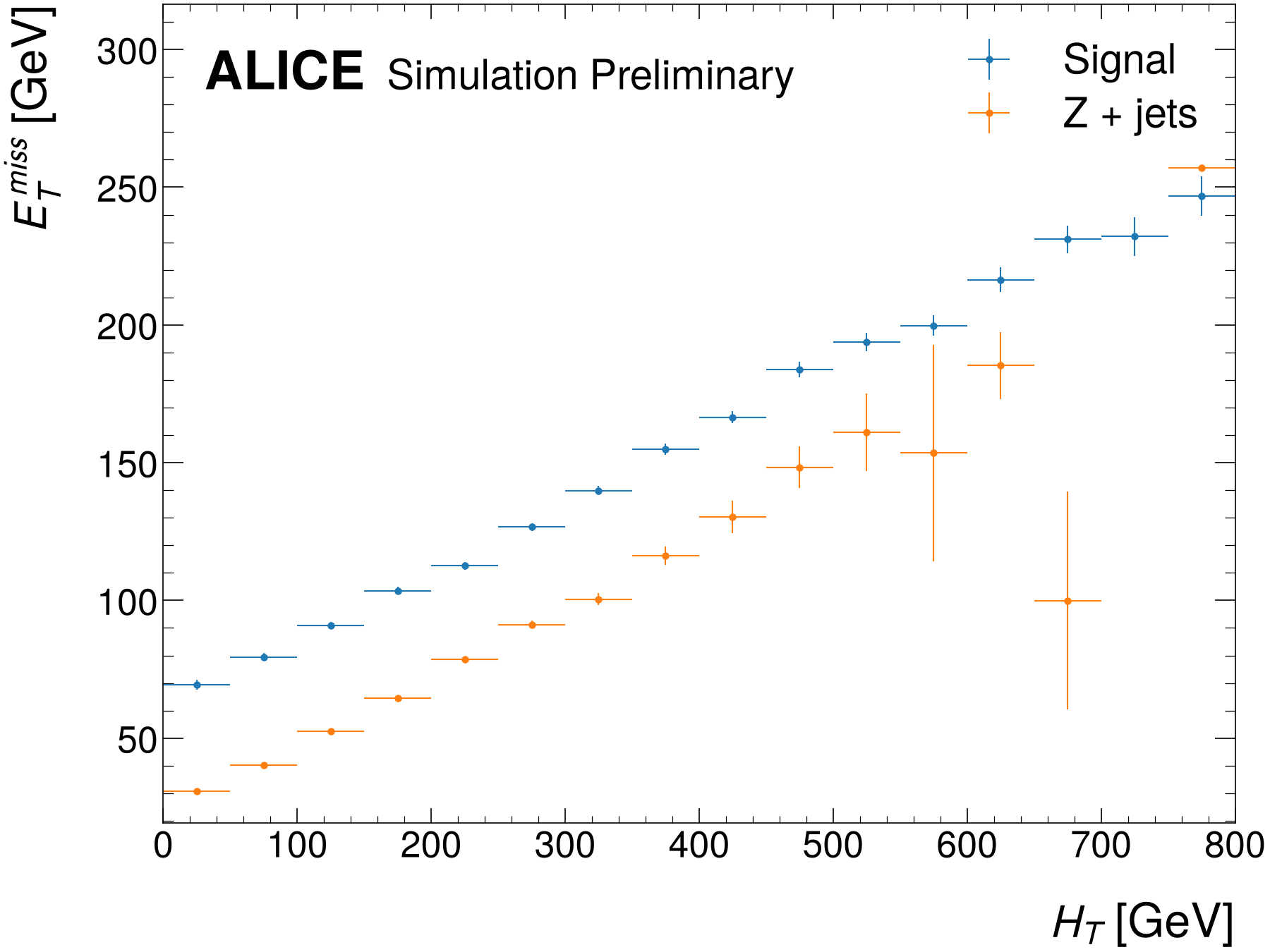
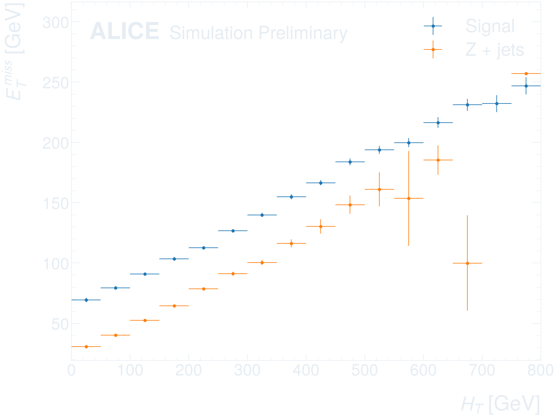
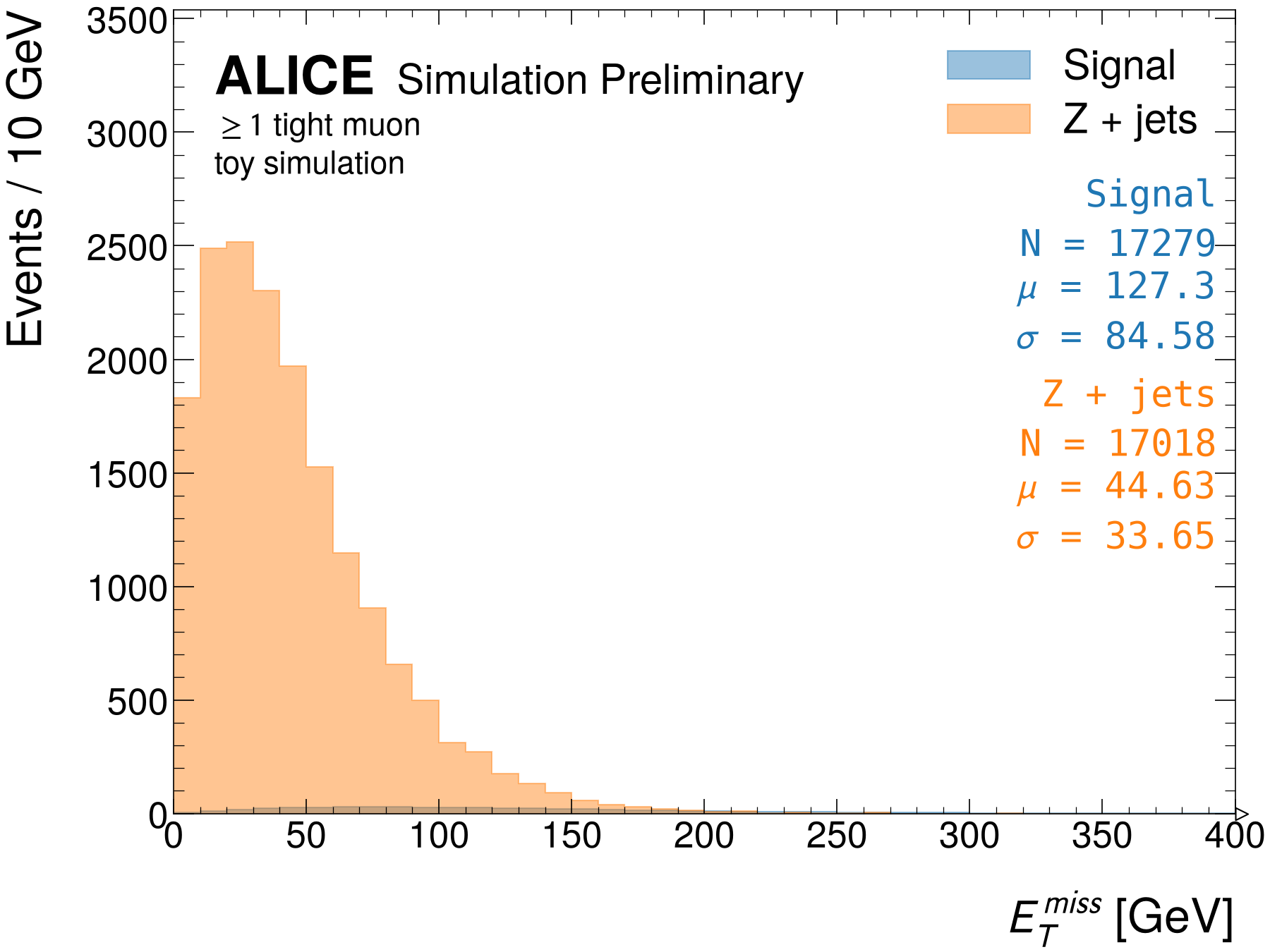
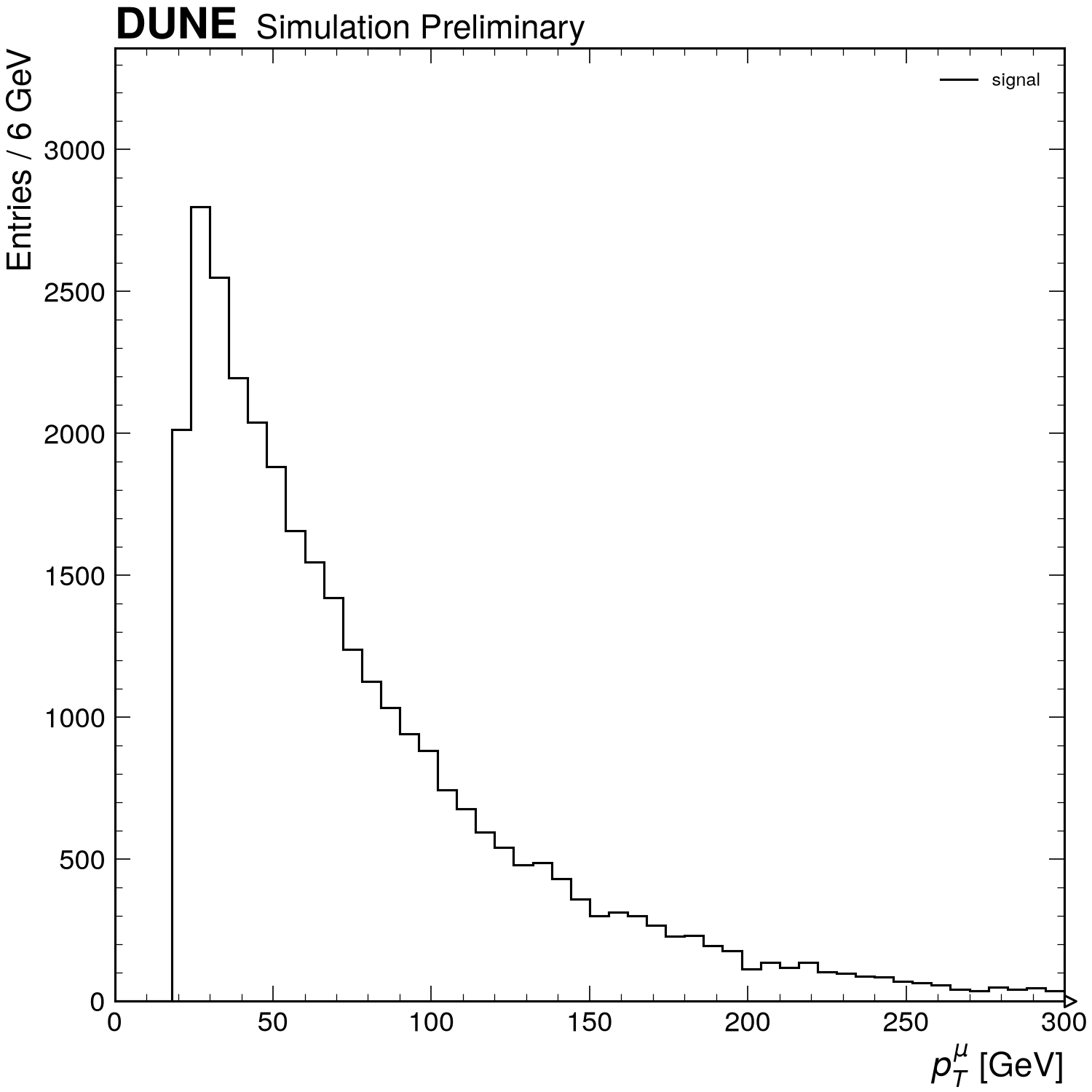
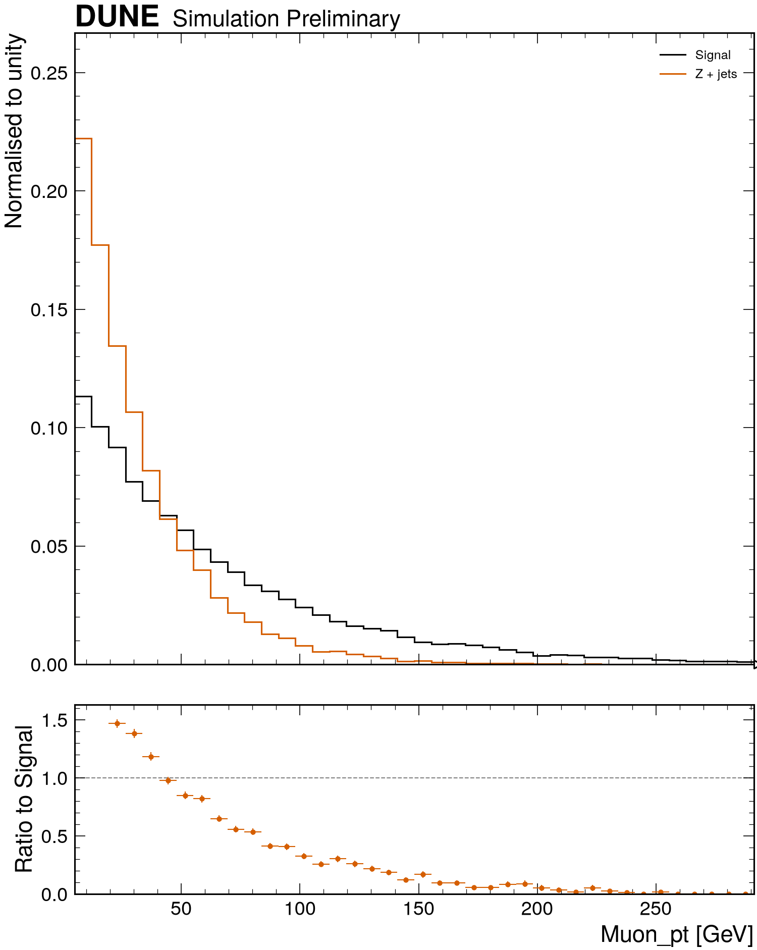
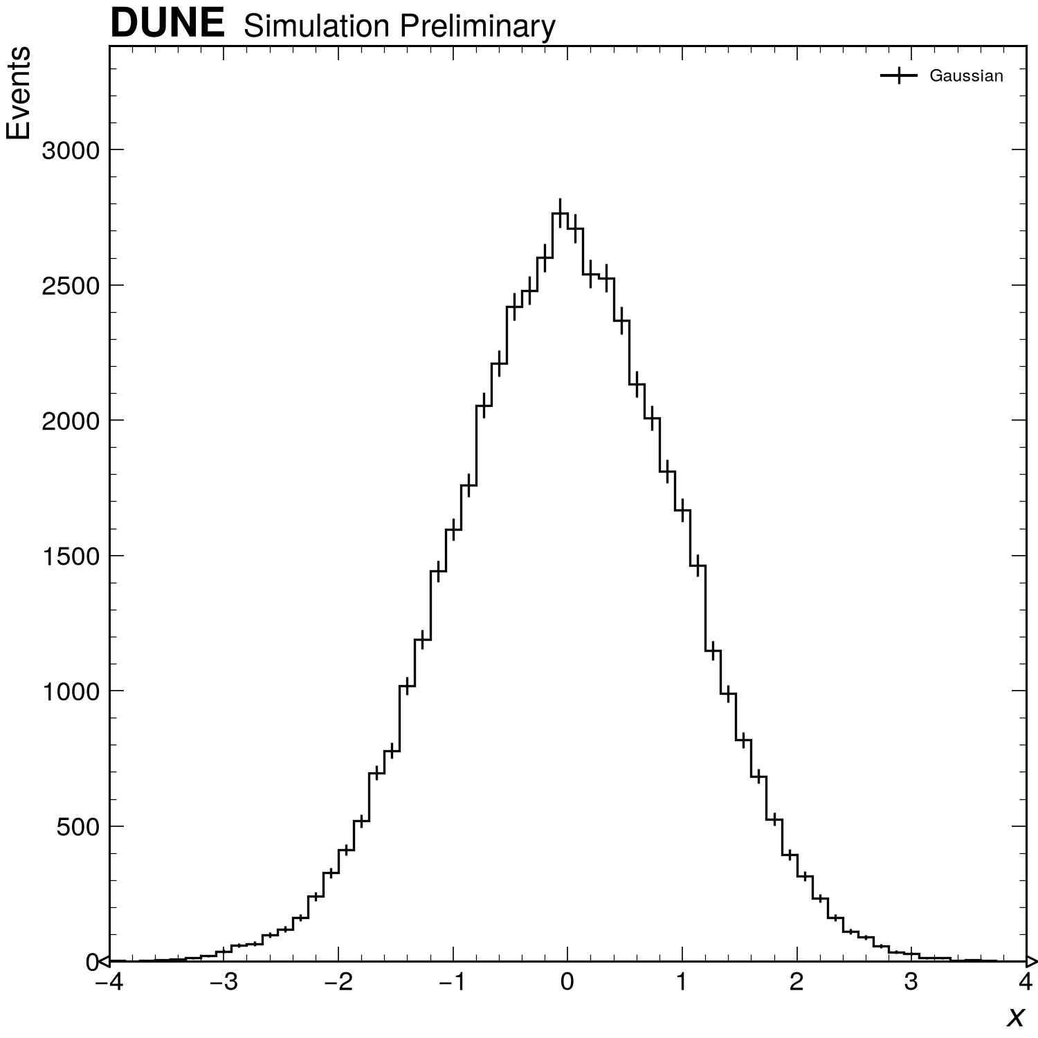
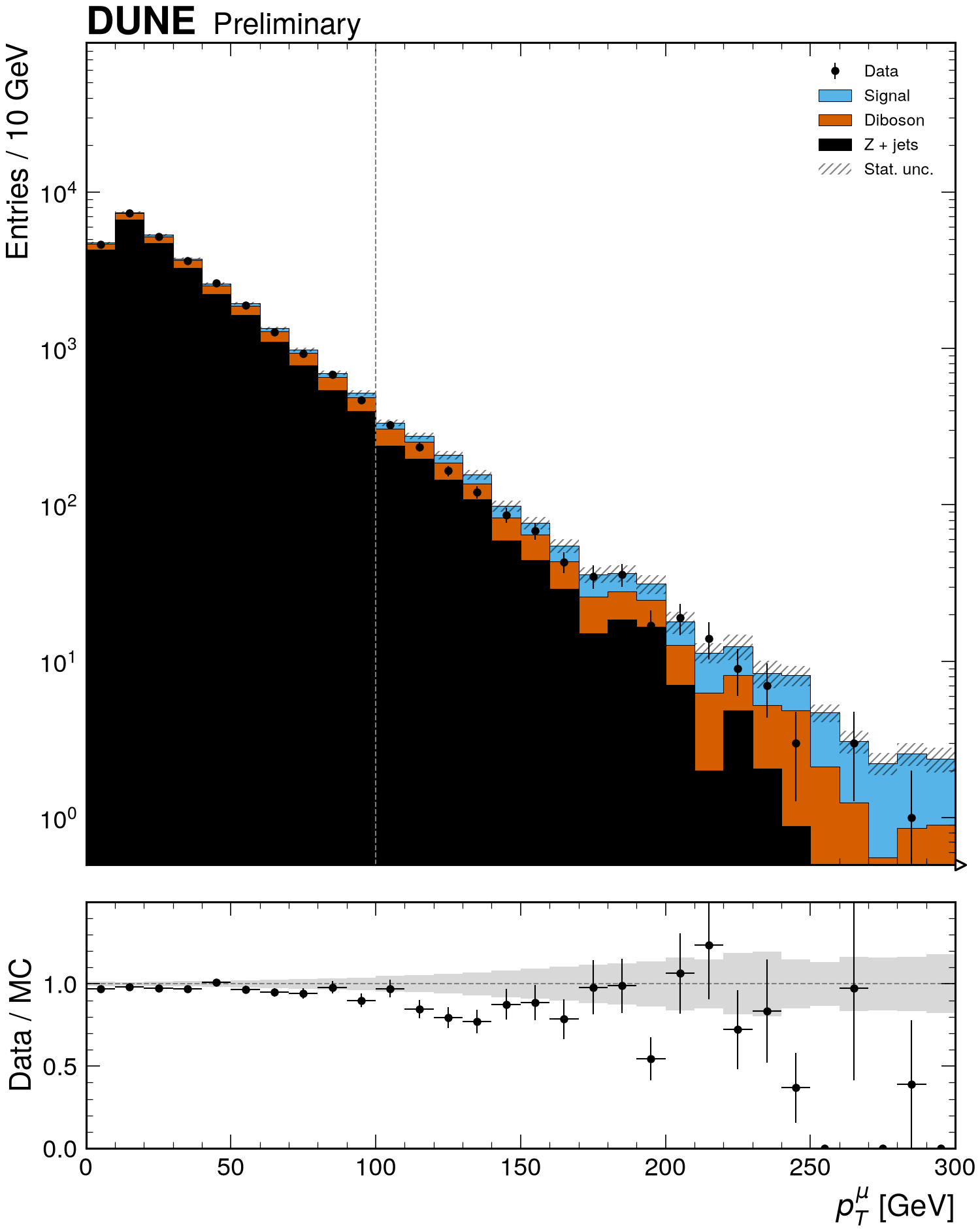
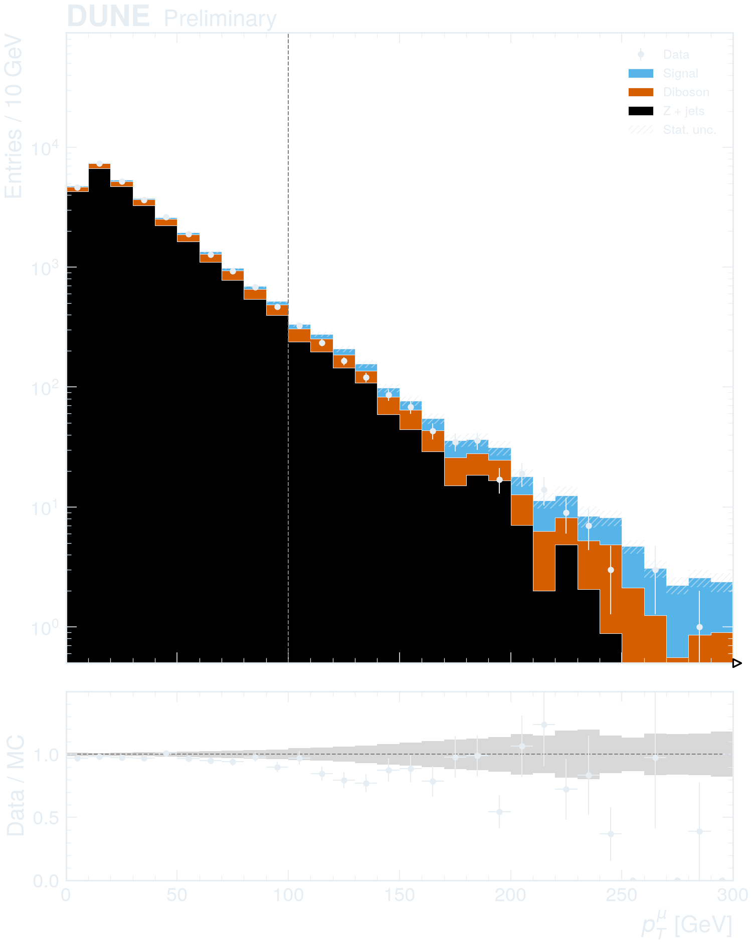
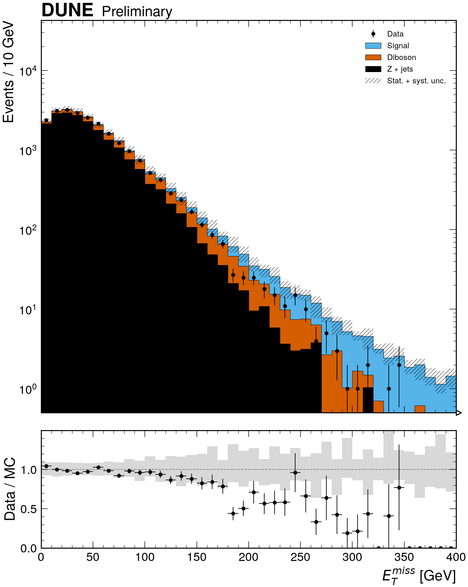
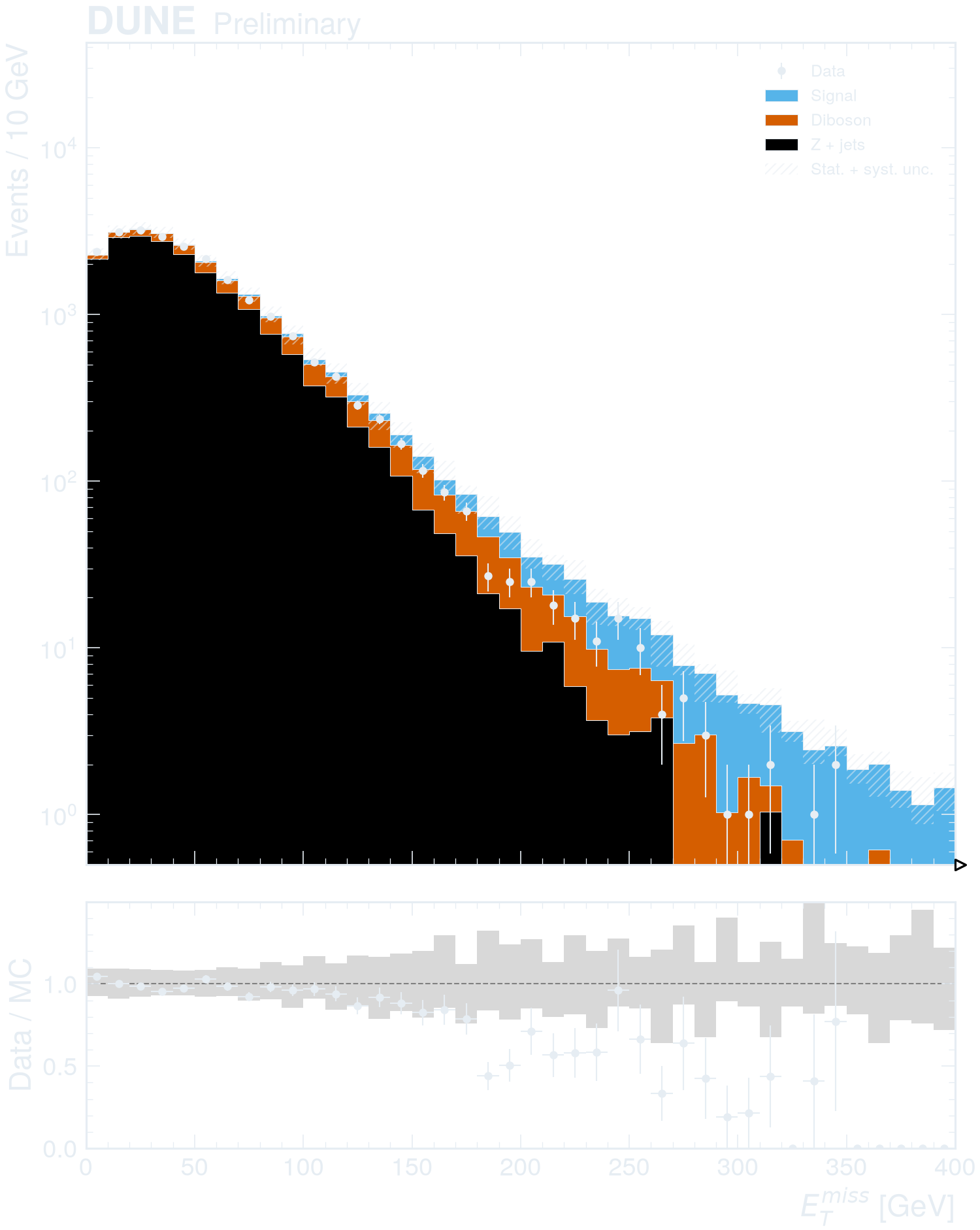
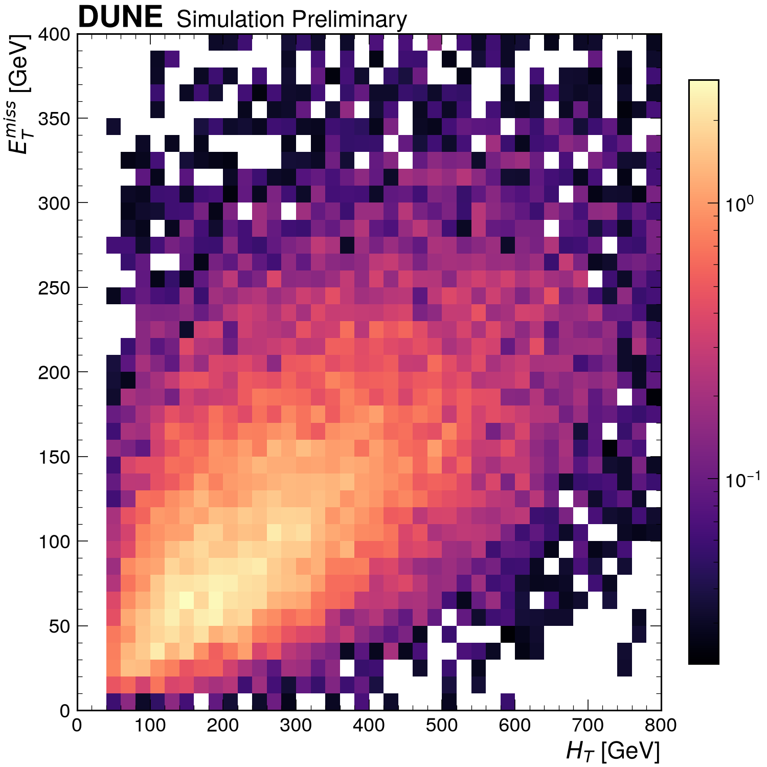
Every figure below is drawn by the code on its page. Most examples use a toy ROOT dataset: three simulated processes and one "observed" sample with muons, jets and event-level quantities. The in-memory arrays example generates its own NumPy data.
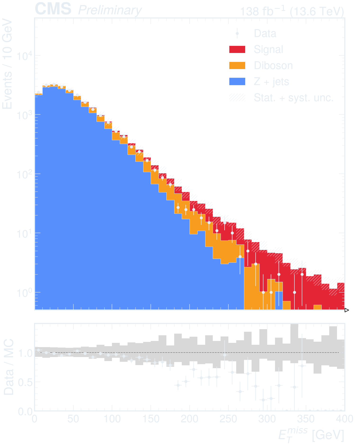
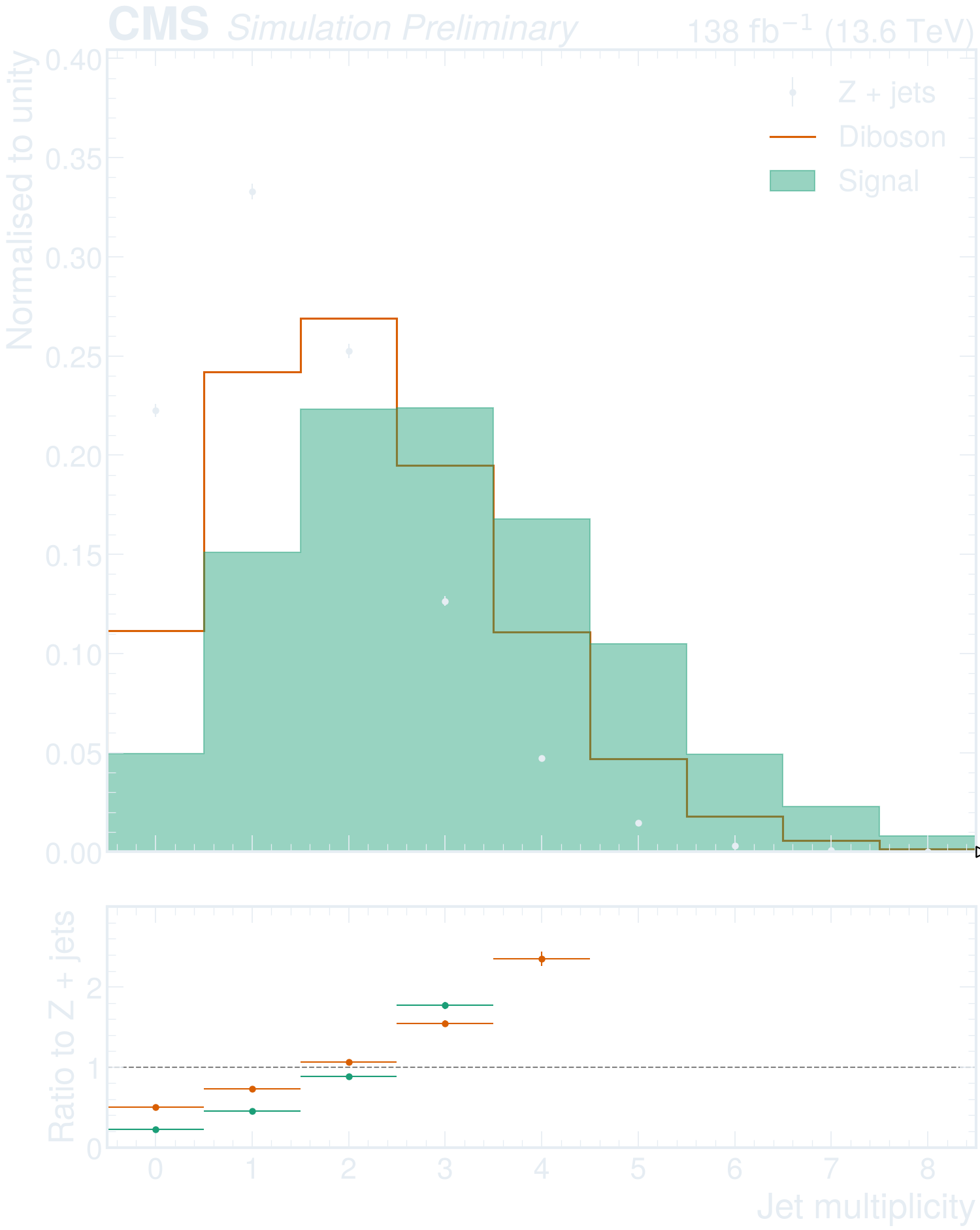
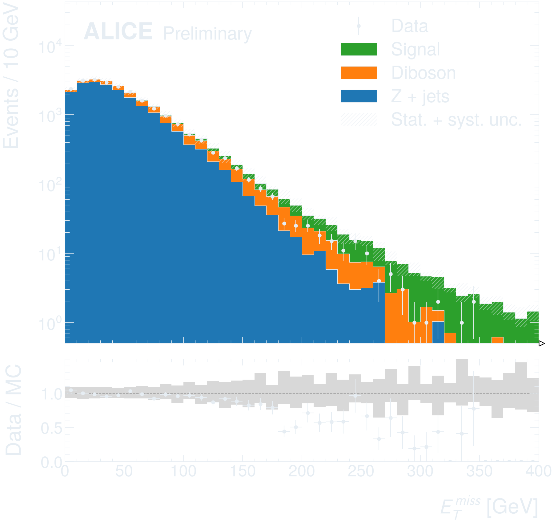
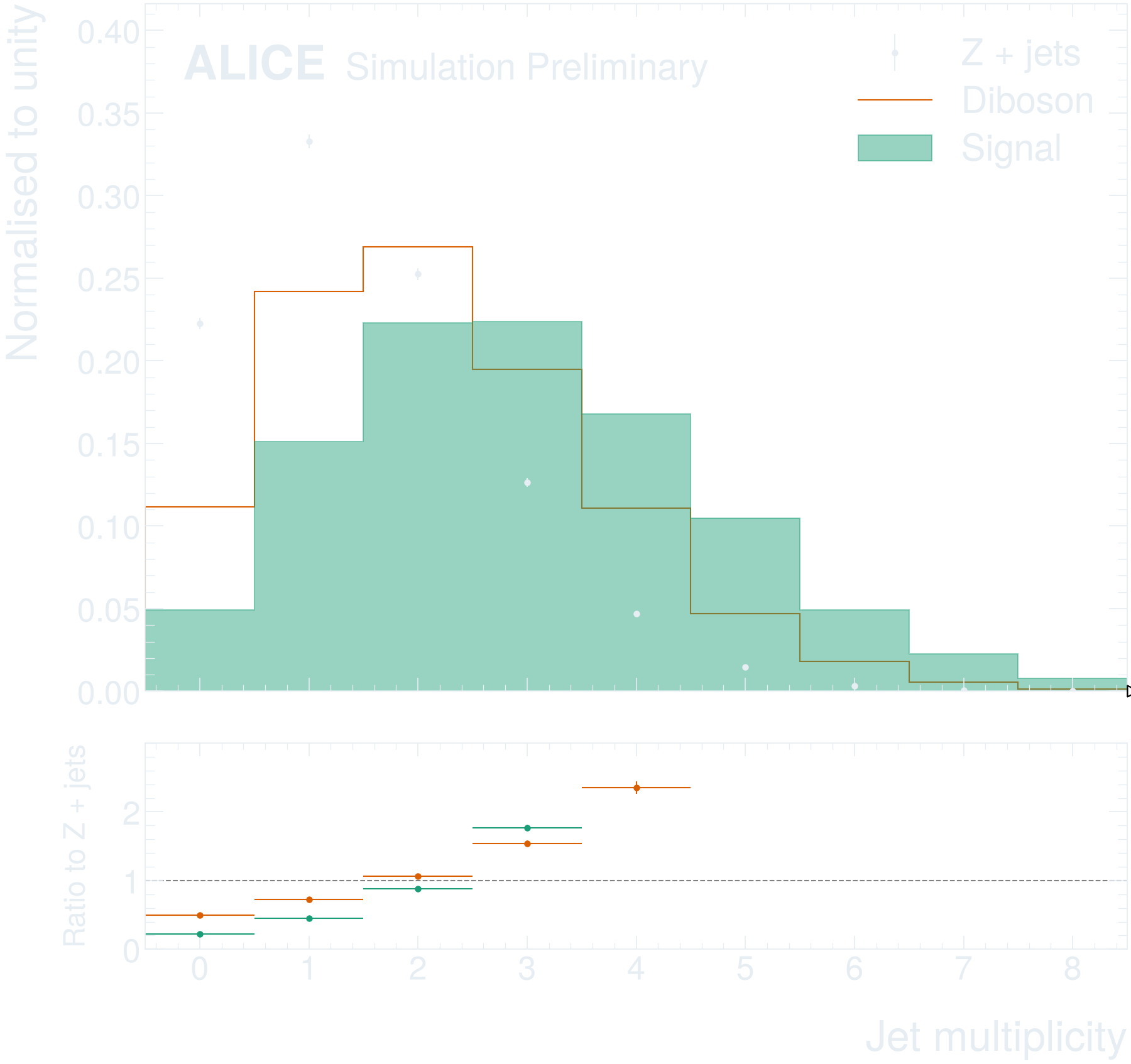
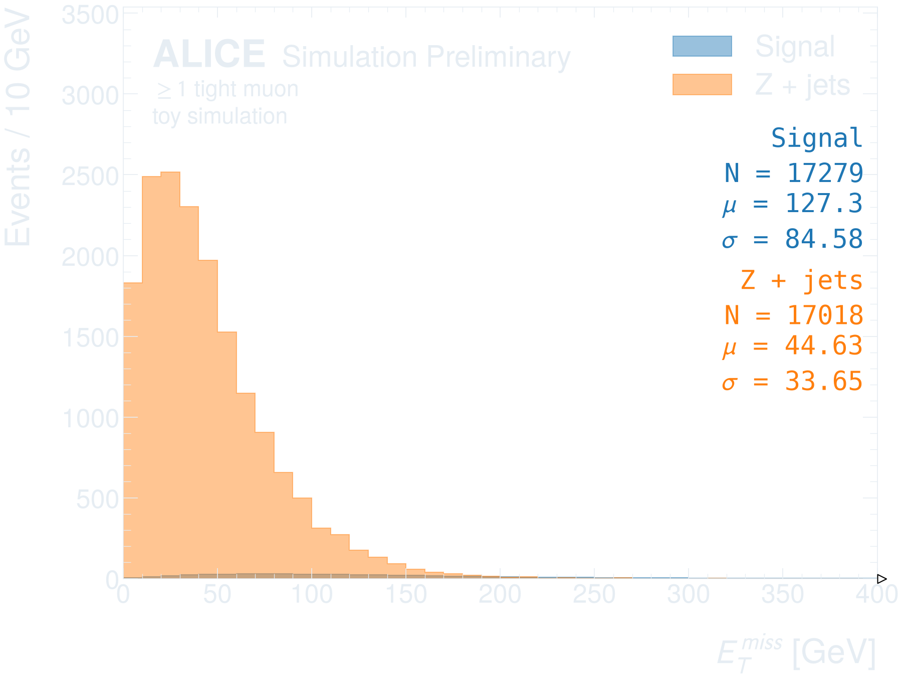
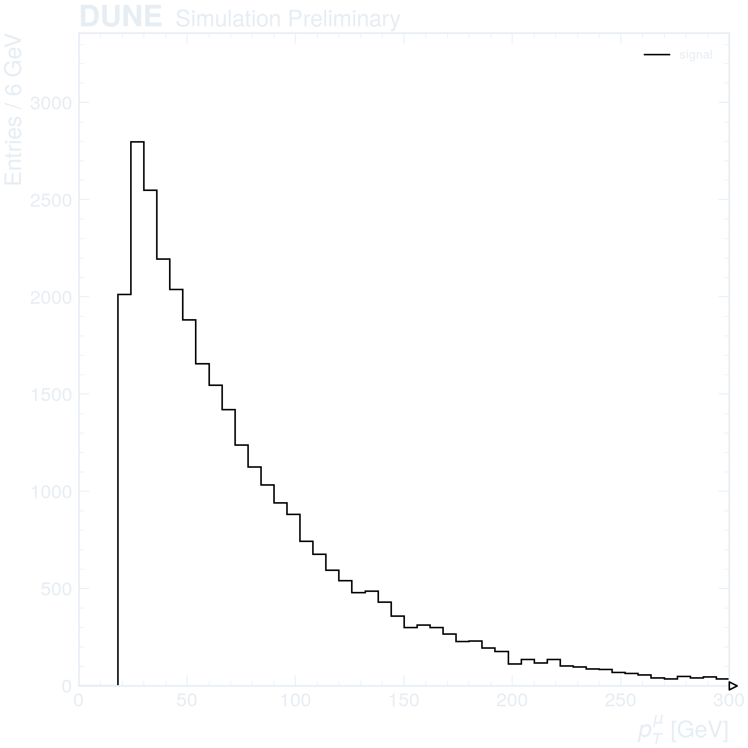
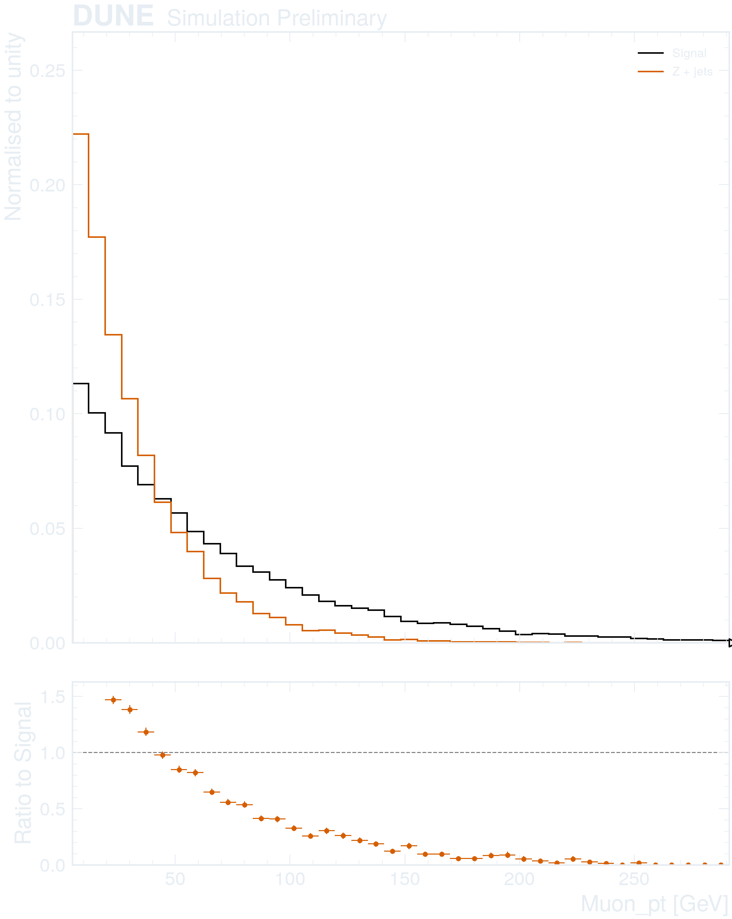
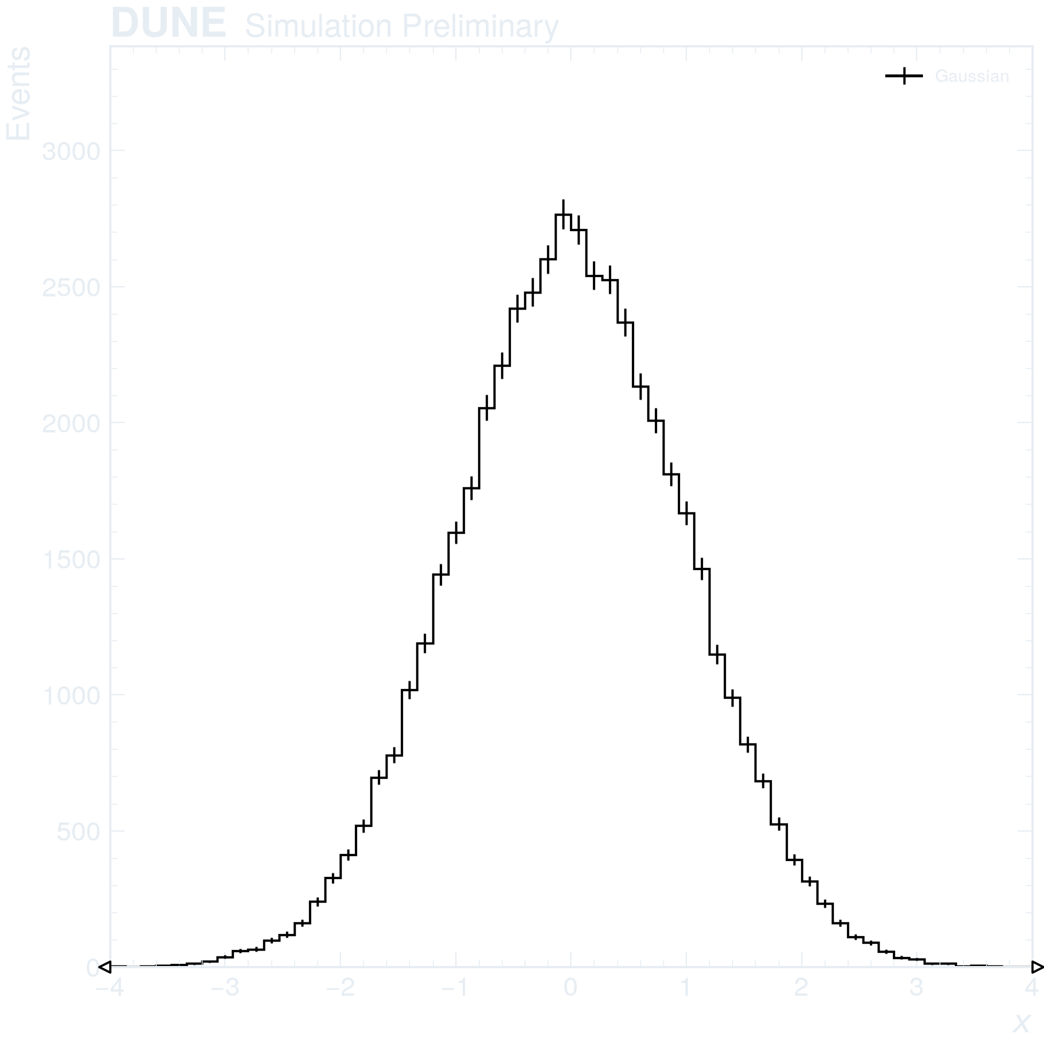
Choose a style: examples with style tabs follow your choice here and on their individual pages. The other examples keep their own styles.
Getting started
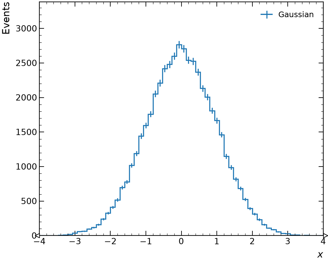
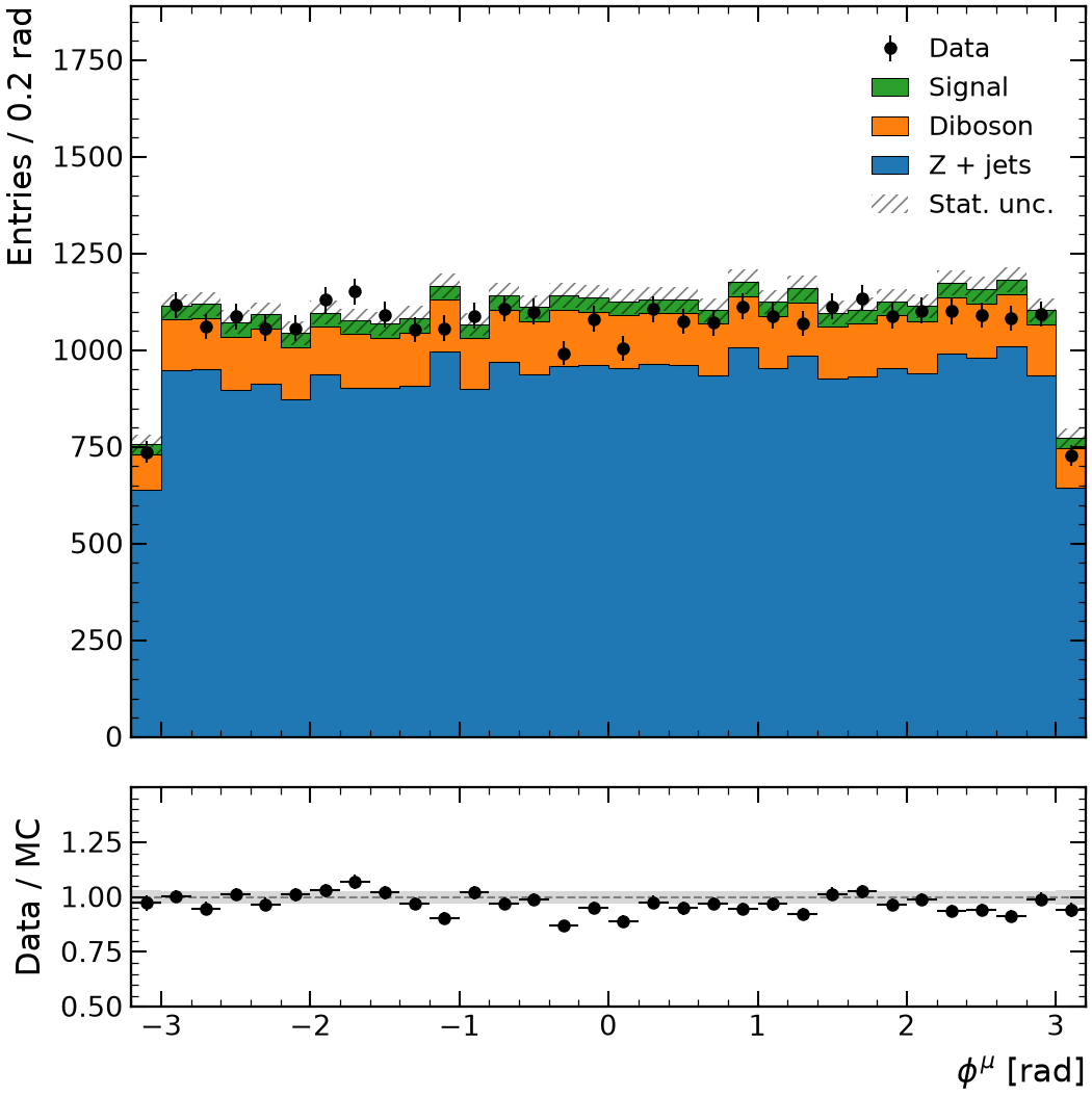
Simulation and data
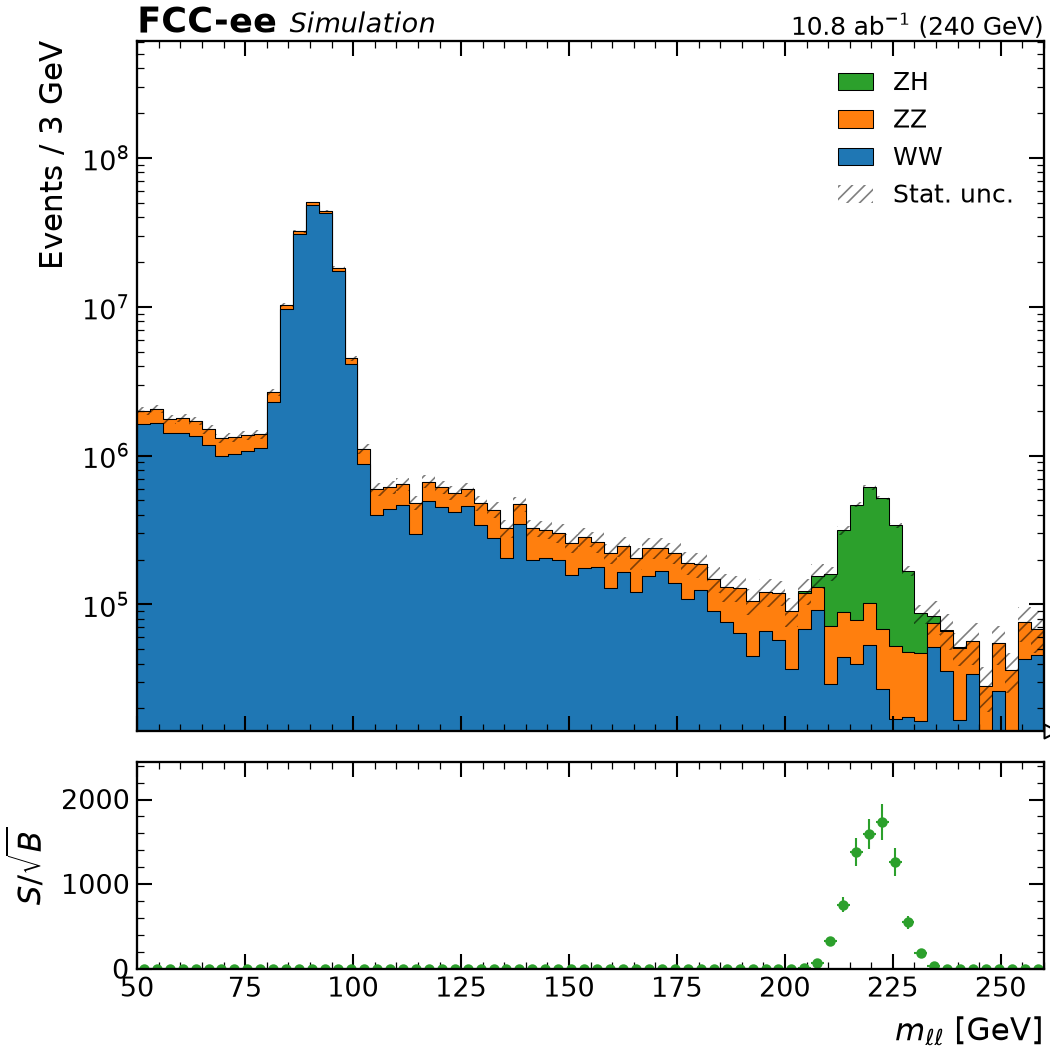
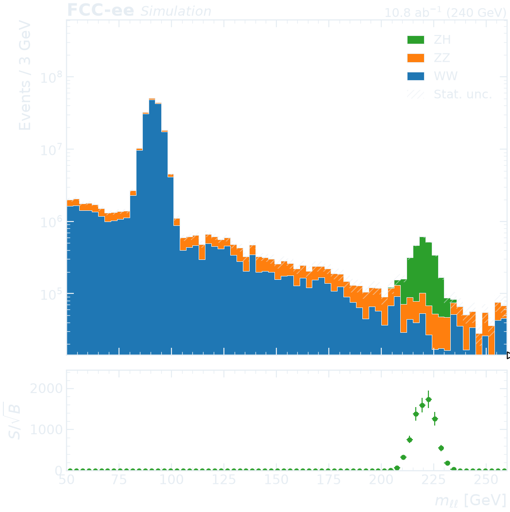
Binning and ranges
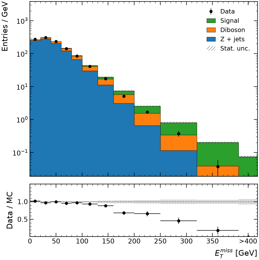
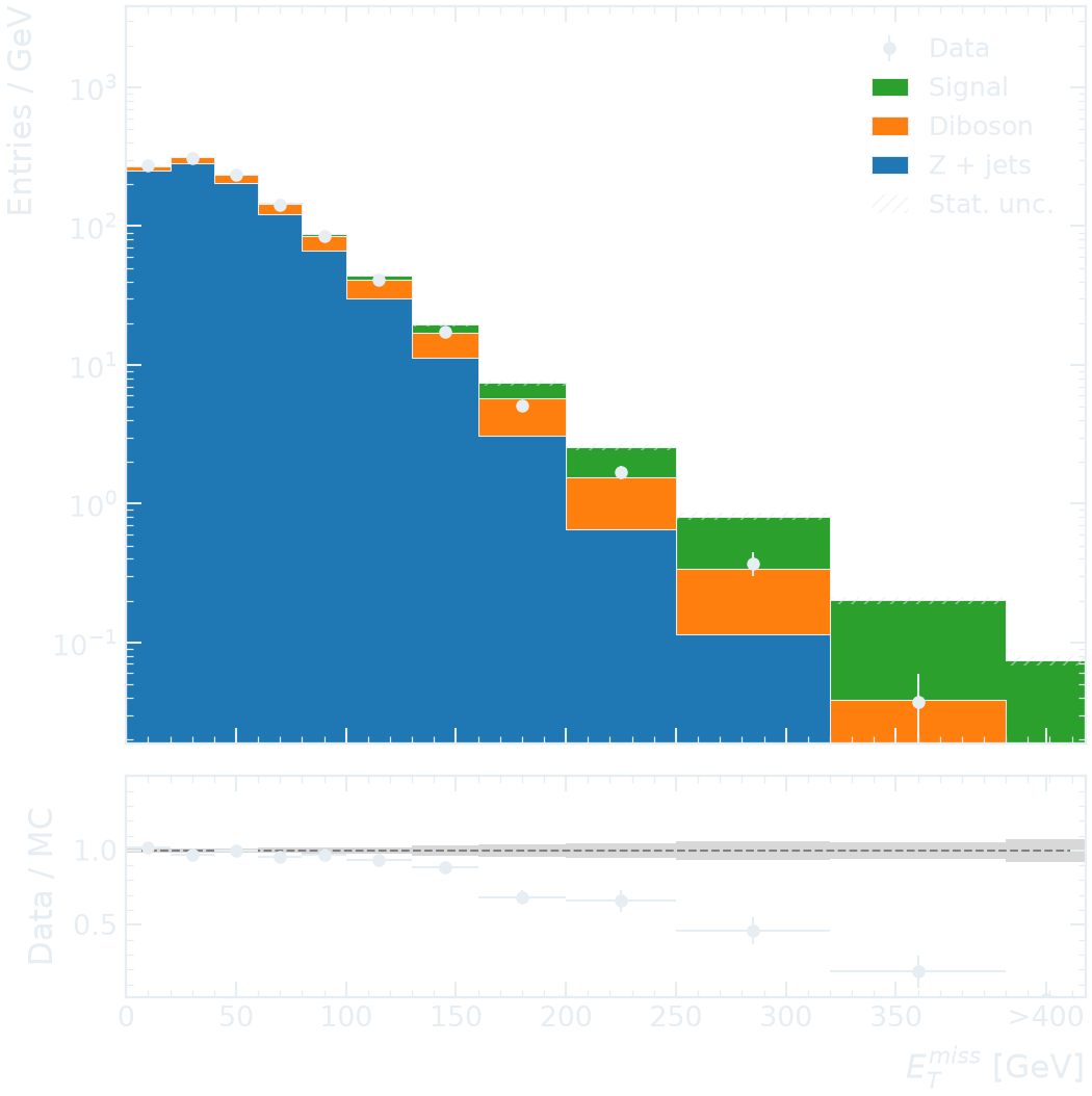
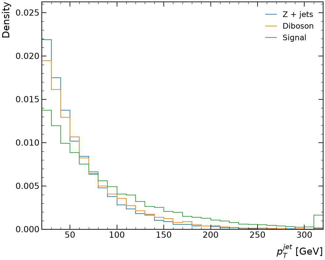
Selections and expressions
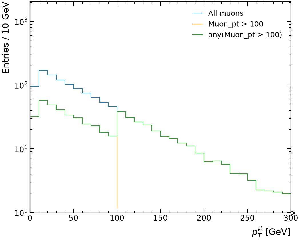
Beyond one dimension
Appearance
Getting started
Simulation and data
Binning and ranges
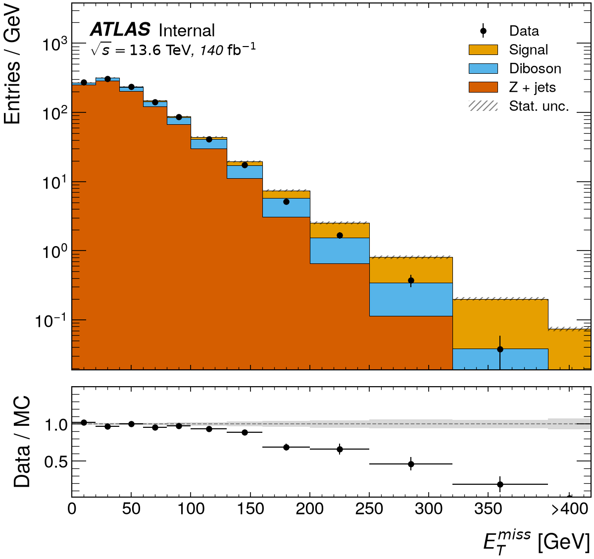
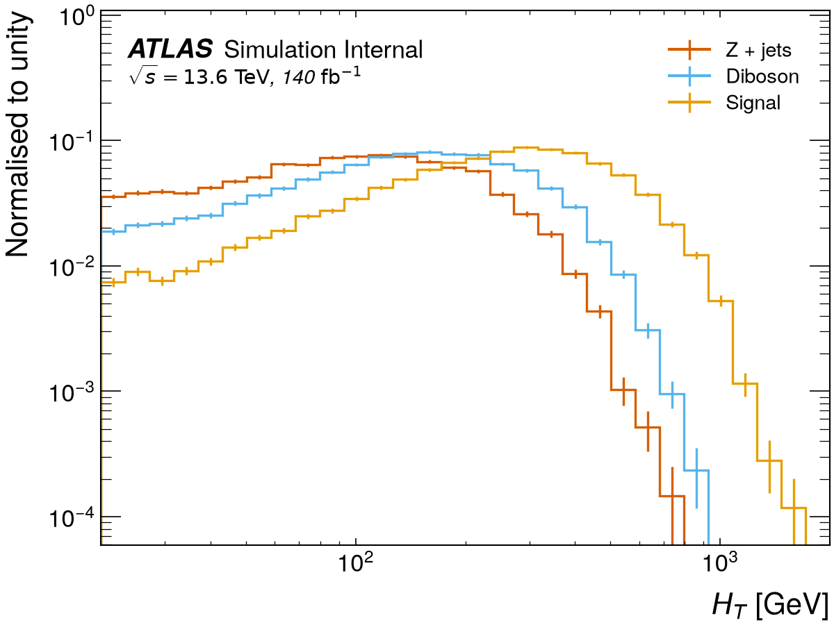
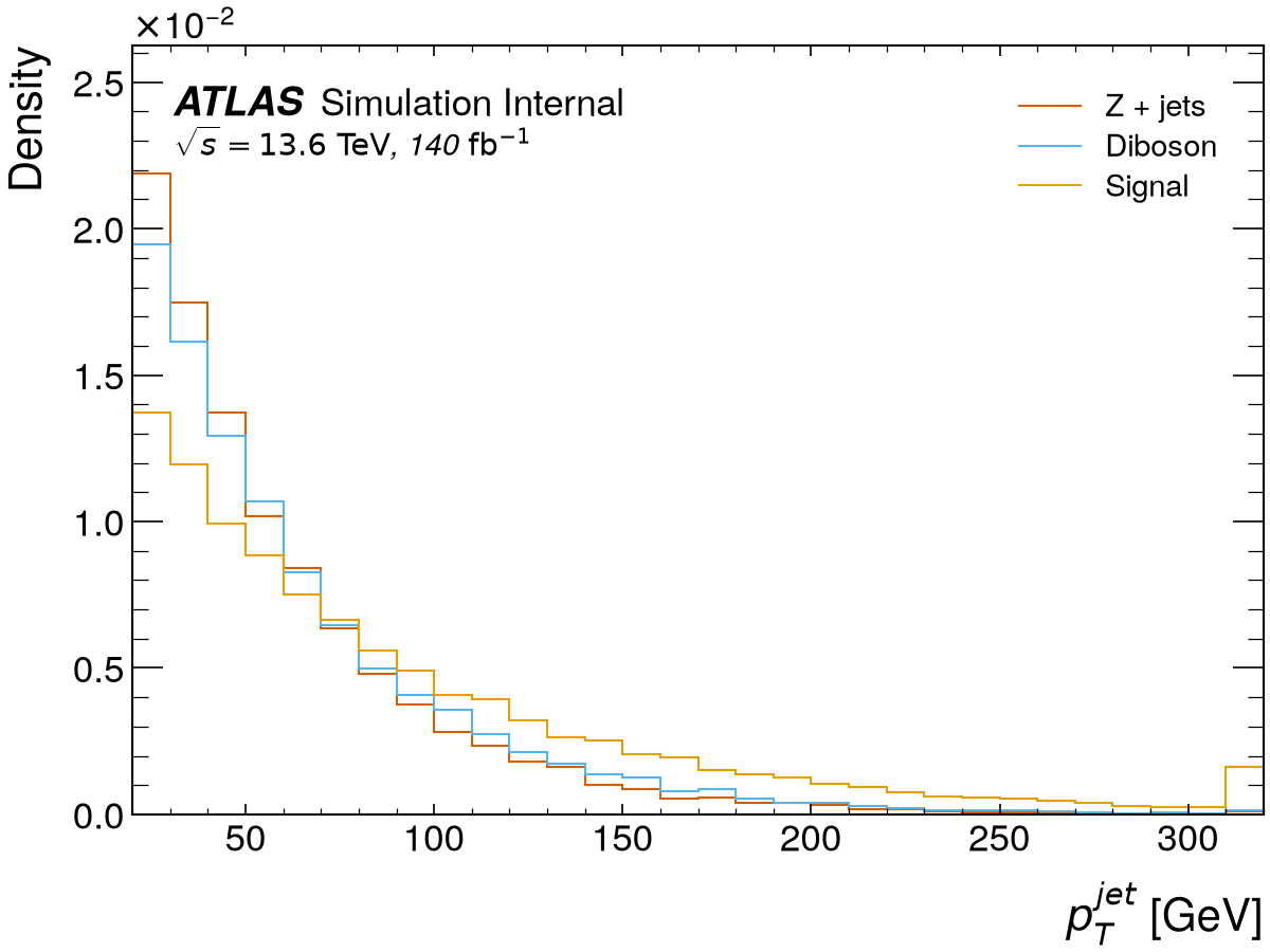
Selections and expressions
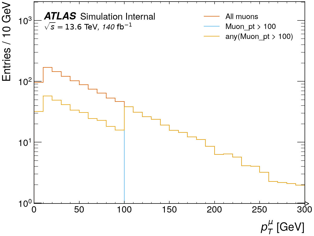
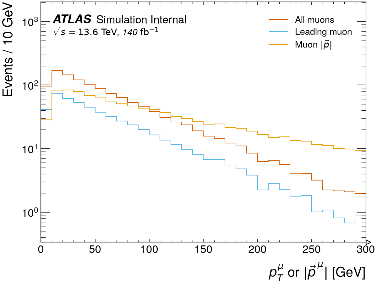
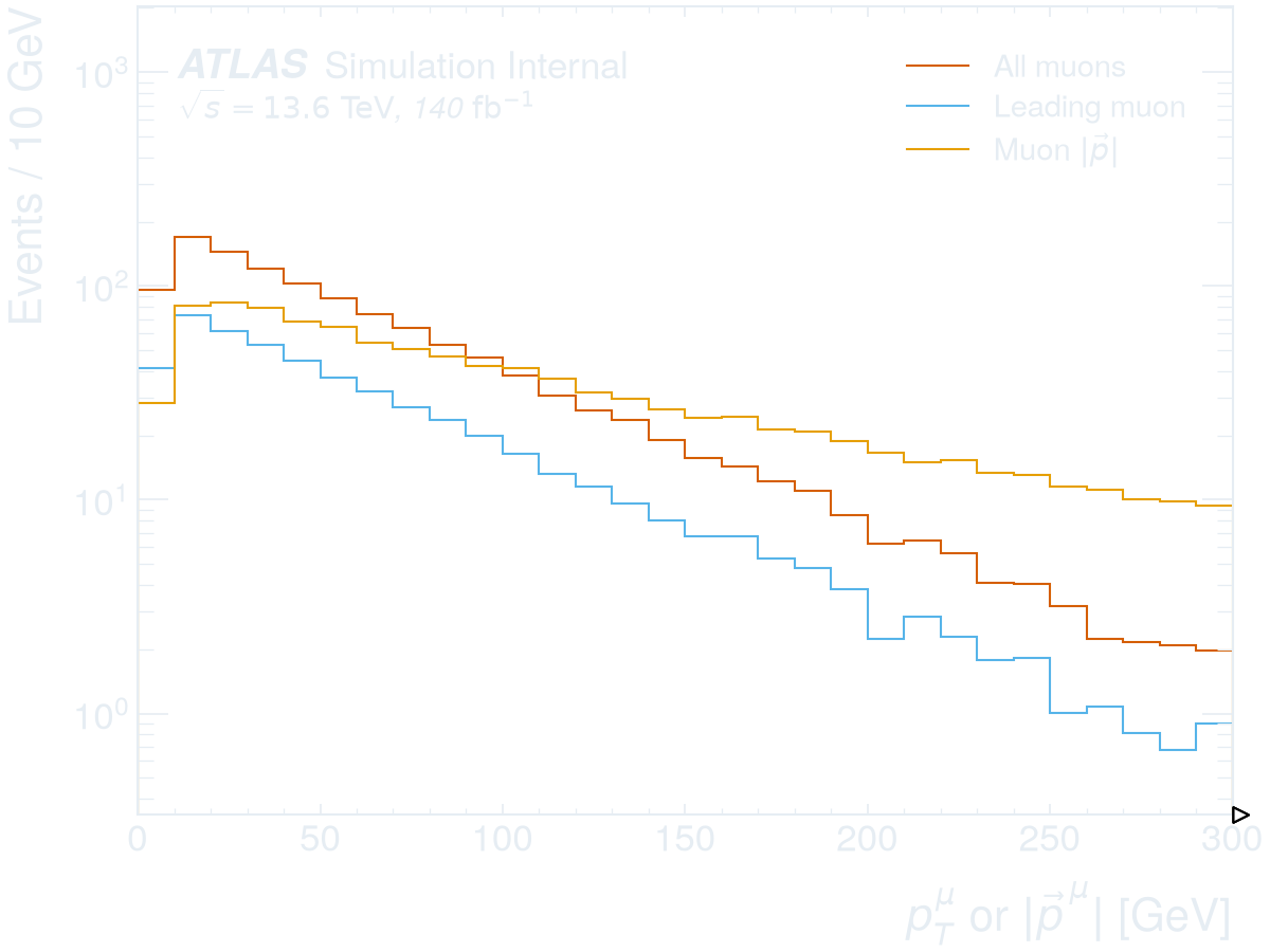
Beyond one dimension
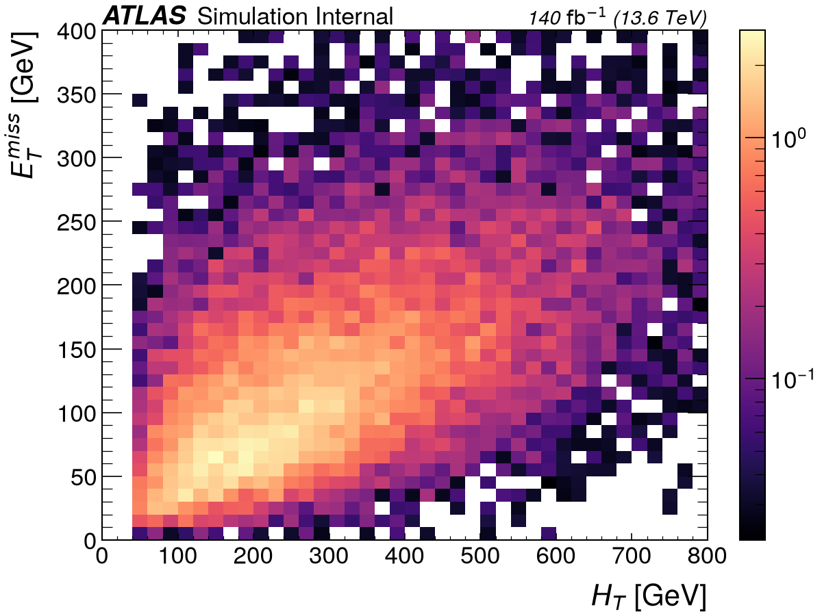
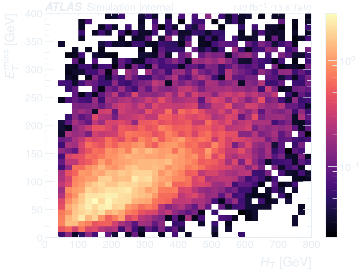
Appearance
Getting started
Simulation and data
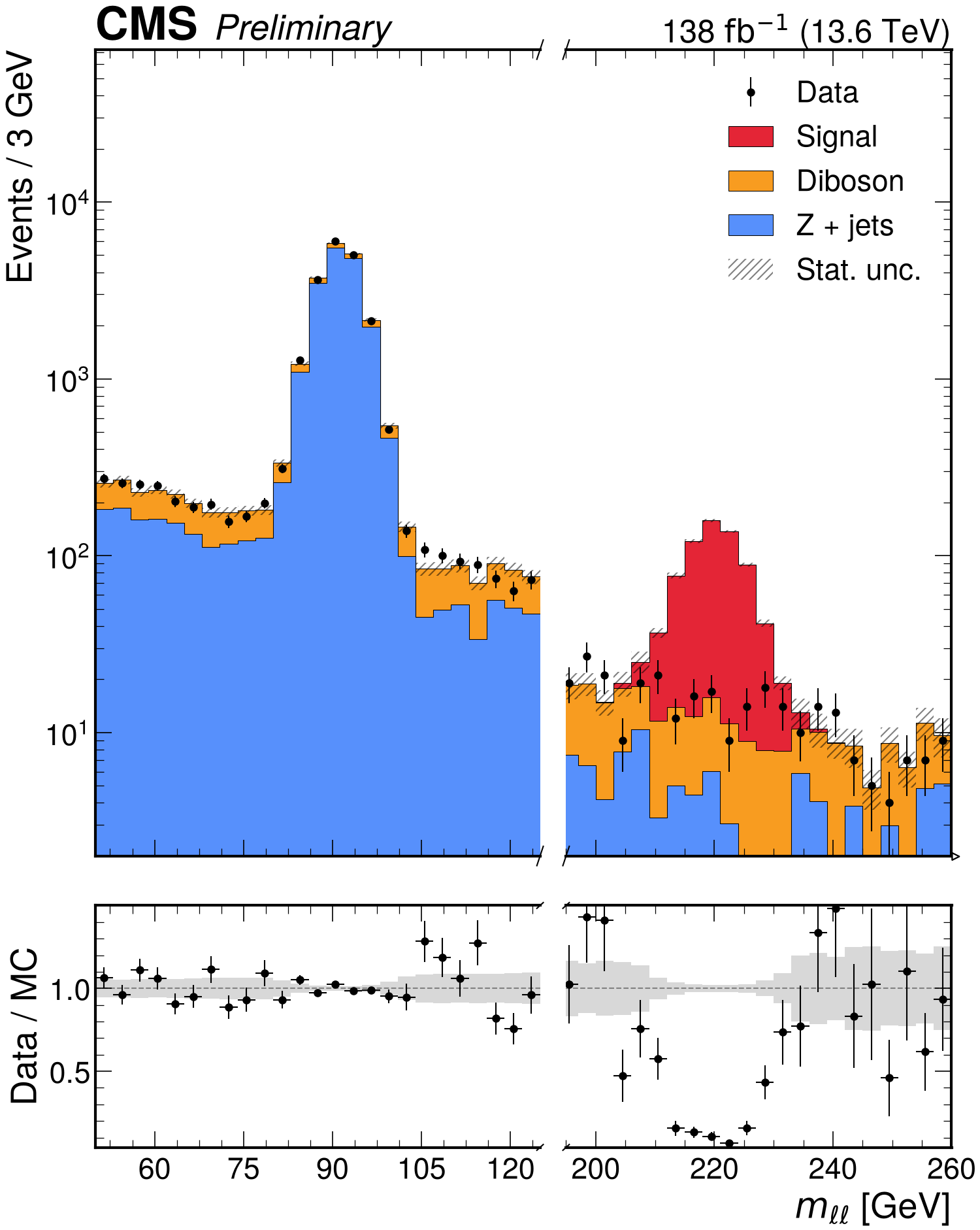
Binning and ranges
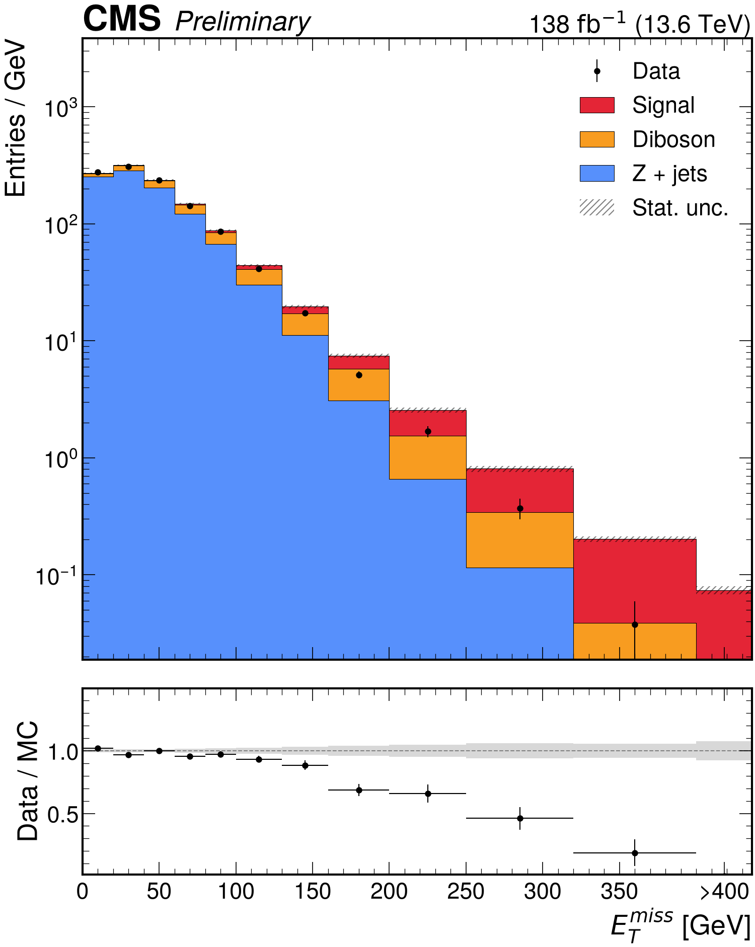
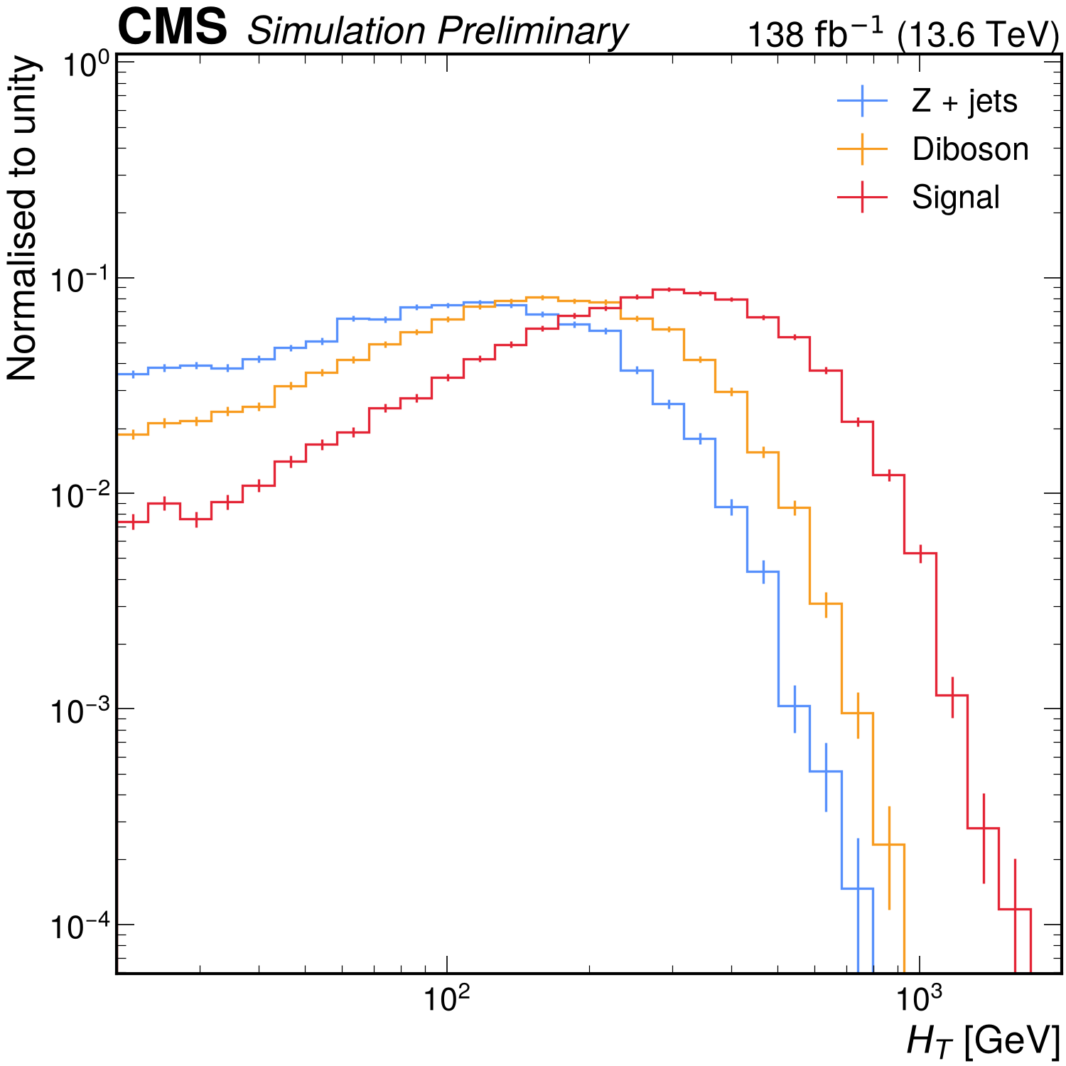
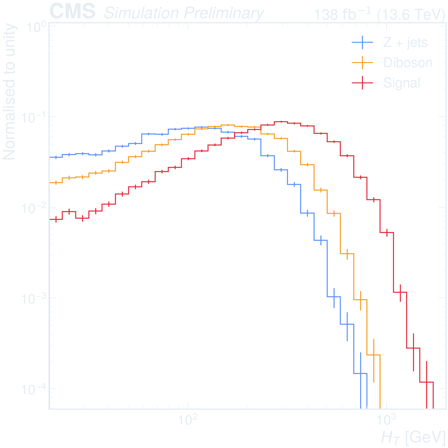
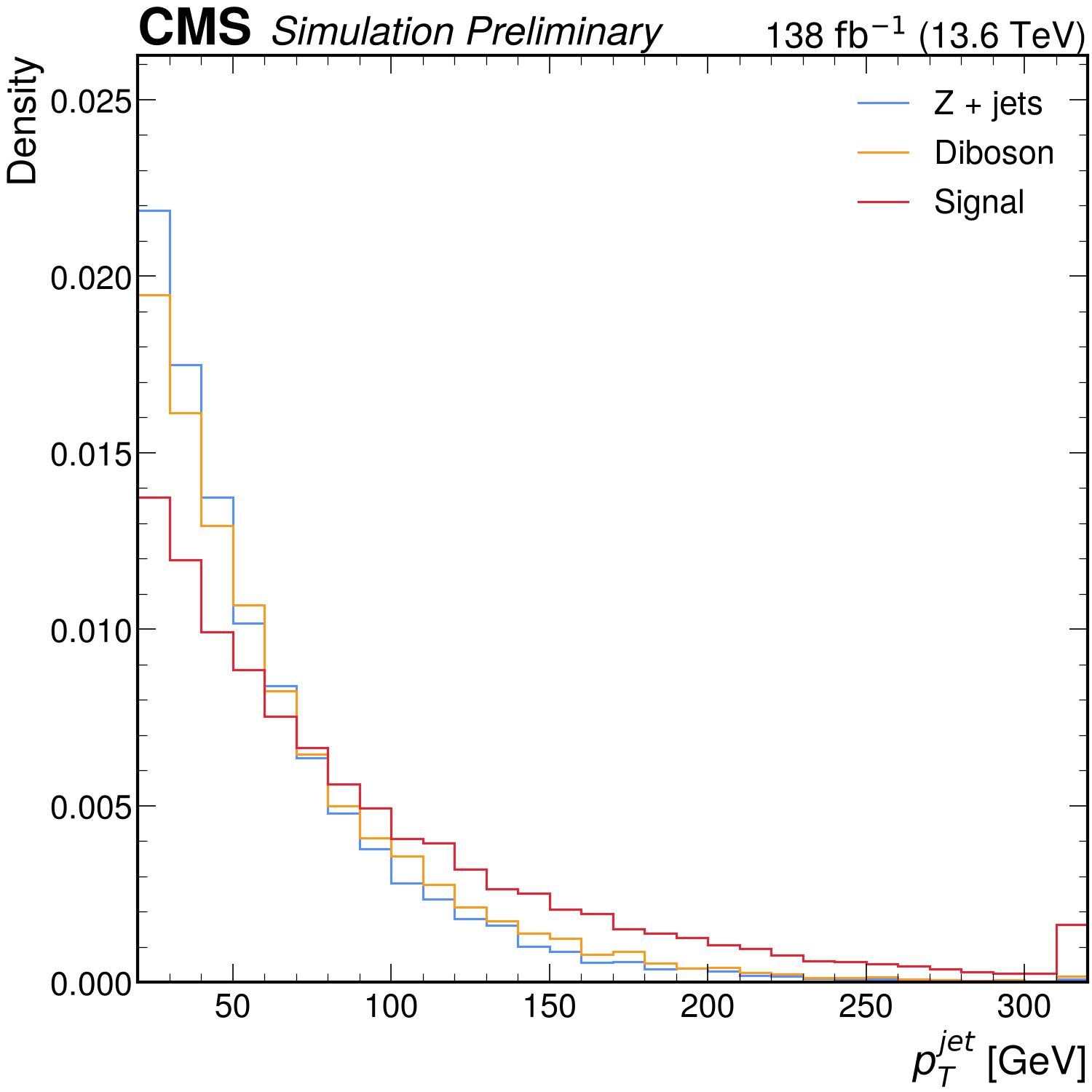
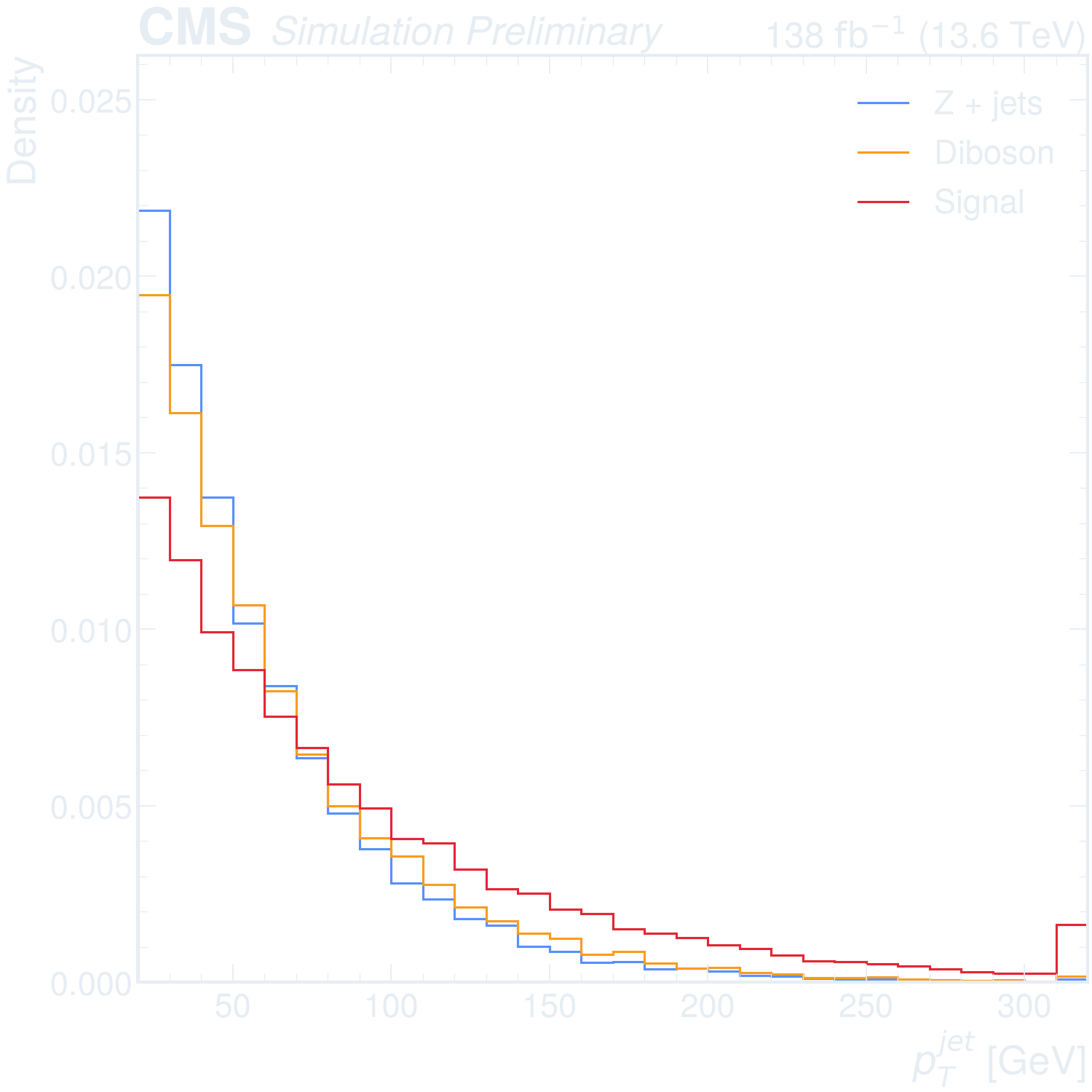
Selections and expressions
Beyond one dimension
Appearance
Getting started
Simulation and data
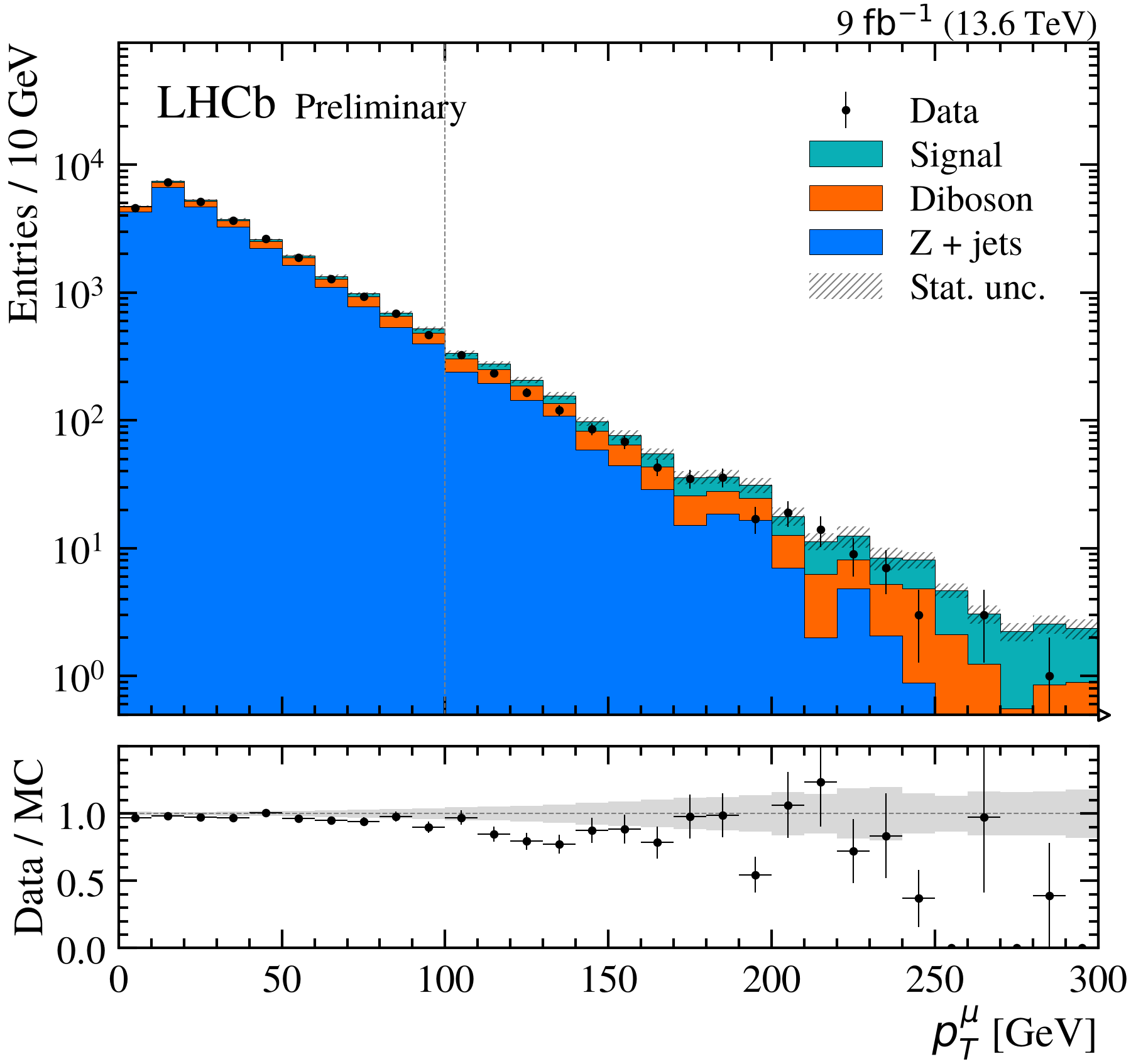
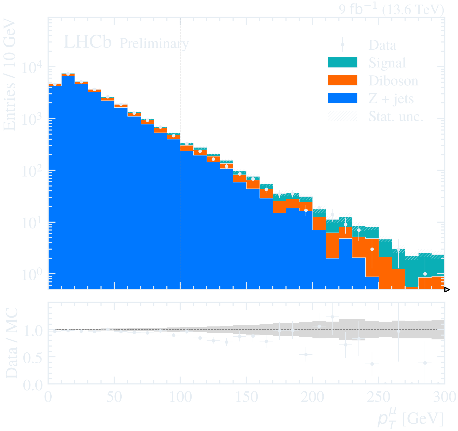
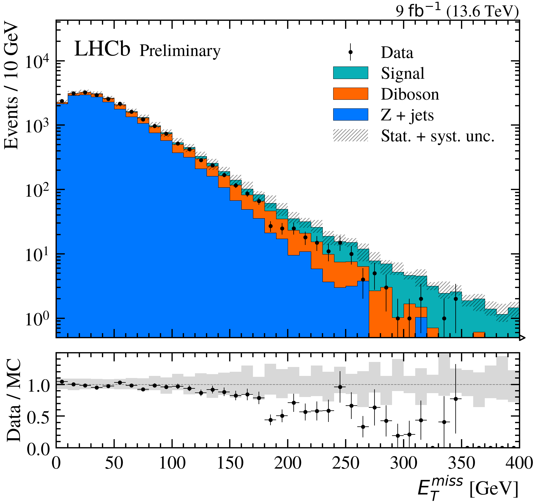
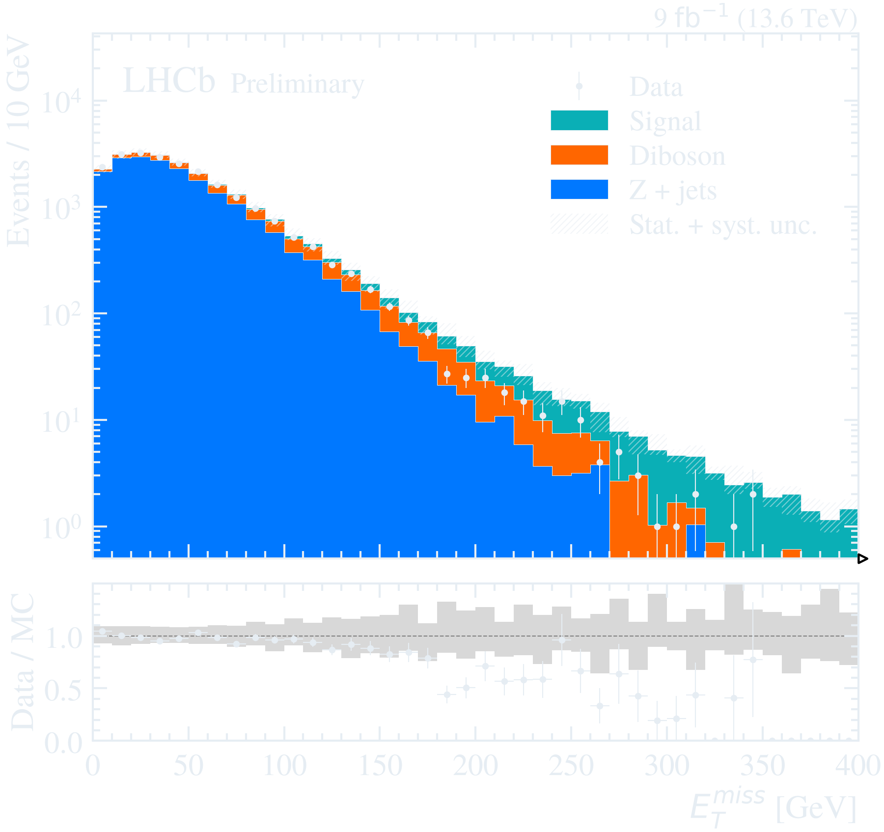
Binning and ranges
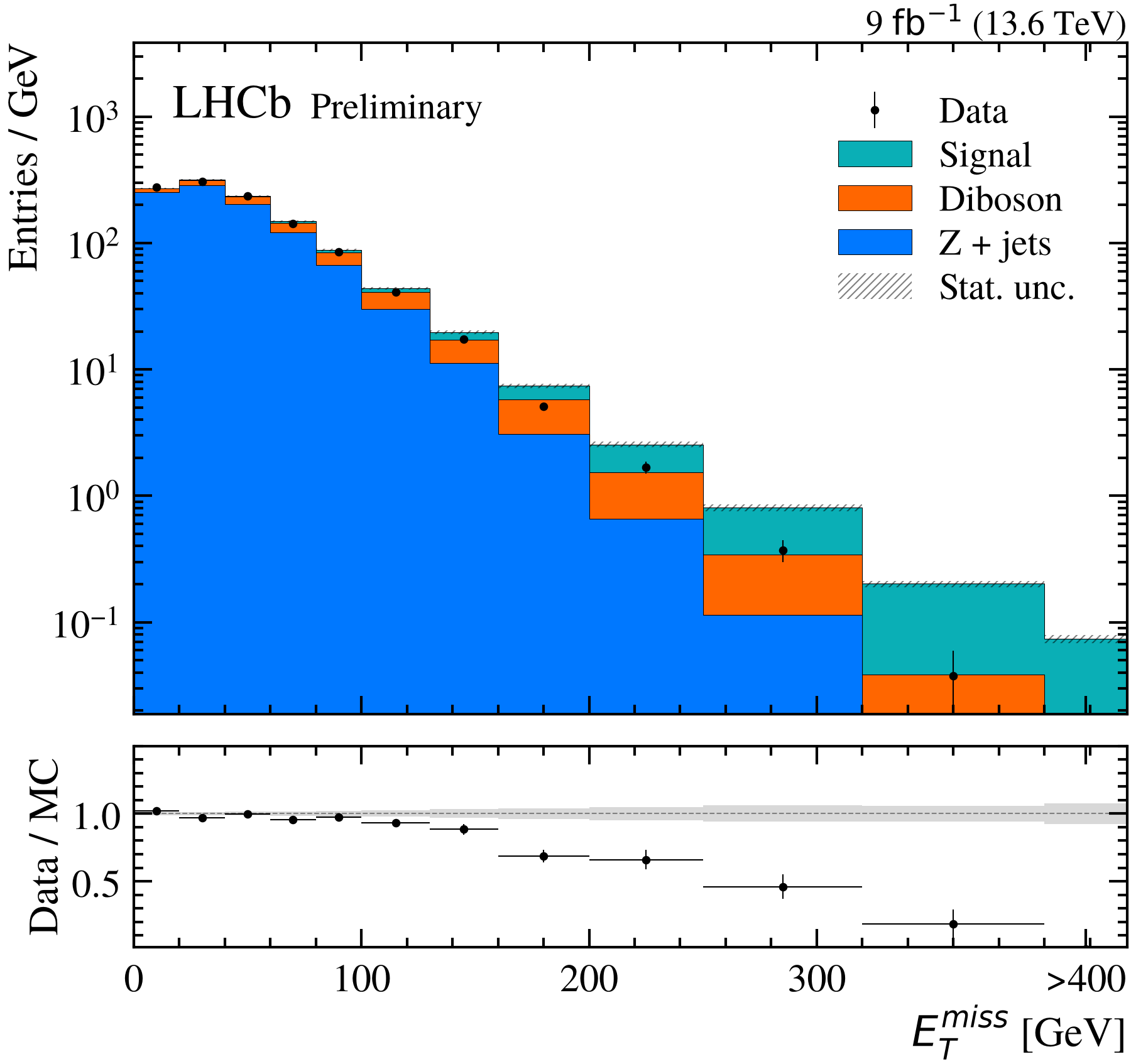
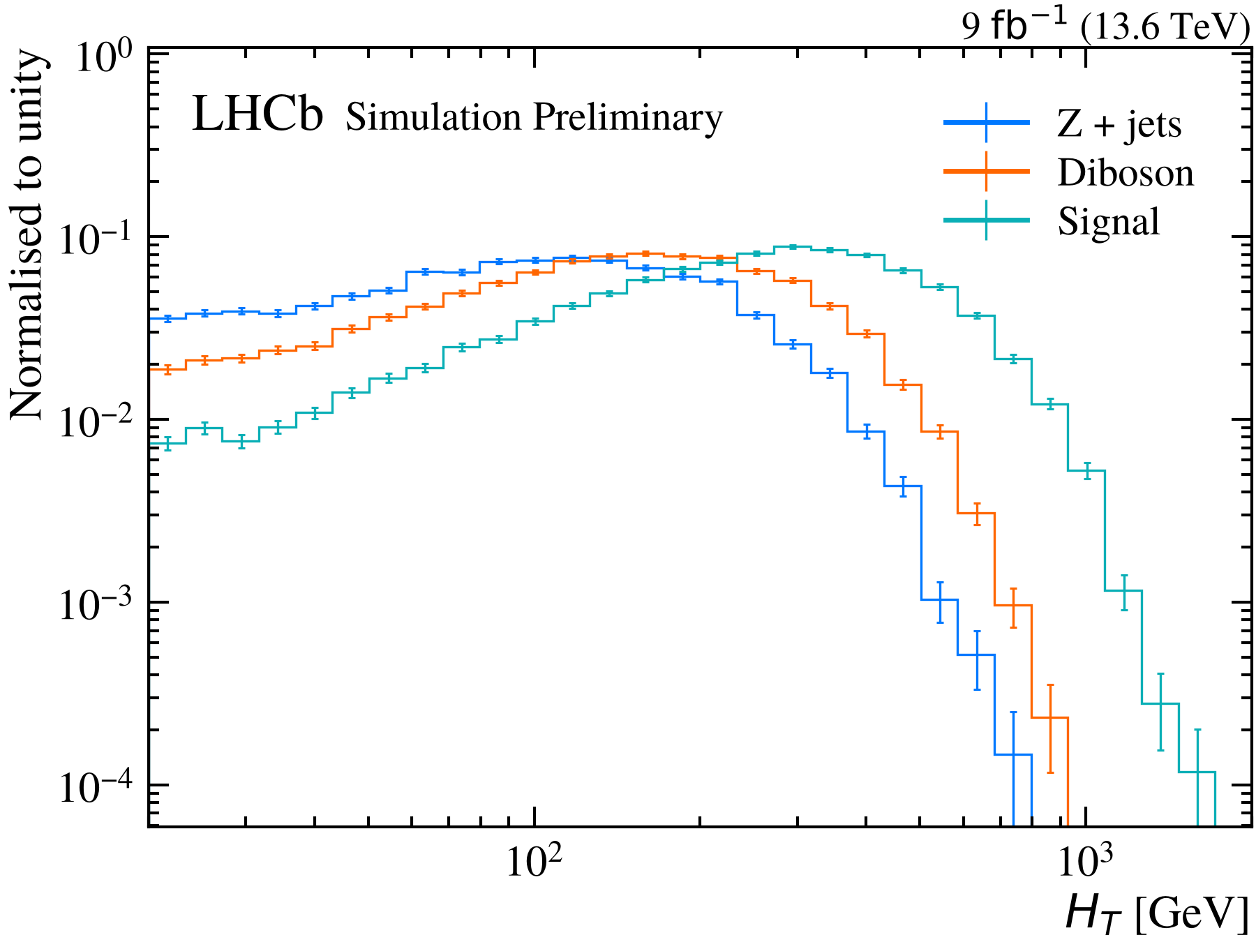
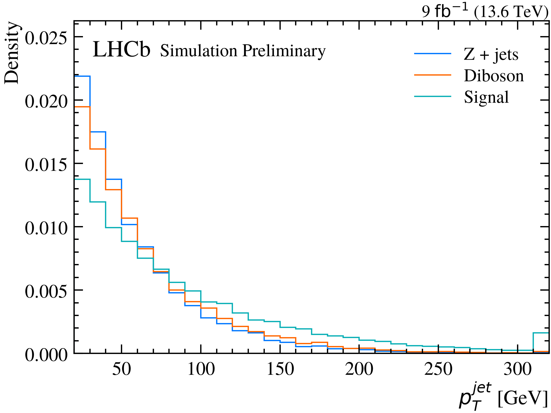
Selections and expressions
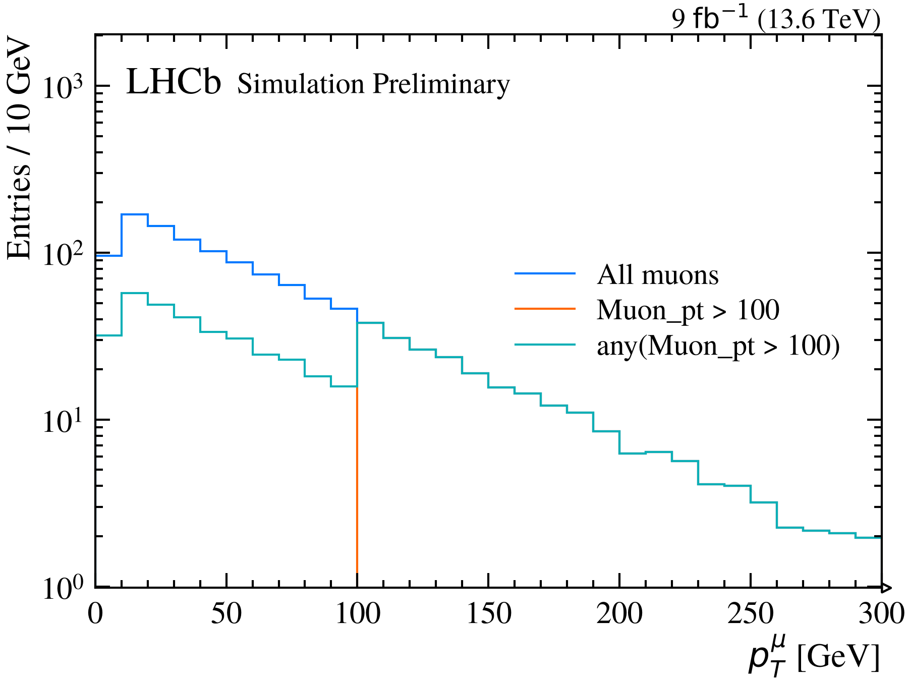
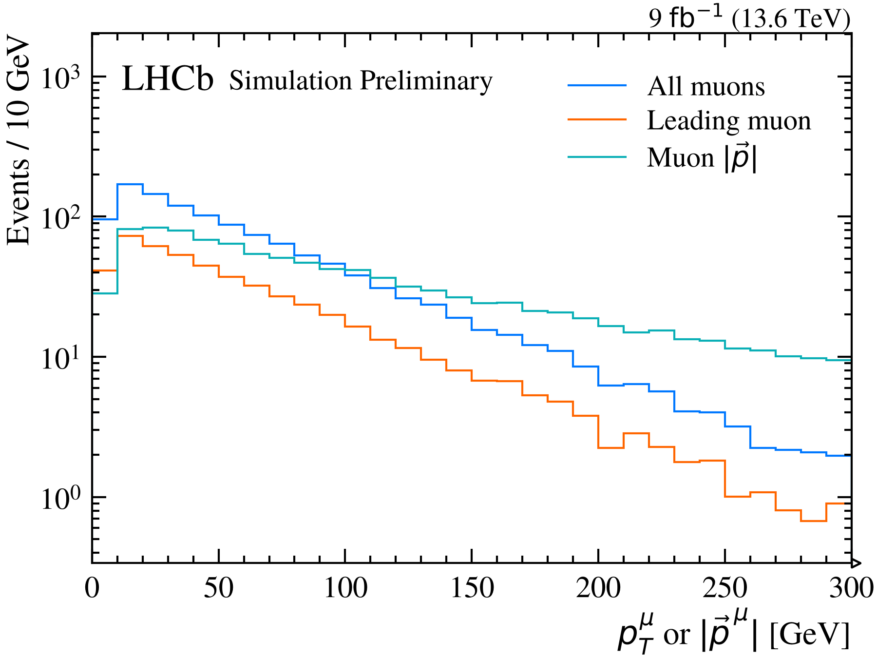
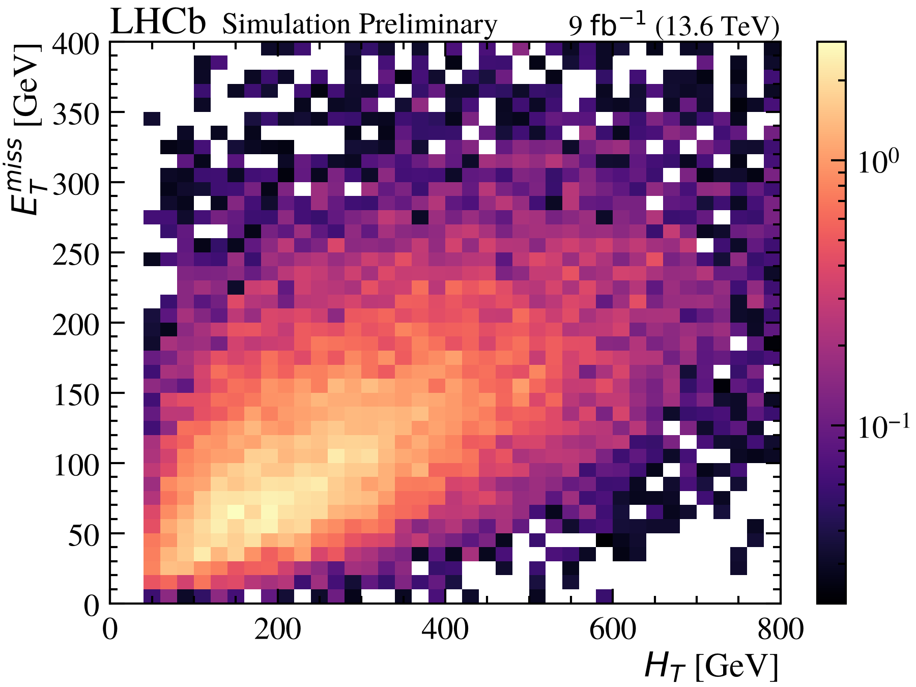
Beyond one dimension
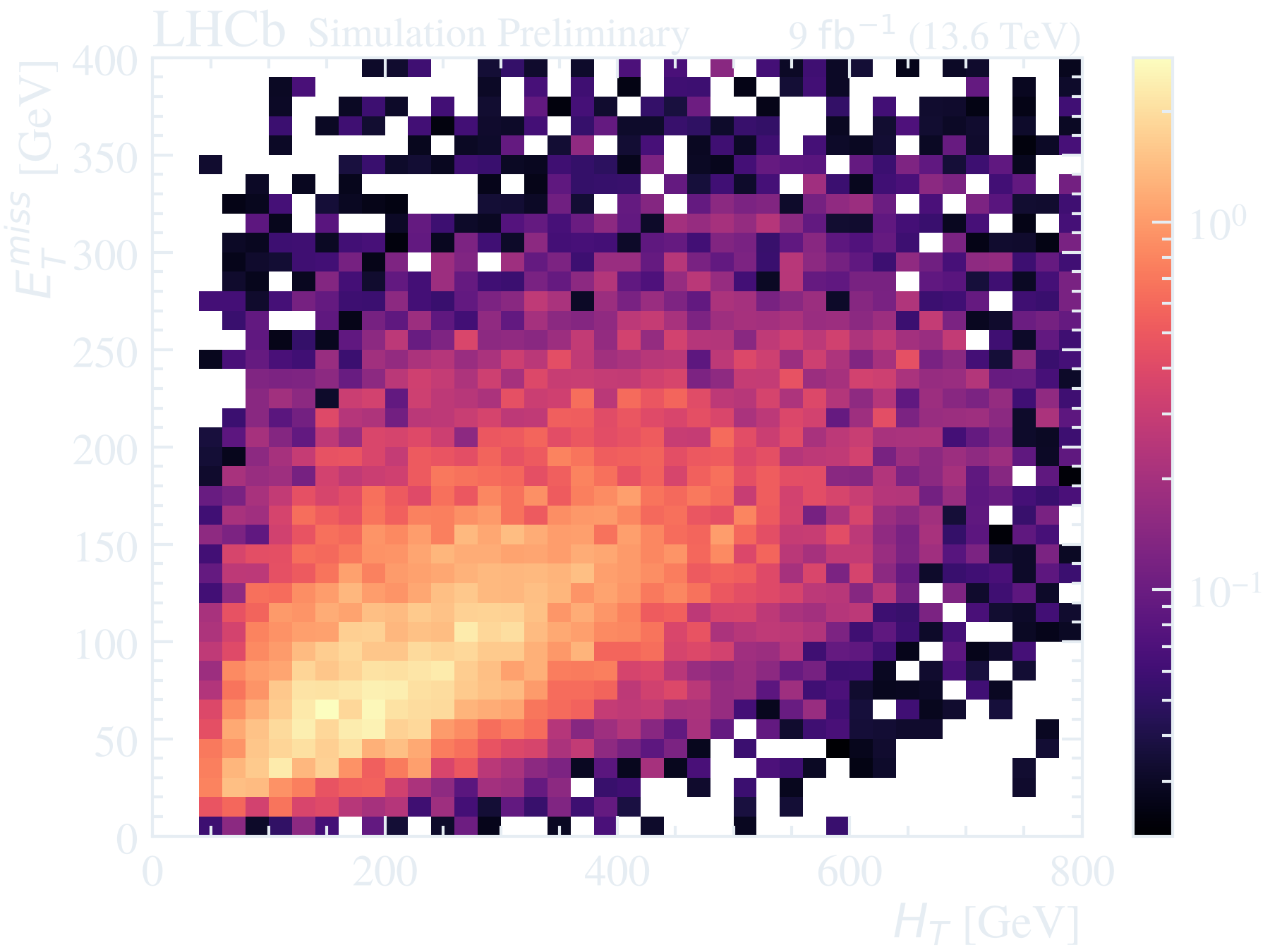
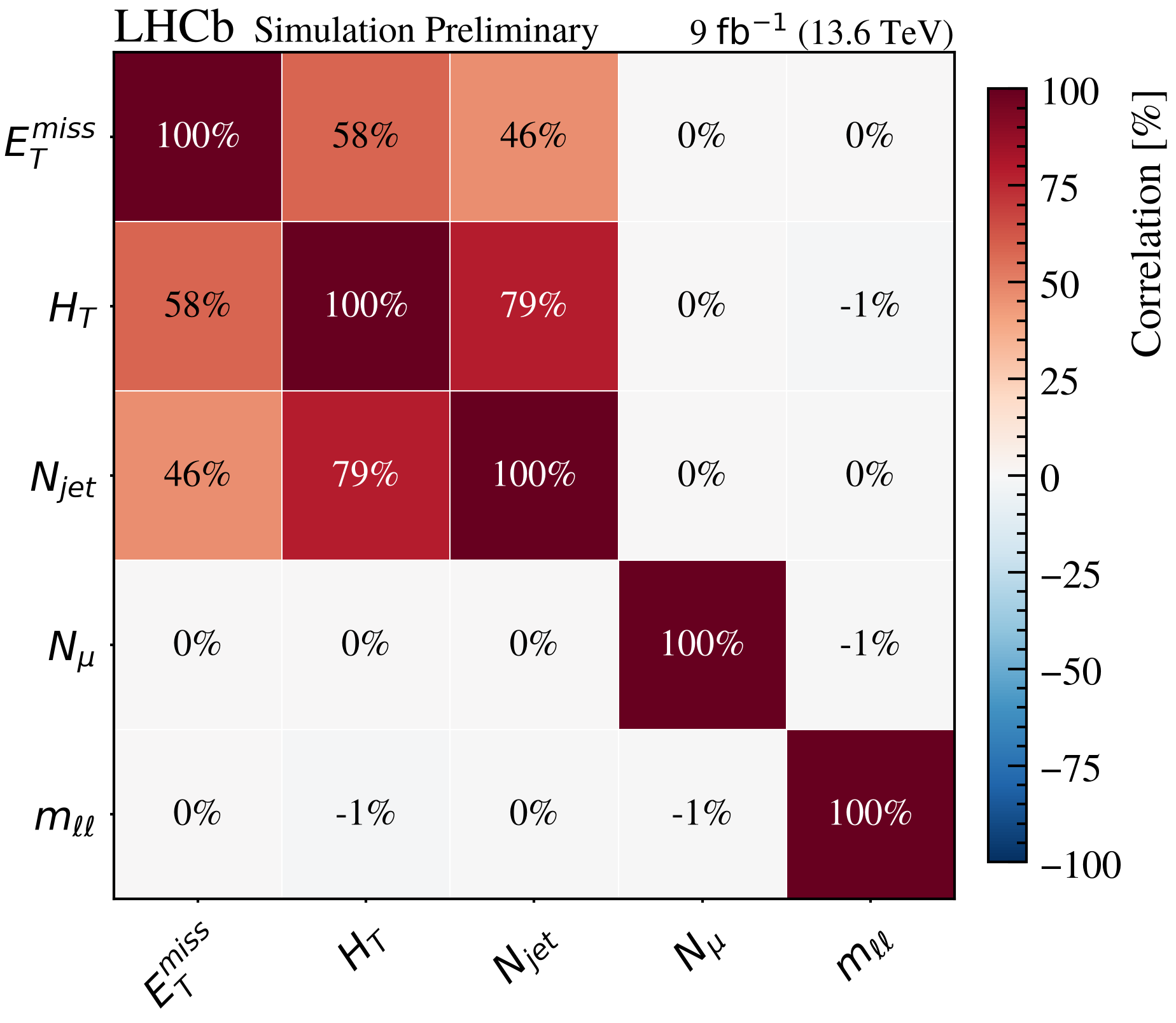
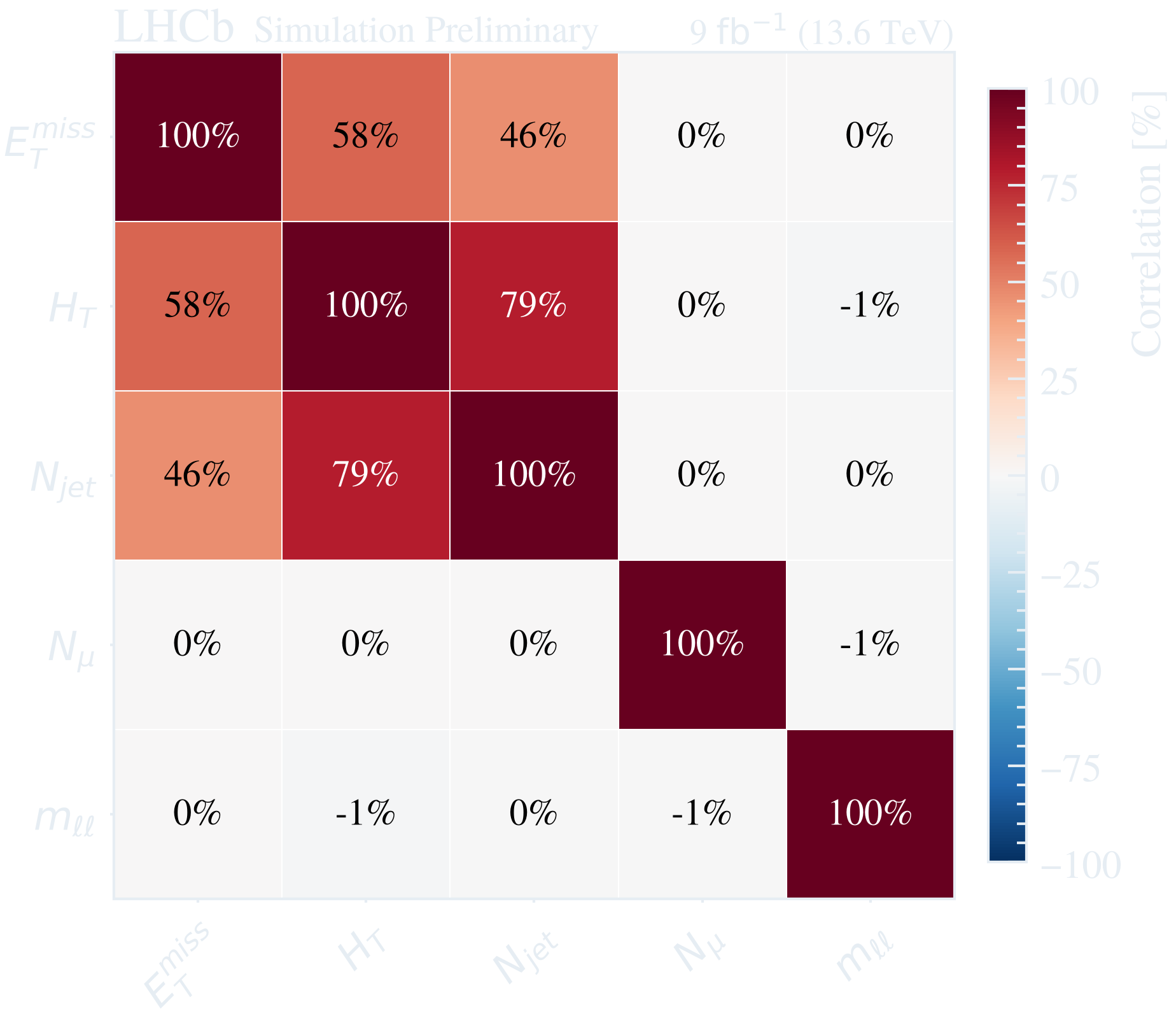
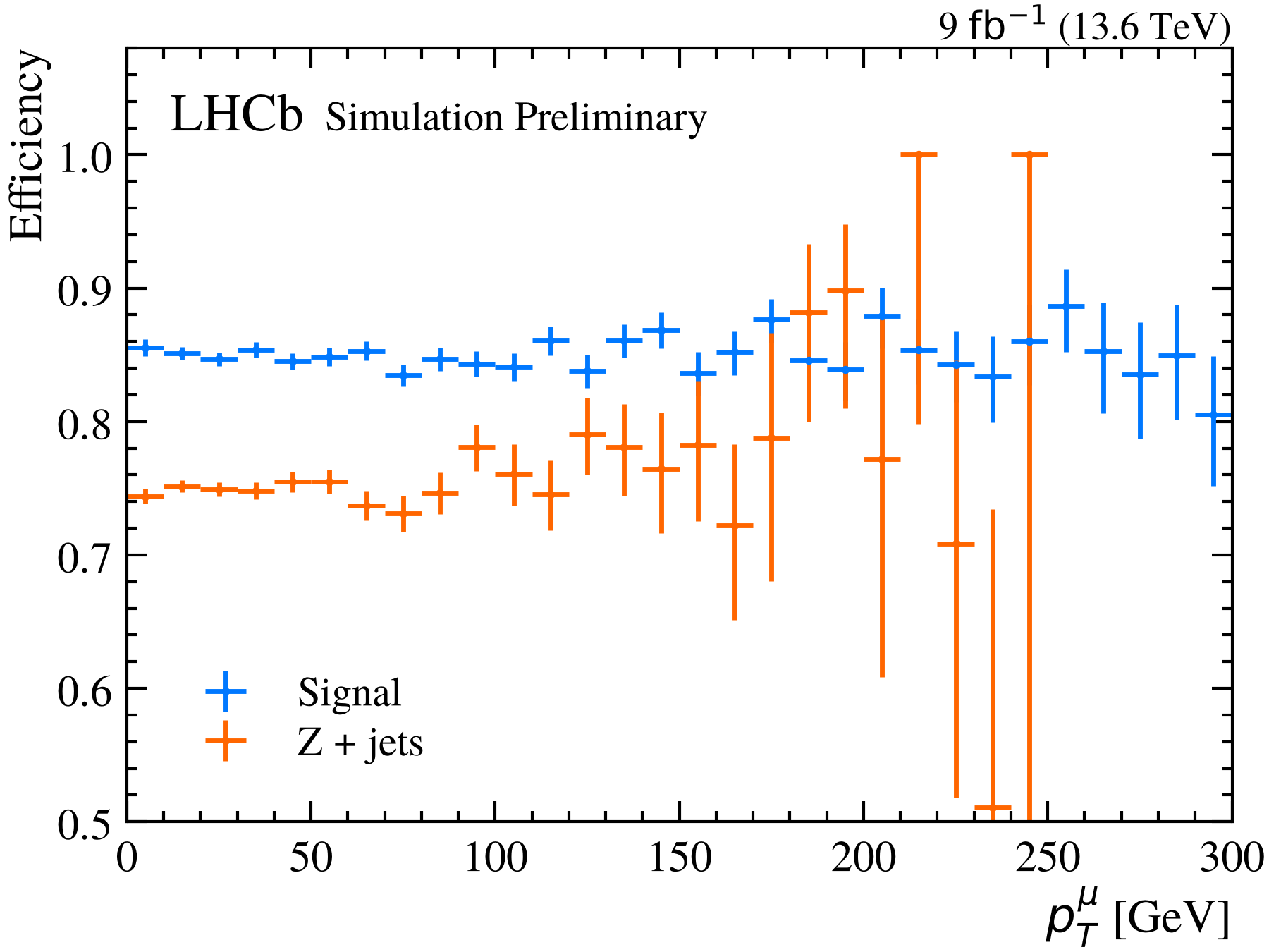
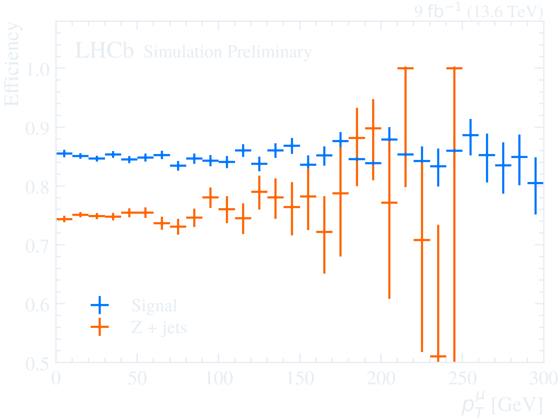
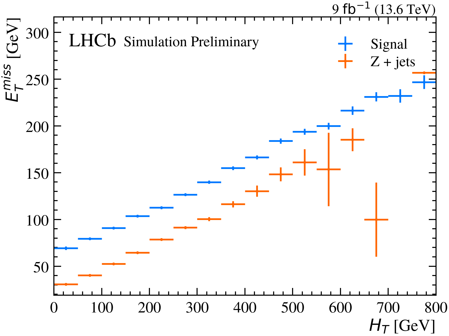
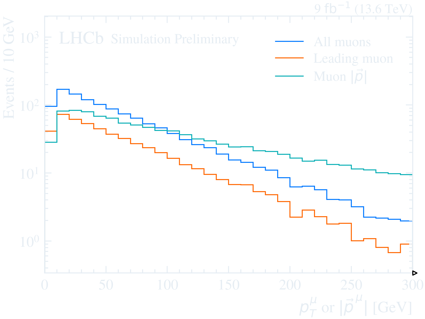
Appearance
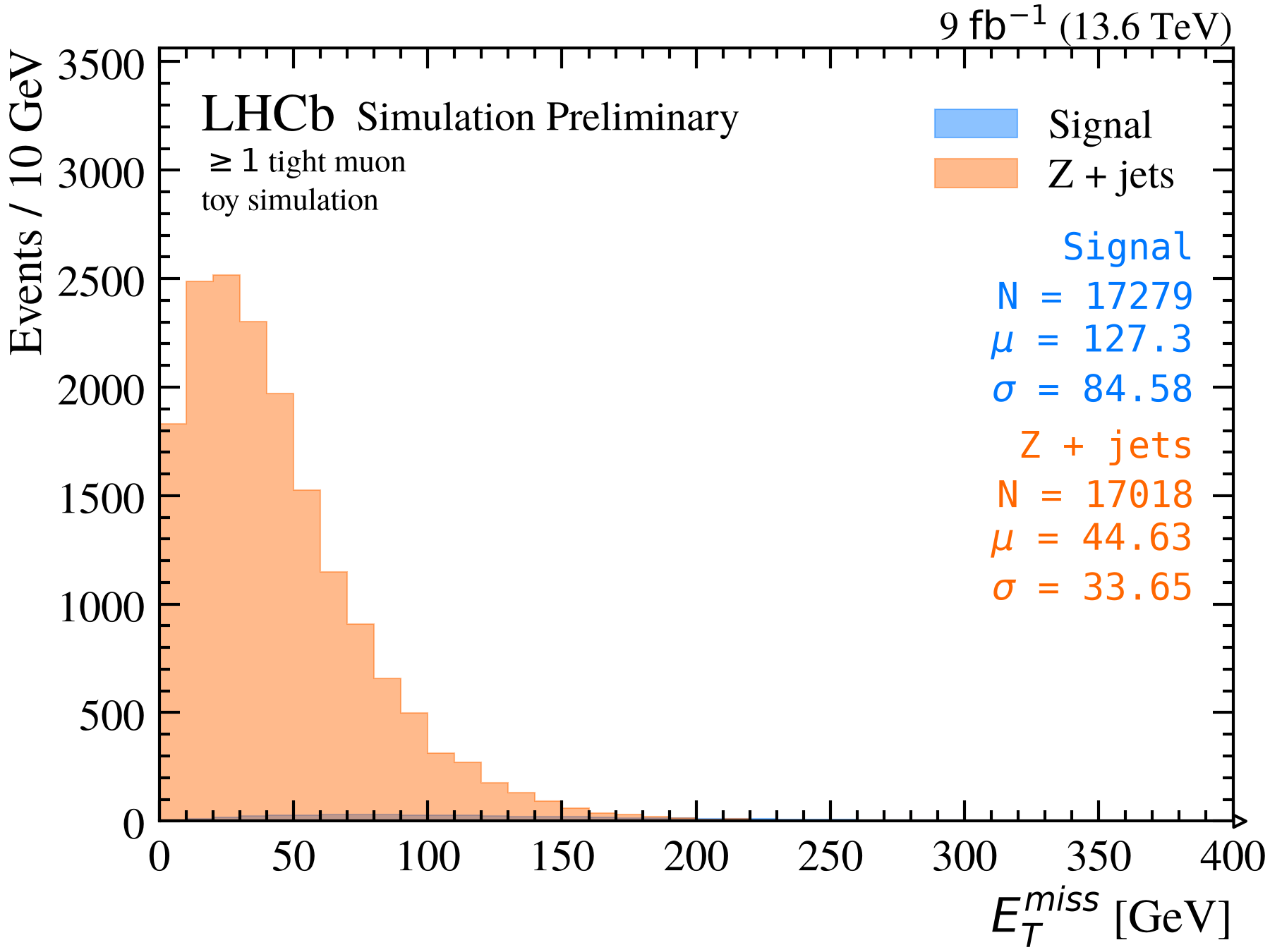
Getting started
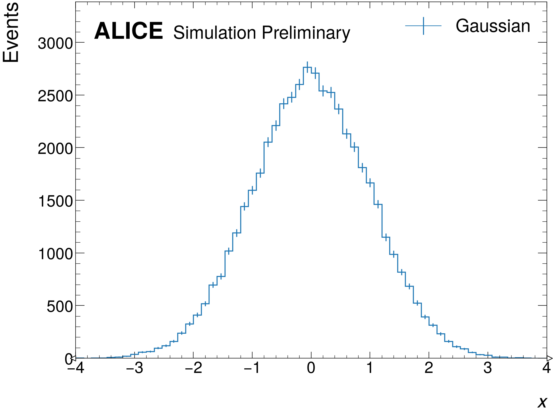
Simulation and data
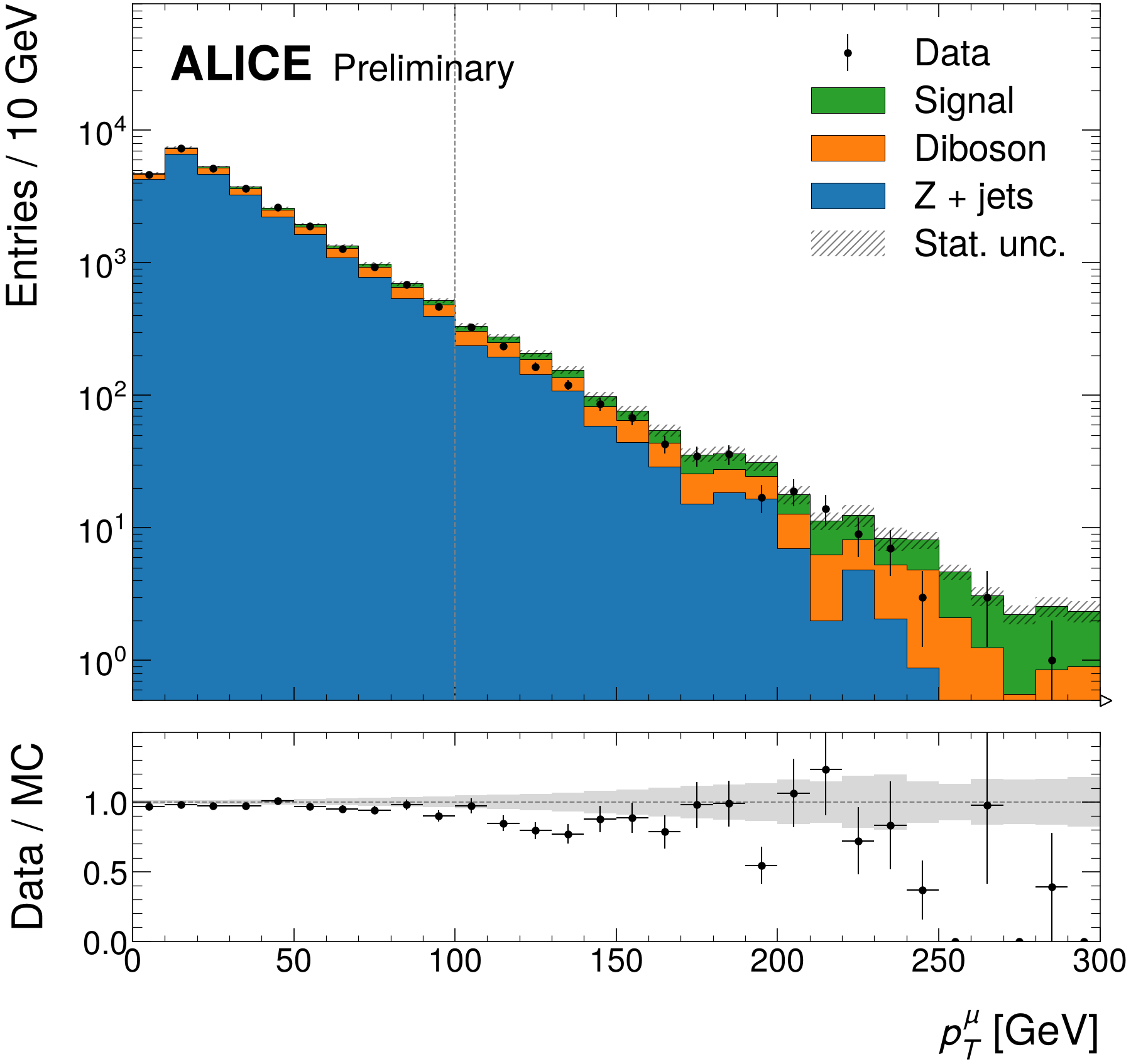
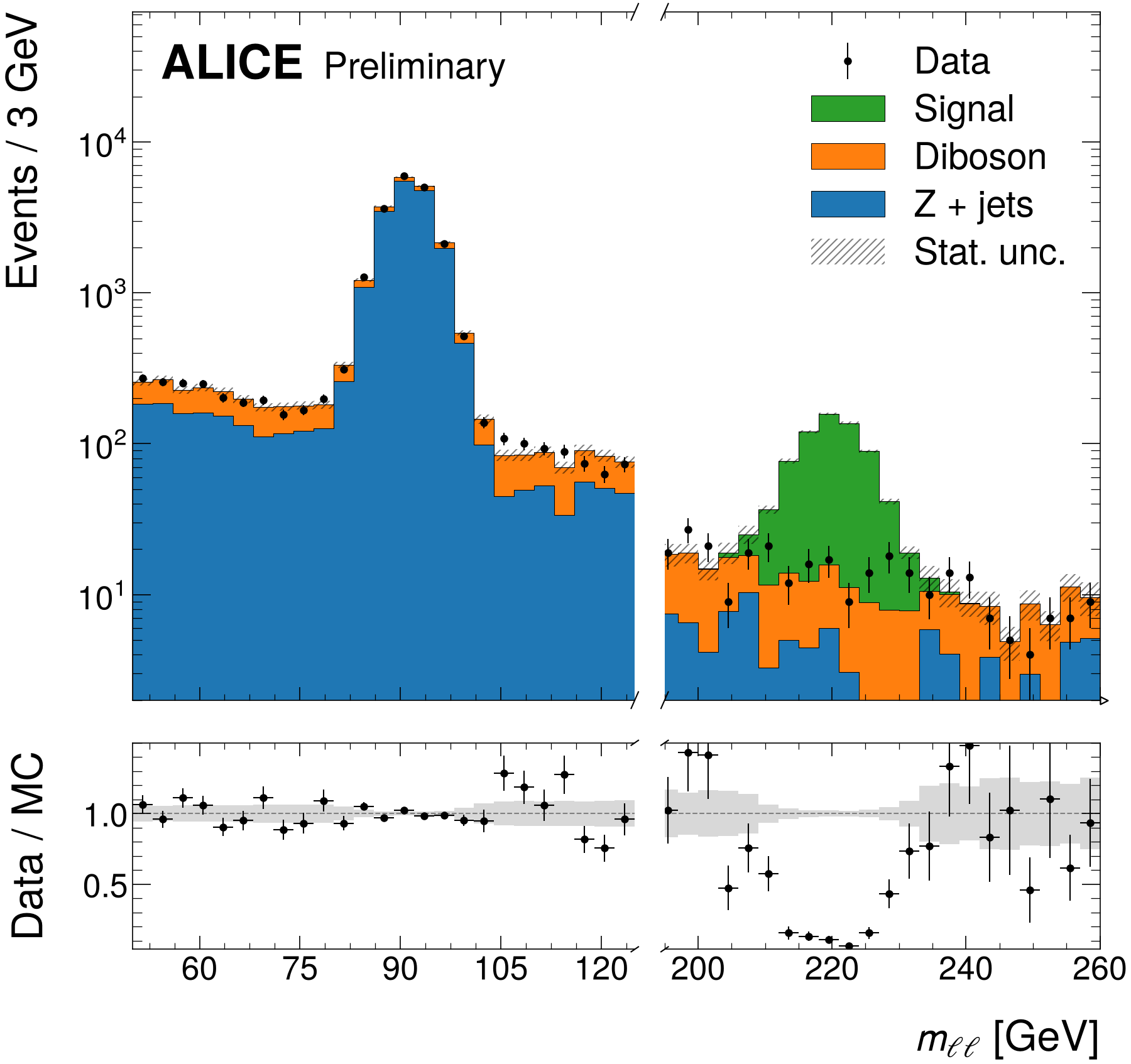
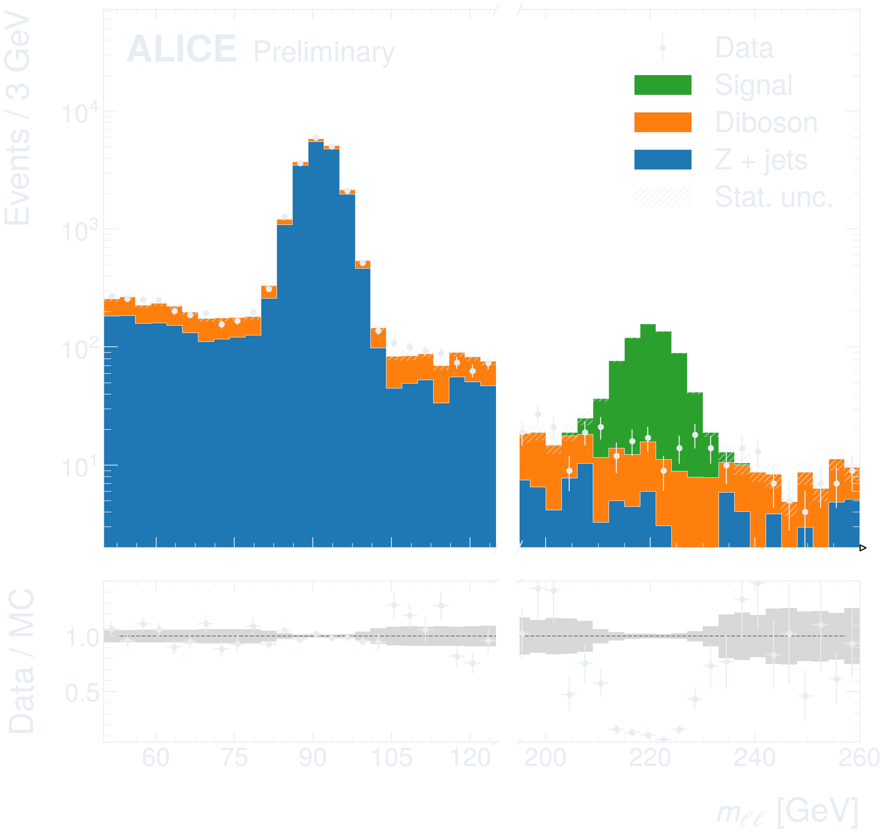
Binning and ranges
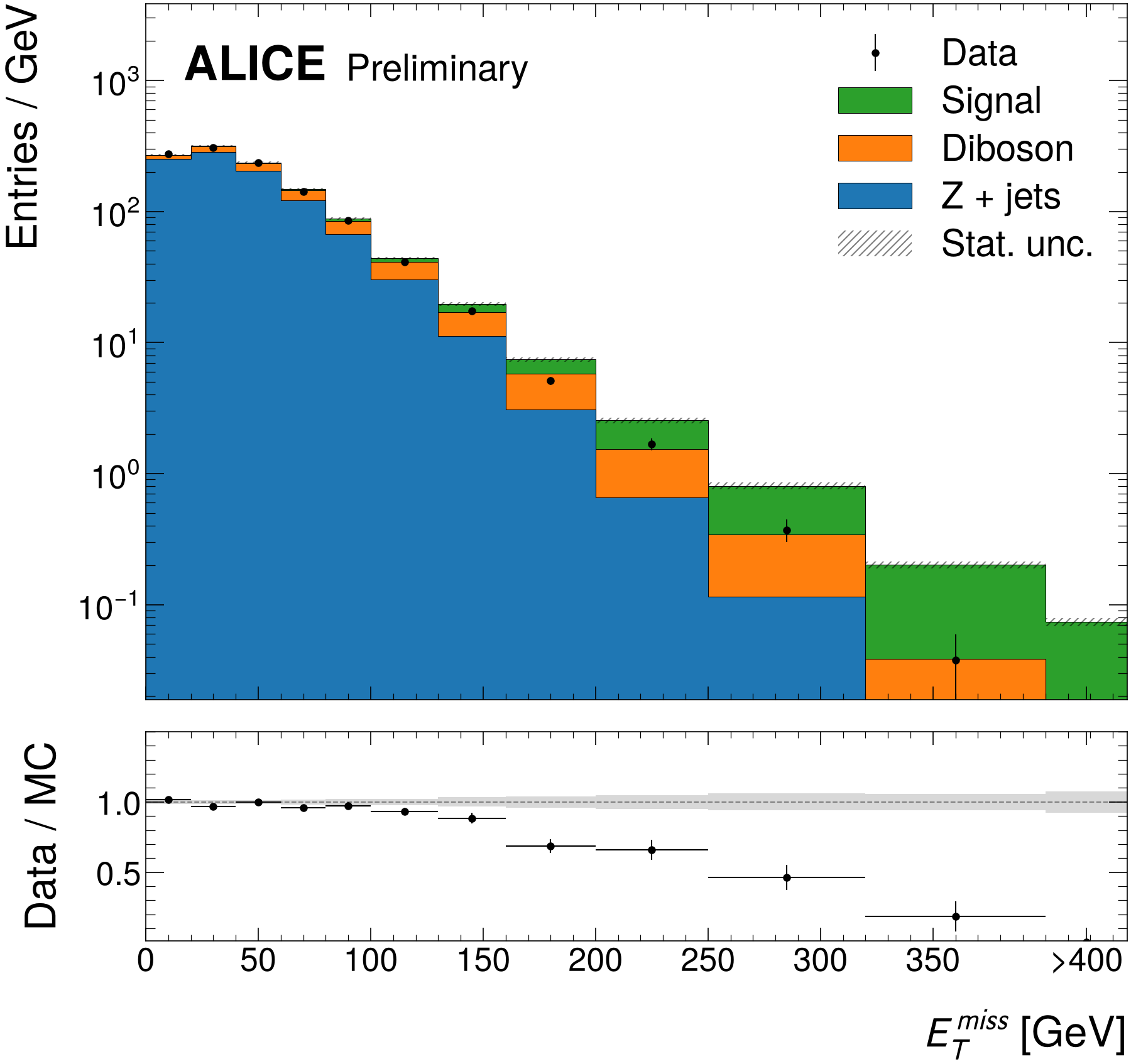
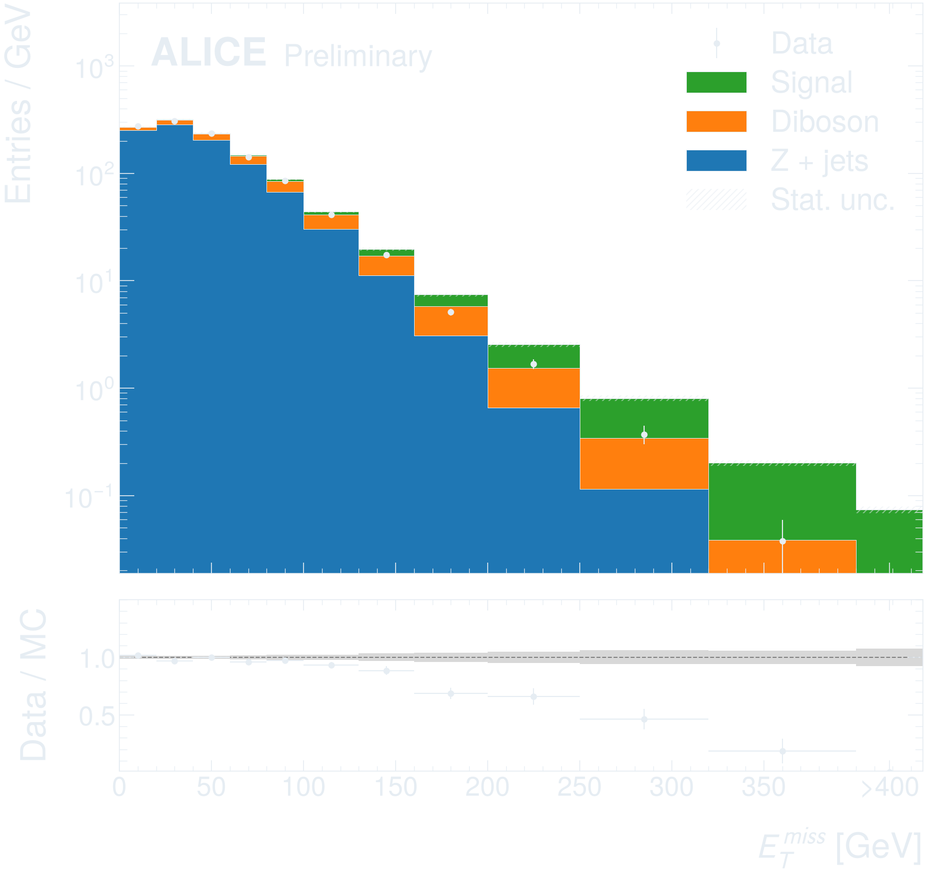
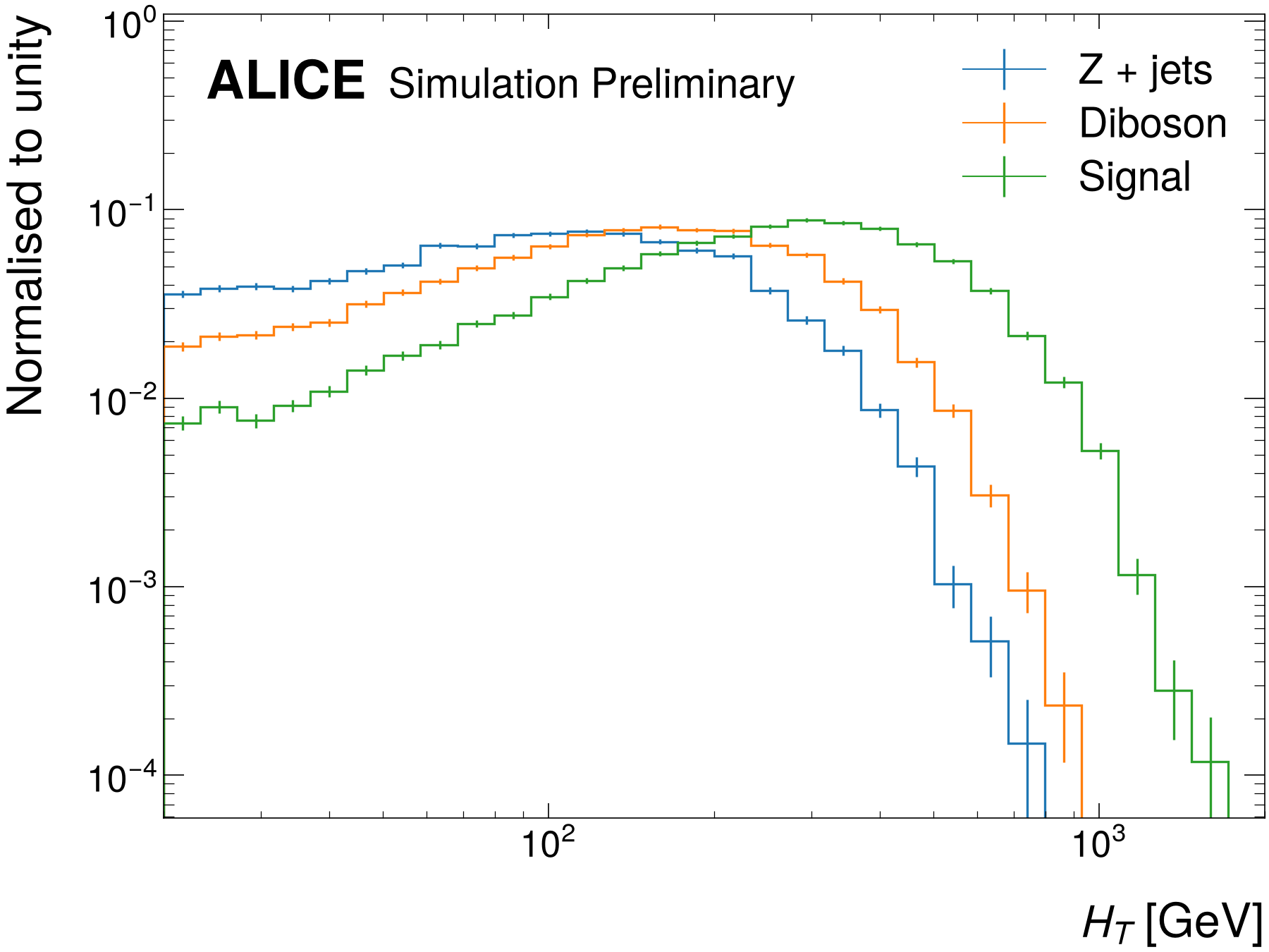
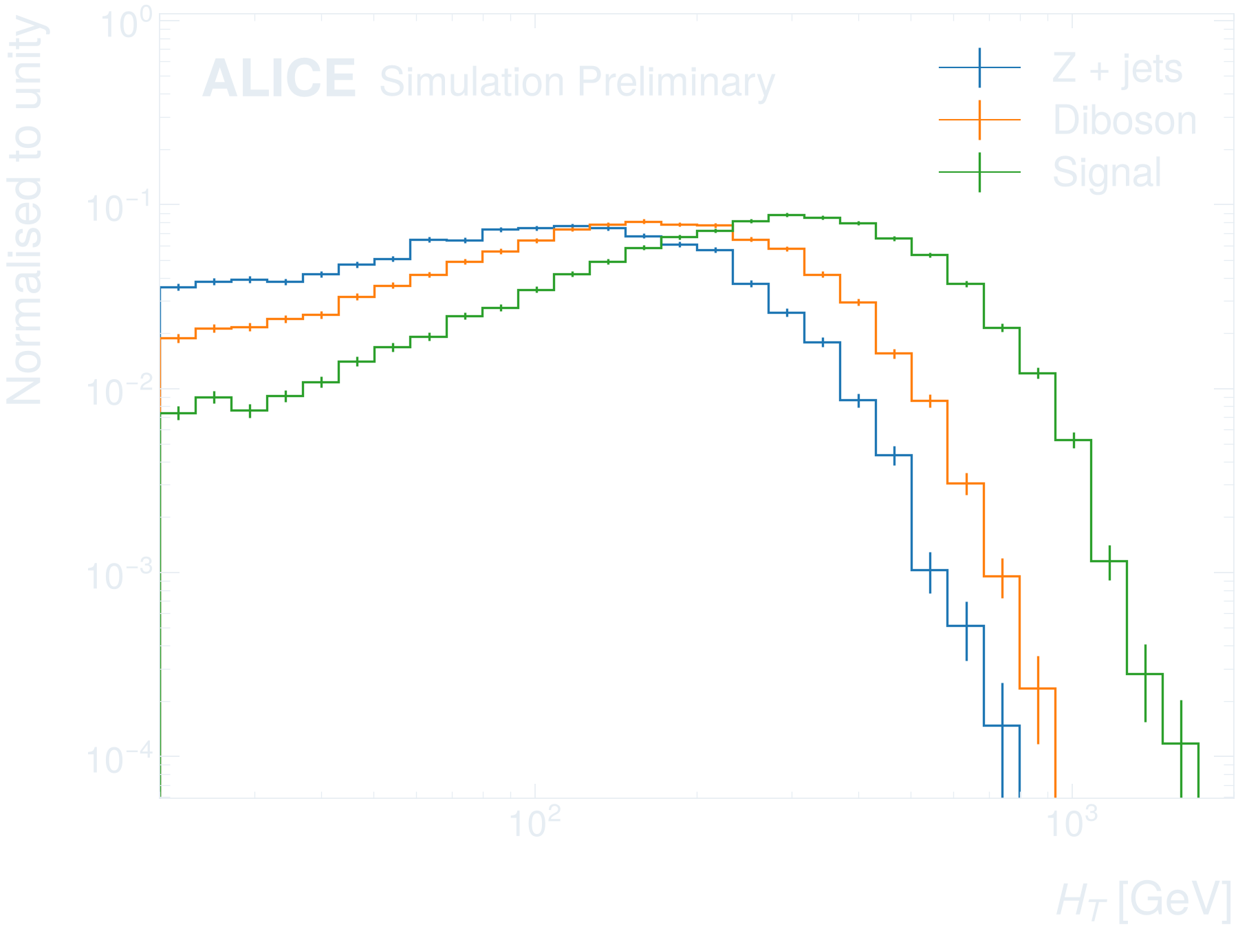
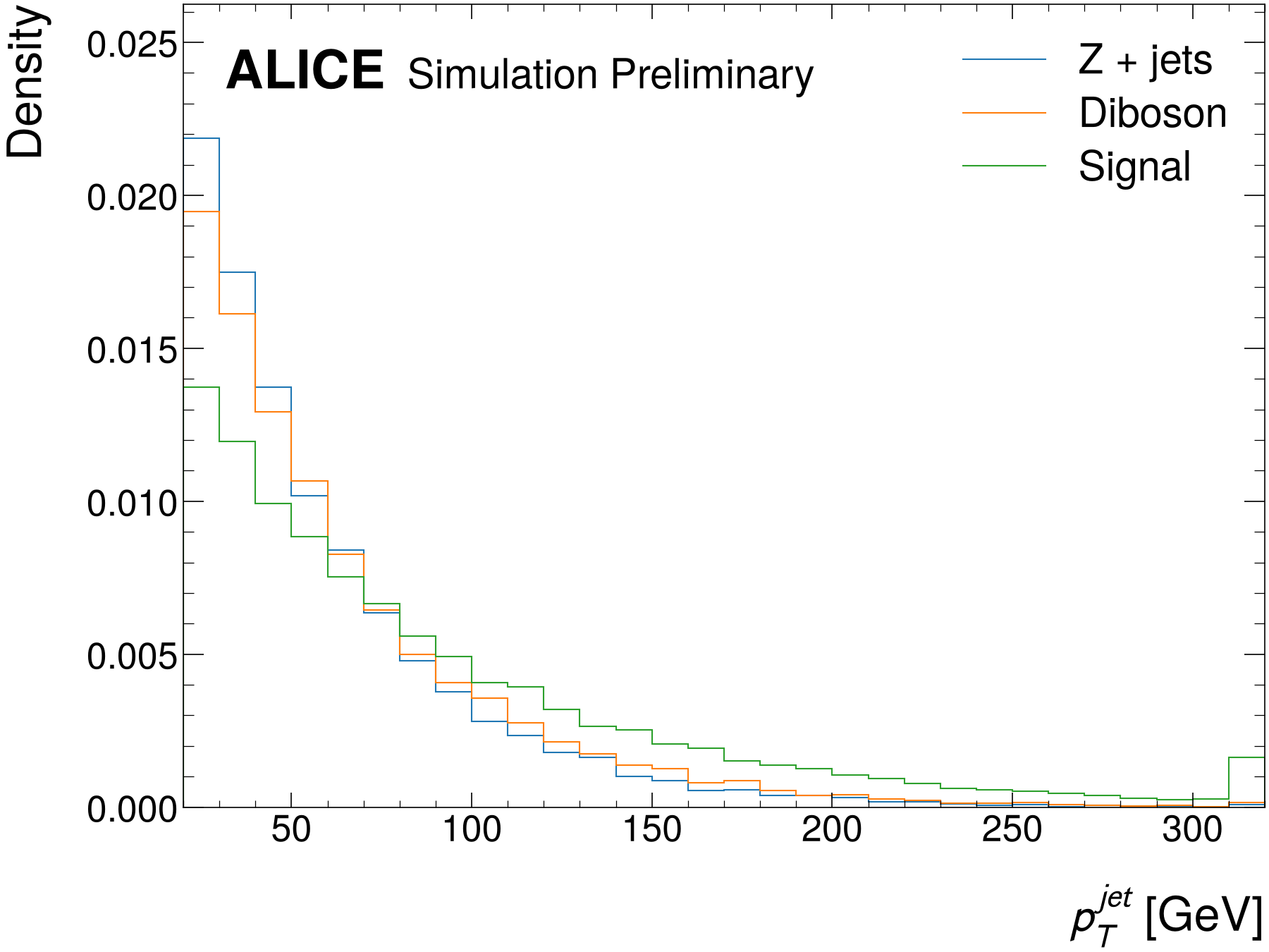
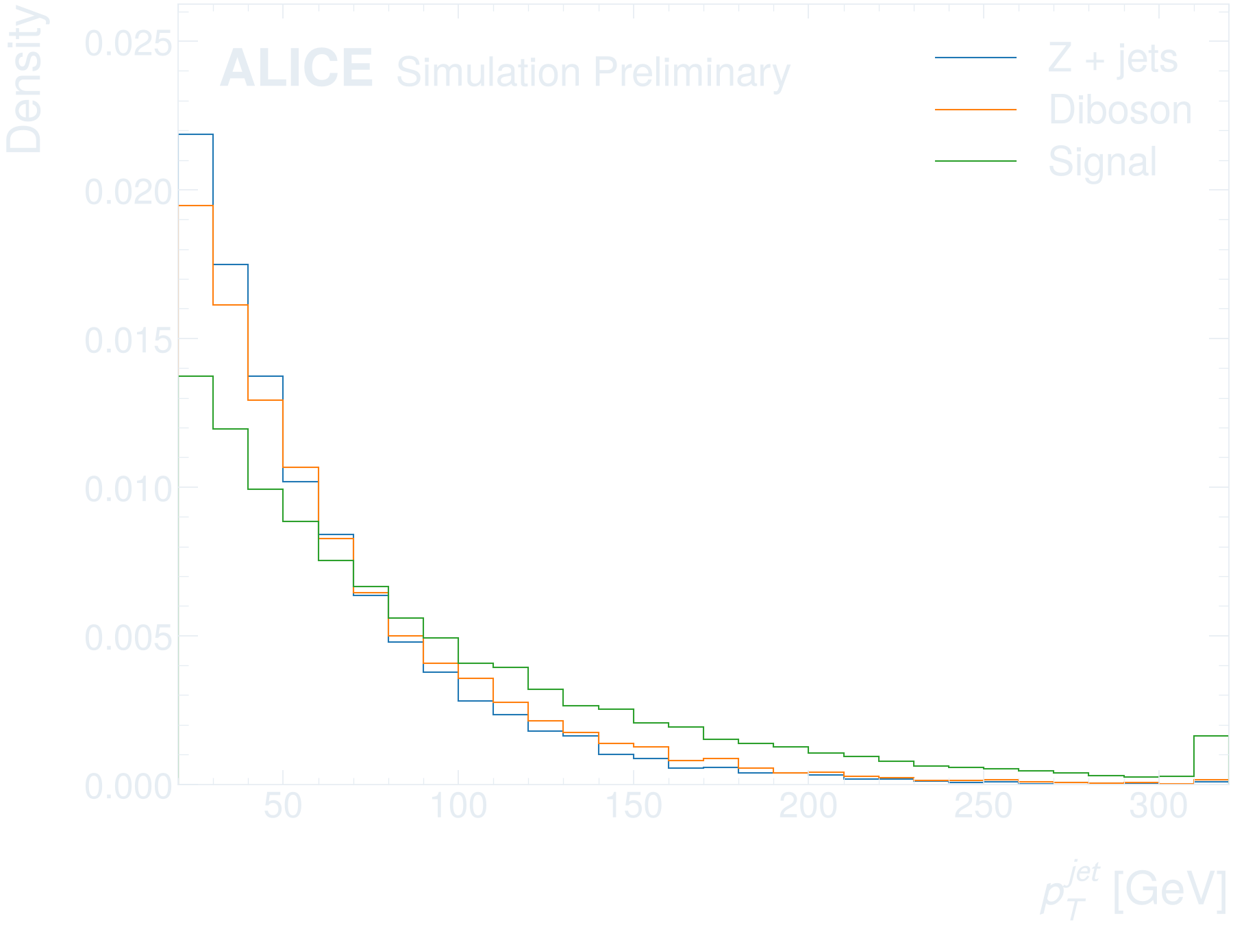
Selections and expressions
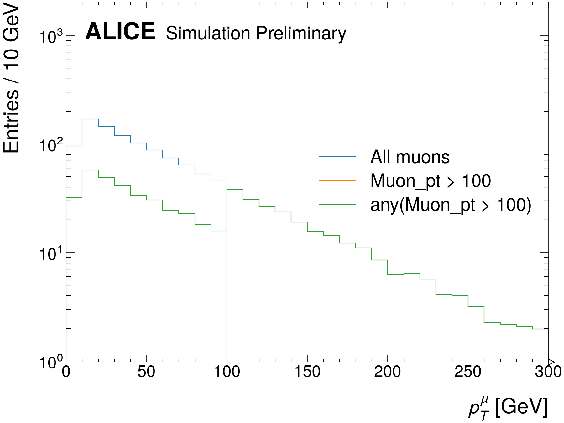
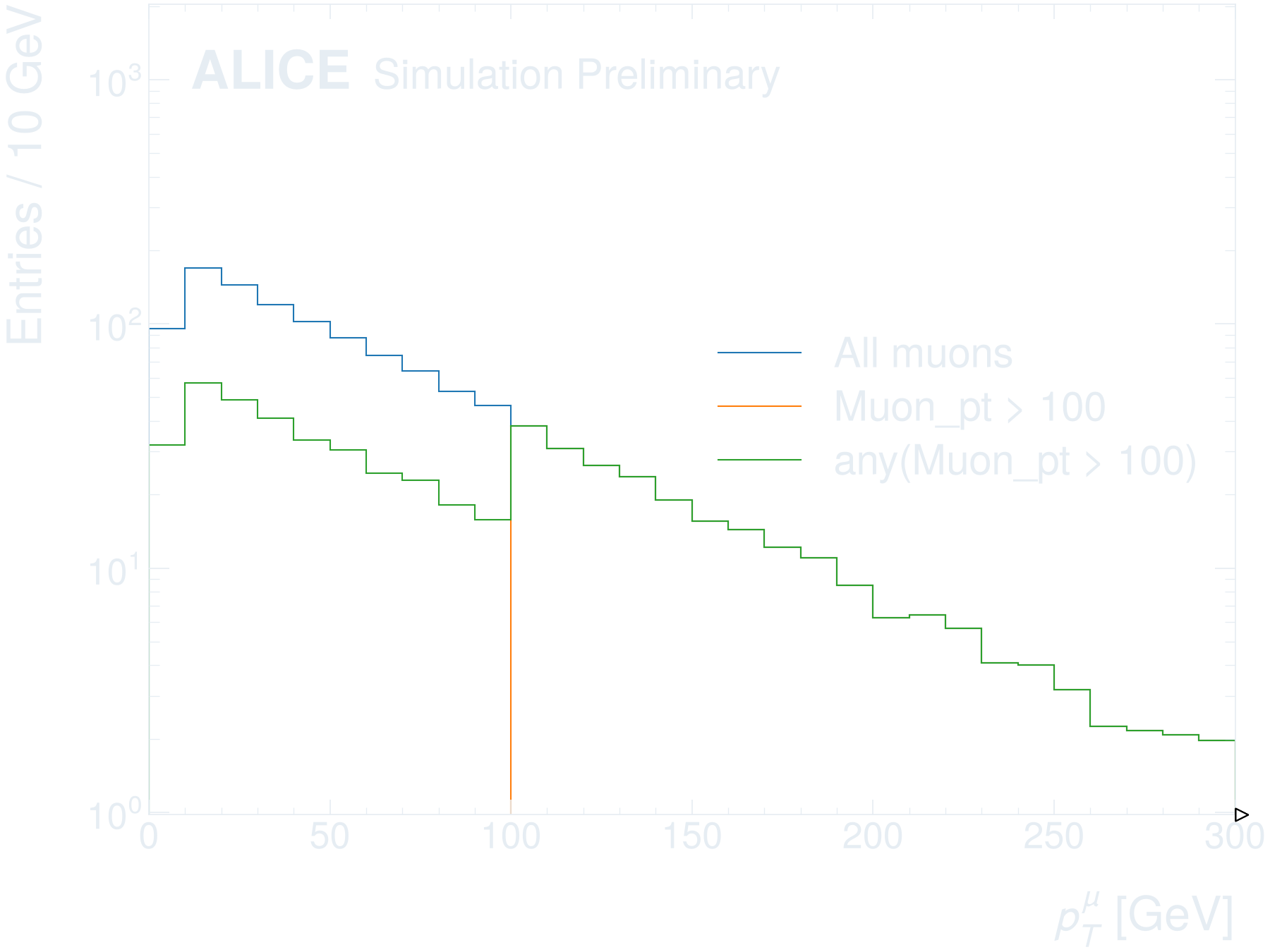
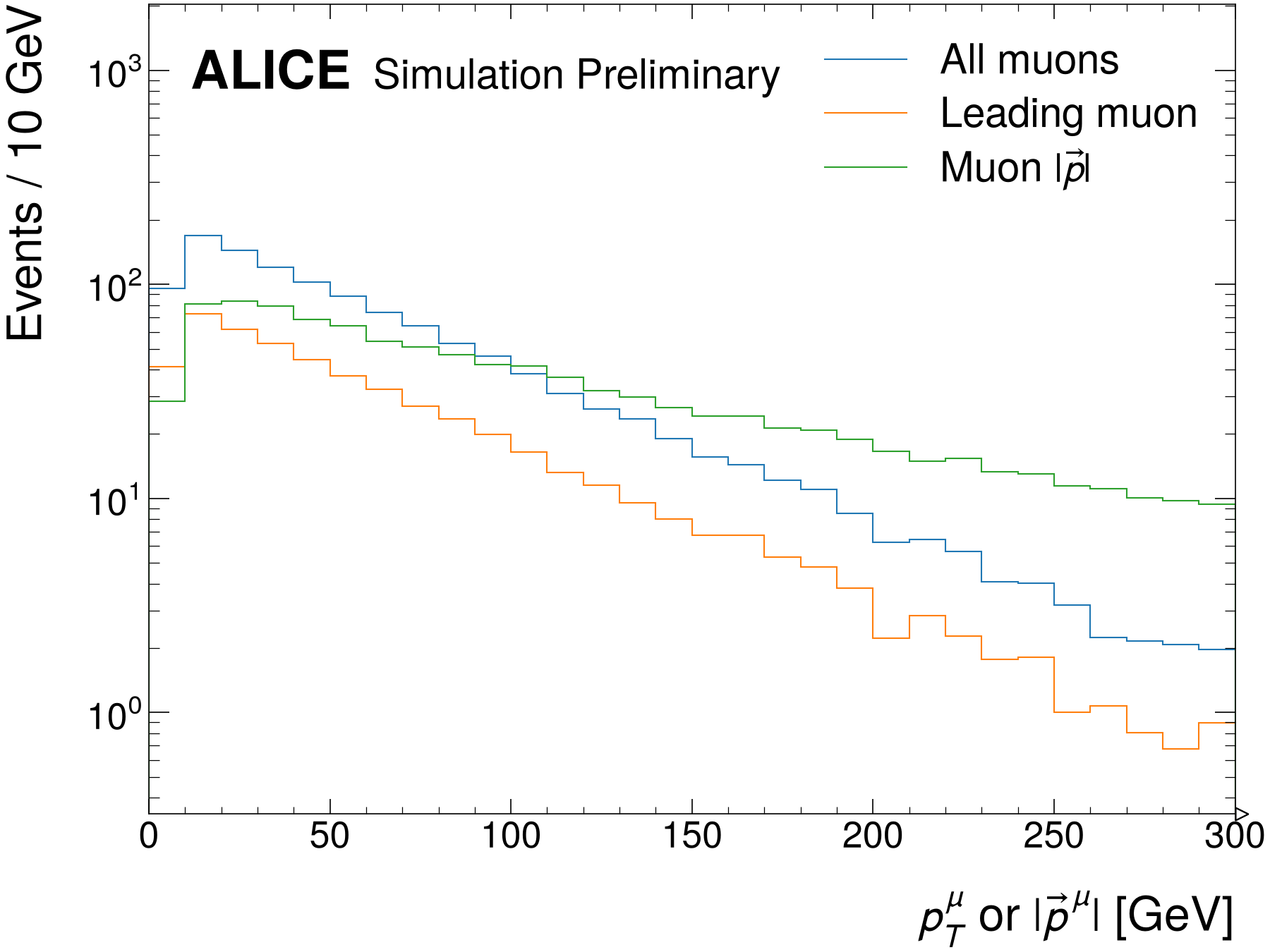
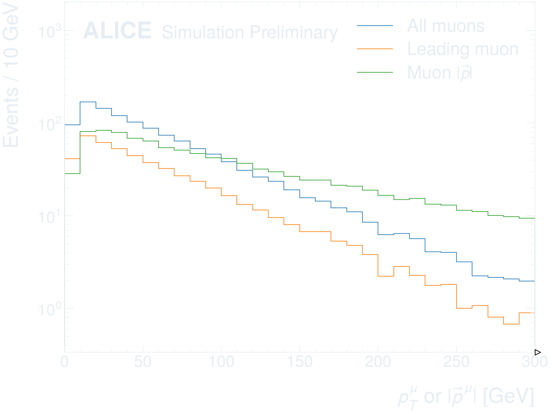
Beyond one dimension
Appearance
Getting started
Simulation and data
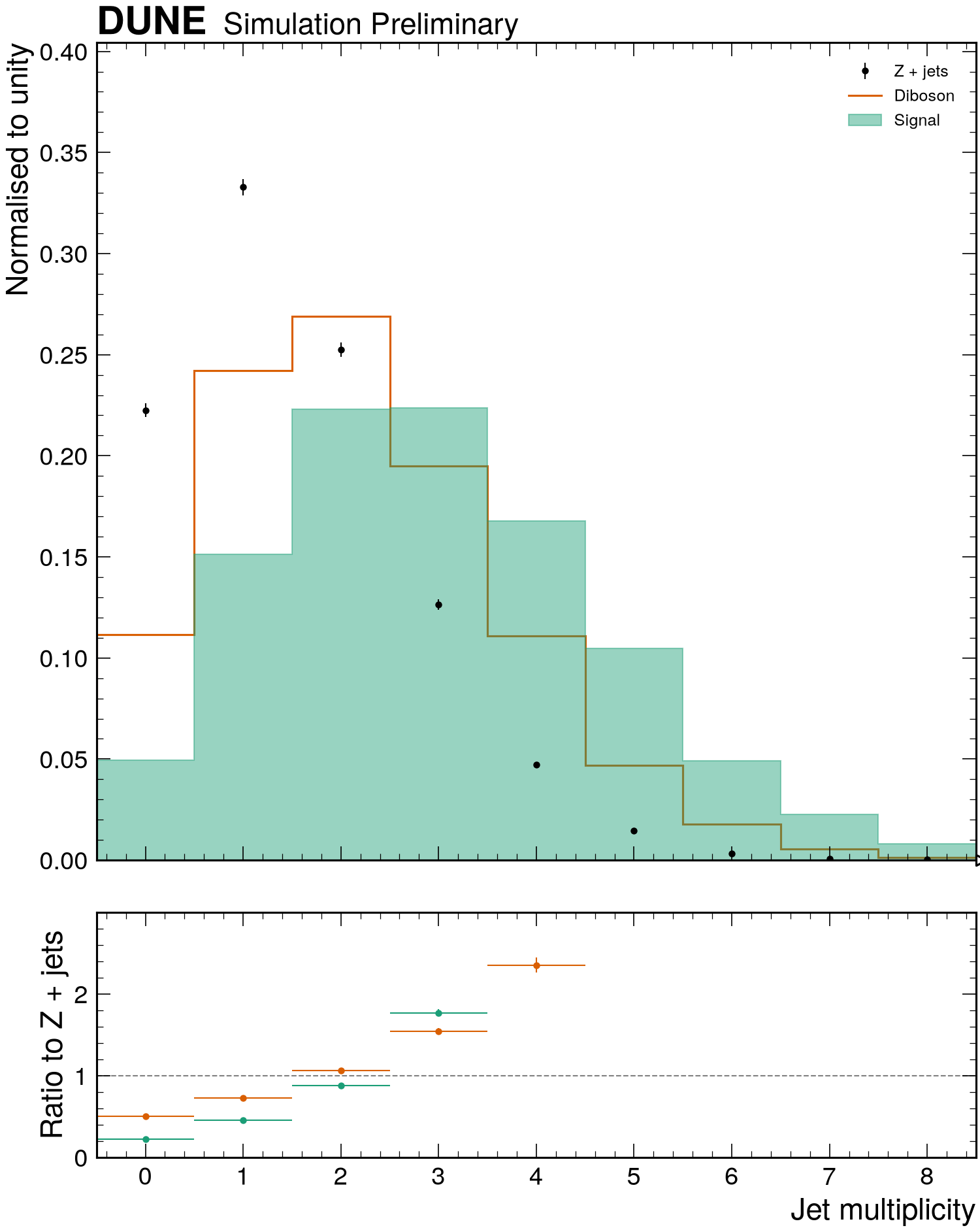
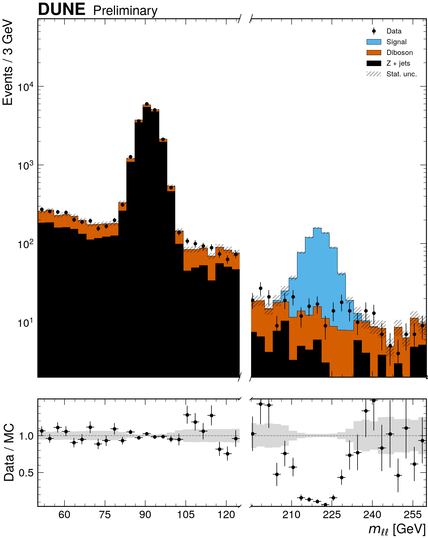
Binning and ranges
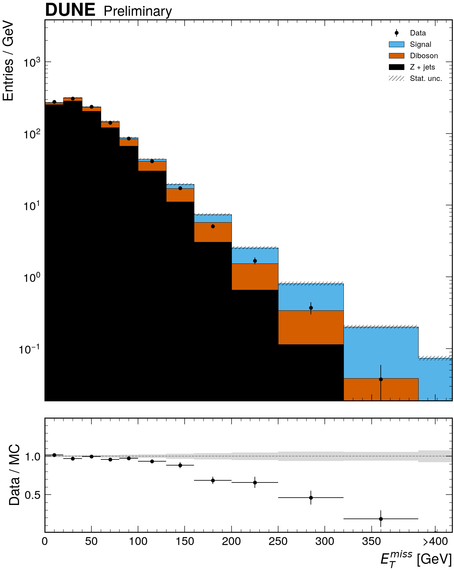
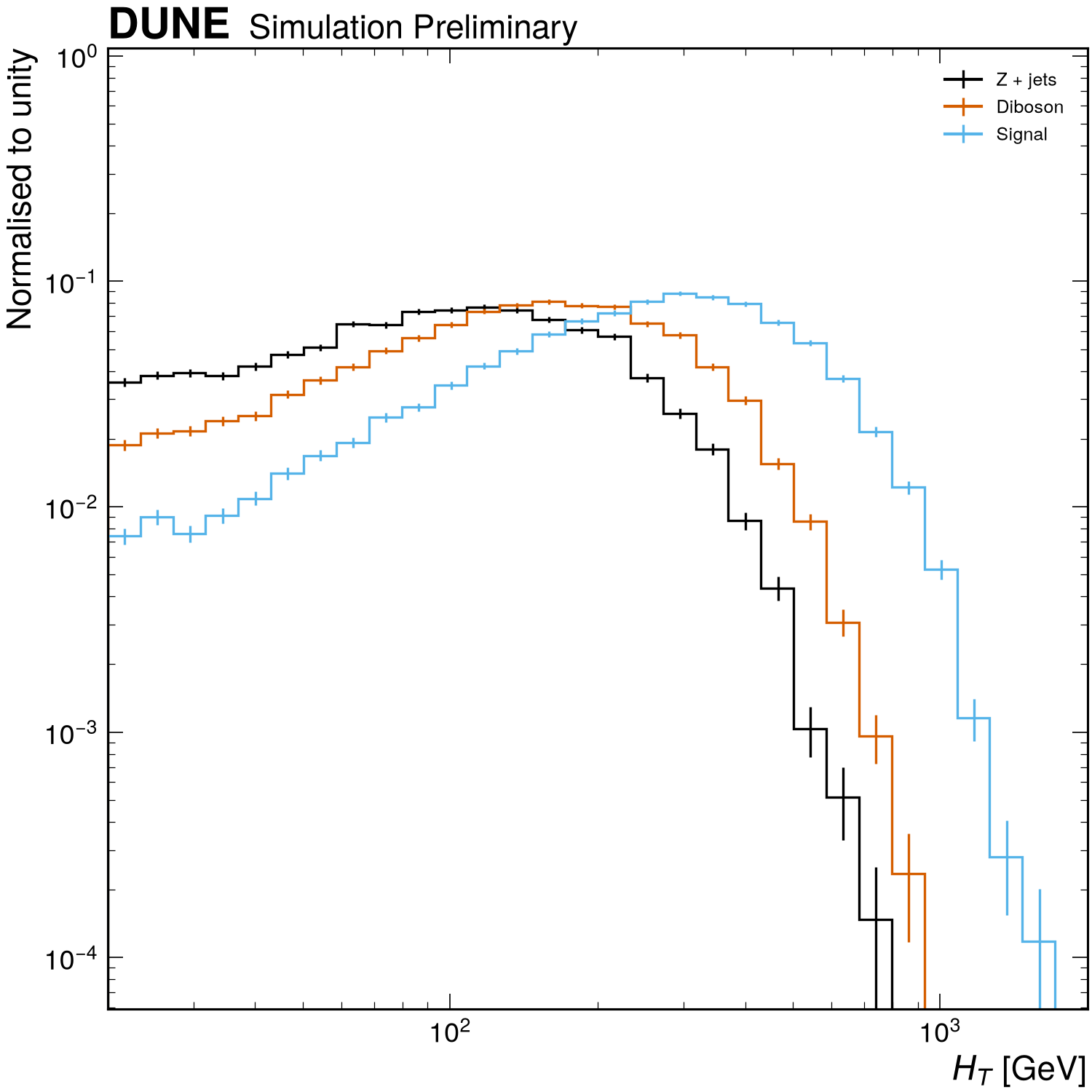
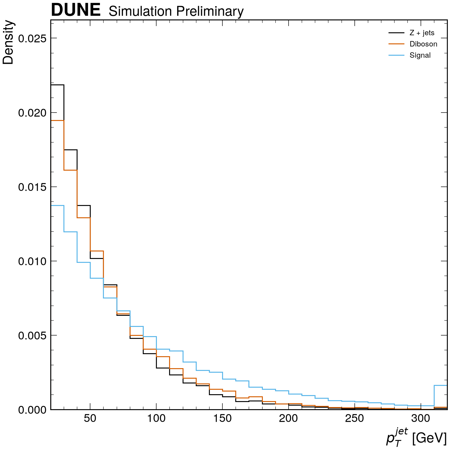
Selections and expressions
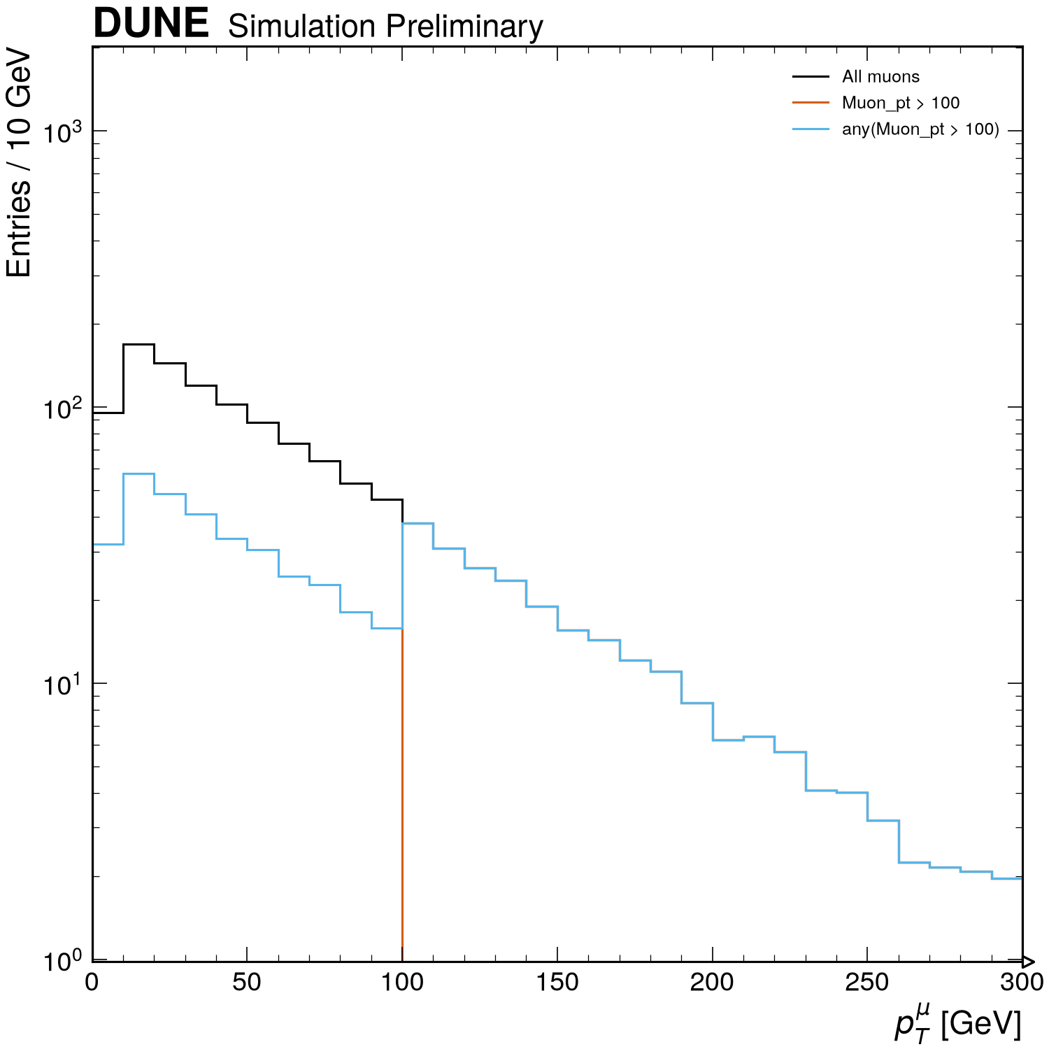
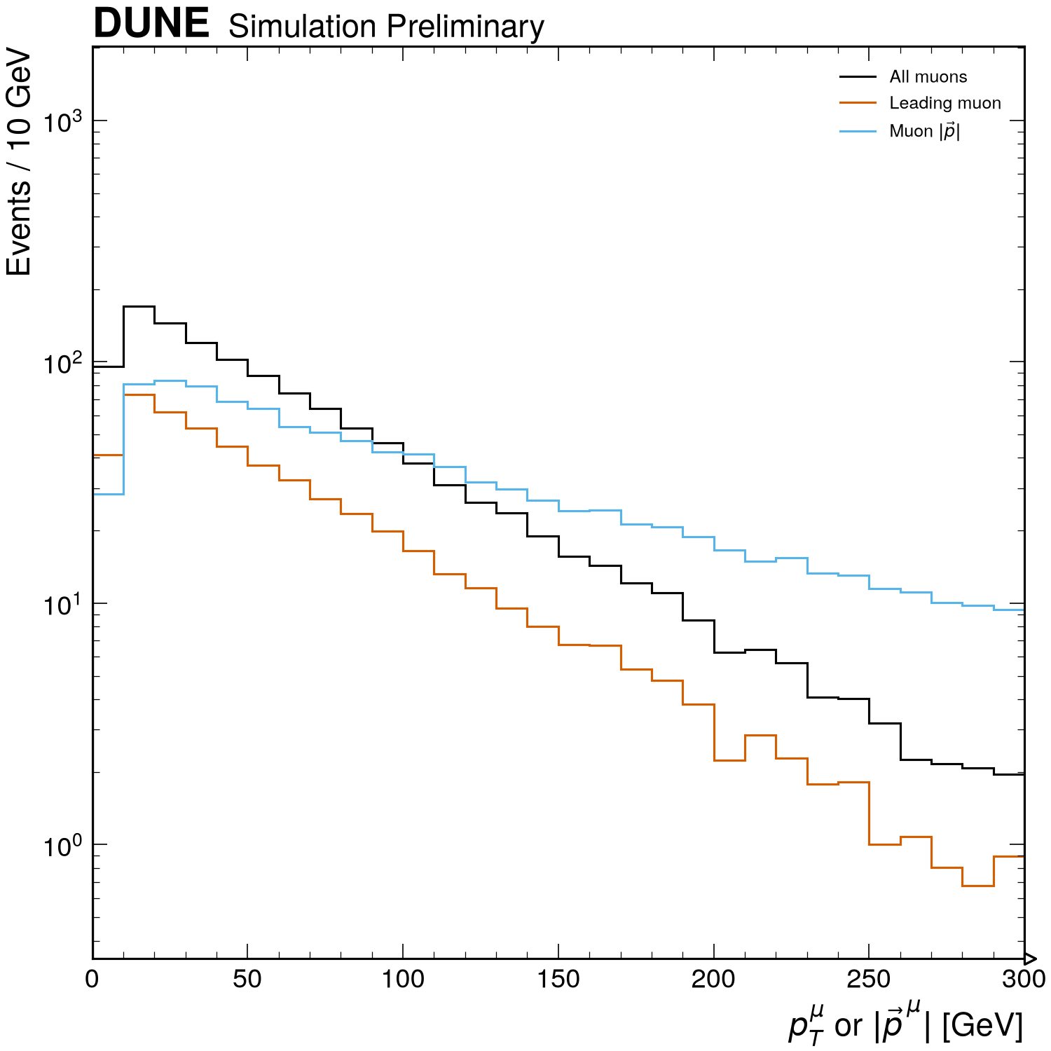
Beyond one dimension
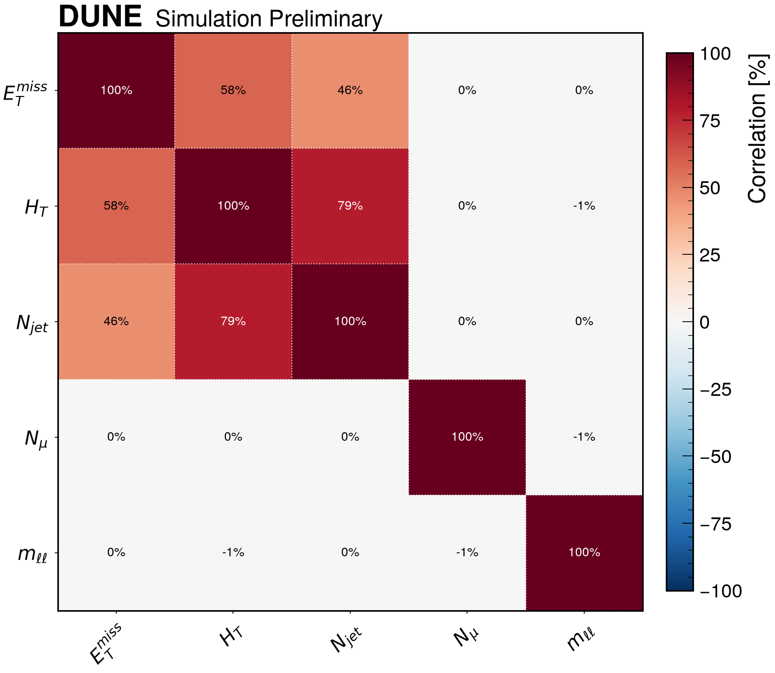
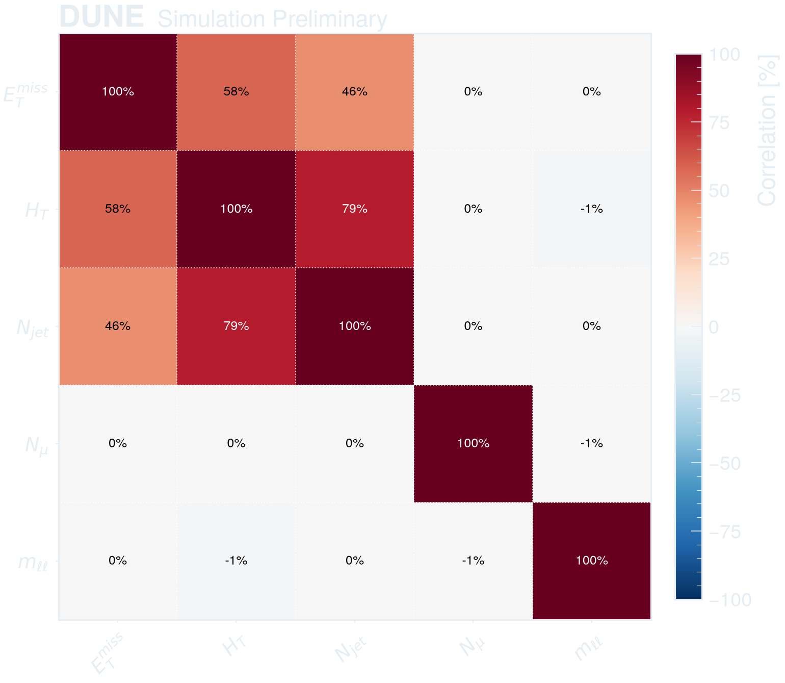
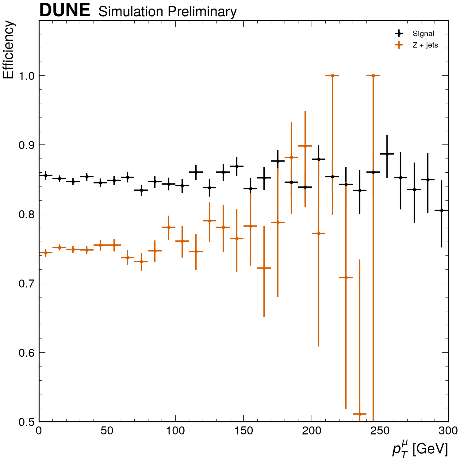
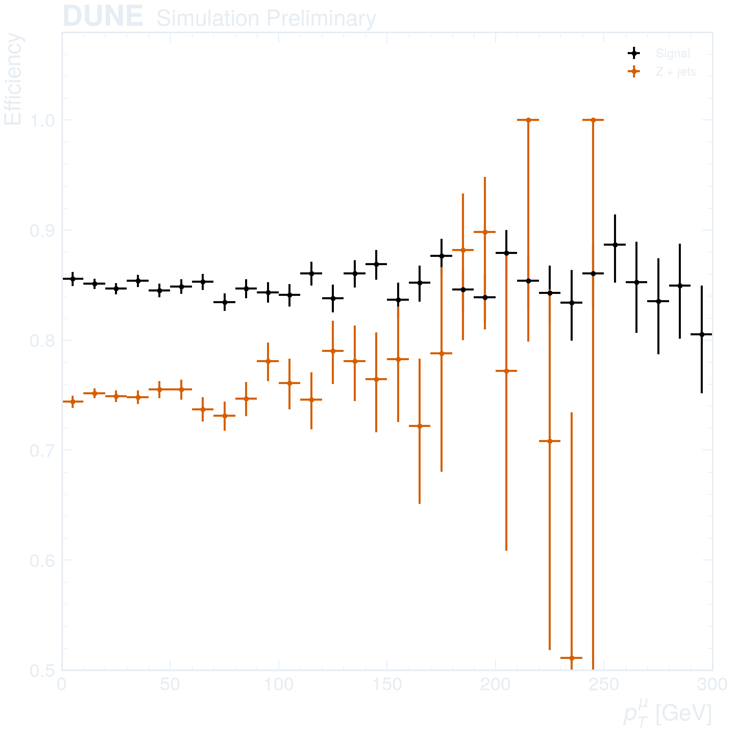
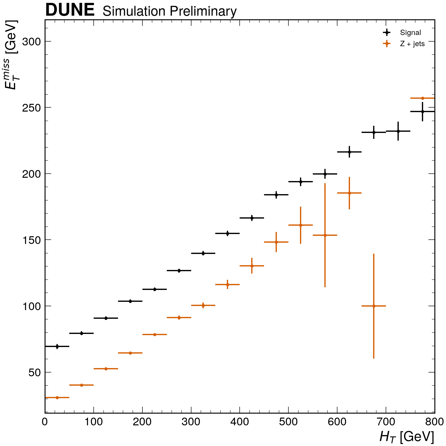
Appearance
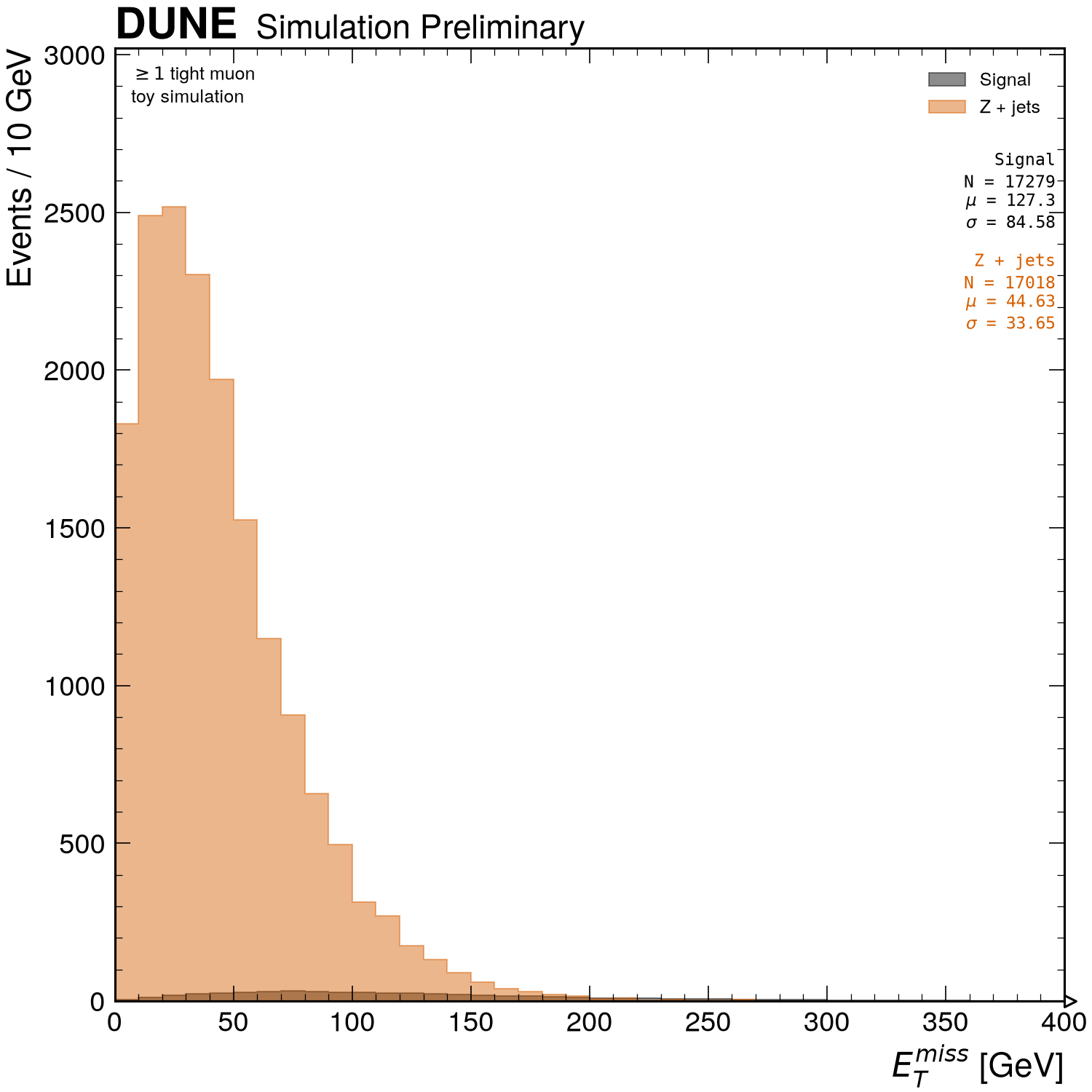
Run the examples
The examples live in
examples/gallery,
and one command writes the toy files and every figure in a few seconds:
python examples/gallery                # everything ends up in examples/out/
python examples/gallery --style CMS    # CMS for examples with style tabs
Each picture is also the reference image the test suite compares against, so what you see is what the current release draws.
Beyond figures
The same inputs feed tables and arrays (mc and signal are the samples from
the setup block of the example pages):
# entries, mean, std, sem, skewness, min, max per sample and variable
print(rf.summarize(mc, ["MET", "Muon_pt"], selection="nMuon > 0"))

# a cut flow: yields, raw counts and step efficiencies per sample
print(
    rf.cutflow(
        mc,
        ["nMuon >= 2", rf.Cut("MET > 50", label="MET > 50 GeV"), "any(Jet_btag > 0.8)"],
    )
)

# evaluated expressions as an Awkward record array
events = rf.load(signal, ["MET", "count(Muon_pt)", "first(Muon_pt)"], selection="nJet >= 2")
events["MET"]

# a plain hist.Hist to feed into your own code
h = rf.histogram(signal, "MET", bins=(40, 0, 400), selection="nJet >= 2")
Cuts compose with &, | and ~, carry optional labels, and combine with
selections given to plot():
base = rf.Cut("nMuon >= 2", label="2 muons")
signal_region = base & "abs(Muon_eta) < 2.4" & ~rf.Cut("any(Jet_btag > 0.8)")
control_region = base & rf.Cut("any(Jet_btag > 0.8)") | "MET > 200"
See Plotting options for every keyword and Expressions and selections for the per-event/per-object rules.